FabCon is coming to Atlanta
Join us at FabCon Atlanta from March 16 - 20, 2026, for the ultimate Fabric, Power BI, AI and SQL community-led event. Save $200 with code FABCOMM.
Register now!- Power BI forums
- Get Help with Power BI
- Desktop
- Service
- Report Server
- Power Query
- Mobile Apps
- Developer
- DAX Commands and Tips
- Custom Visuals Development Discussion
- Health and Life Sciences
- Power BI Spanish forums
- Translated Spanish Desktop
- Training and Consulting
- Instructor Led Training
- Dashboard in a Day for Women, by Women
- Galleries
- Data Stories Gallery
- Themes Gallery
- Contests Gallery
- QuickViz Gallery
- Quick Measures Gallery
- Visual Calculations Gallery
- Notebook Gallery
- Translytical Task Flow Gallery
- TMDL Gallery
- R Script Showcase
- Webinars and Video Gallery
- Ideas
- Custom Visuals Ideas (read-only)
- Issues
- Issues
- Events
- Upcoming Events
Get Fabric Certified for FREE during Fabric Data Days. Don't miss your chance! Request now
- Power BI forums
- Forums
- Get Help with Power BI
- Desktop
- Re: Data reporting
- Subscribe to RSS Feed
- Mark Topic as New
- Mark Topic as Read
- Float this Topic for Current User
- Bookmark
- Subscribe
- Printer Friendly Page
- Mark as New
- Bookmark
- Subscribe
- Mute
- Subscribe to RSS Feed
- Permalink
- Report Inappropriate Content
Data reporting
So new to Power Bi and the community. please let me know if this is the correct forumn.
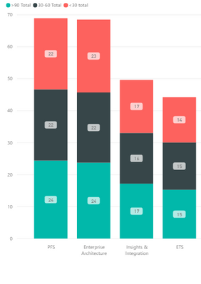
I have an ask to put together a chart that would depict a business unit broken out by number of Crit/high/med vulnerabilities per month across a 6 month time frame. These would be additionally broke out by aged <30/30-60/>90. I am able to get the business unit with aged <30/30-60/>90 but then I am having trouble showing it for Crit/high/med vulnerabilities. How would I beable to divide the column further into showing these?
Solved! Go to Solution.
- Mark as New
- Bookmark
- Subscribe
- Mute
- Subscribe to RSS Feed
- Permalink
- Report Inappropriate Content
hi @JAmbrose69
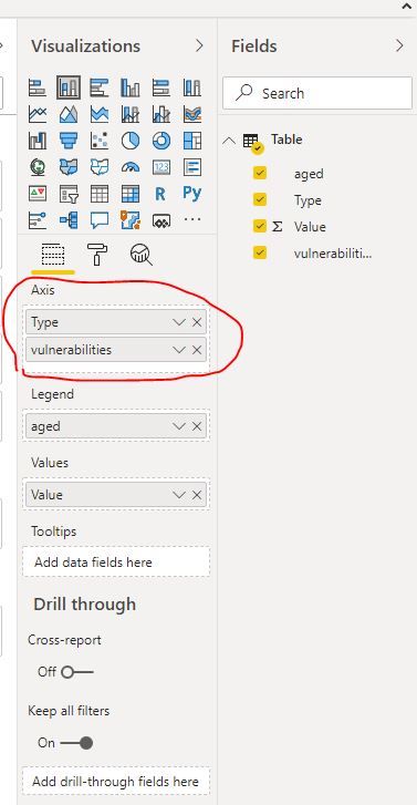
it could achieve that have multiple columns on the legend, so there are two workaround for you refer to:
1. Drag vulnerabilities column into Axis too.
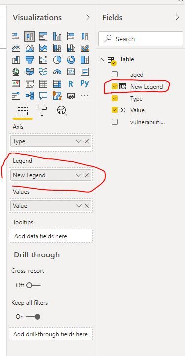
2. As parry2k said, create a new column that combines "aged" and "vulnerabilities " column into one column.
New Legend = 'Table'[aged] &"-"&'Table'[vulnerabilities]then drag this new column into Legend
By the way, to upload a PBIX or the excel file, you can upload it to OneDrive for business and post the link here. Do mask sensitive data before uploading.
Regards,
Lin
If this post helps, then please consider Accept it as the solution to help the other members find it more quickly.
- Mark as New
- Bookmark
- Subscribe
- Mute
- Subscribe to RSS Feed
- Permalink
- Report Inappropriate Content
@JAmbrose69 you cannot have multiple columns on the legend when hack could be to add a column that concatenates both vulnerability & age and use that on the legend.
I would ❤ Kudos if my solution helped. 👉 If you can spend time posting the question, you can also make efforts to give Kudos whoever helped to solve your problem. It is a token of appreciation!
⚡Visit us at https://perytus.com, your one-stop shop for Power BI related projects/training/consultancy.⚡
Subscribe to the @PowerBIHowTo YT channel for an upcoming video on List and Record functions in Power Query!!
Learn Power BI and Fabric - subscribe to our YT channel - Click here: @PowerBIHowTo
If my solution proved useful, I'd be delighted to receive Kudos. When you put effort into asking a question, it's equally thoughtful to acknowledge and give Kudos to the individual who helped you solve the problem. It's a small gesture that shows appreciation and encouragement! ❤
Did I answer your question? Mark my post as a solution. Proud to be a Super User! Appreciate your Kudos 🙂
Feel free to email me with any of your BI needs.
- Mark as New
- Bookmark
- Subscribe
- Mute
- Subscribe to RSS Feed
- Permalink
- Report Inappropriate Content
@JAmbrose69 ,Can you share sample data and sample output in table format? Or a sample pbix after removing sensitive data.
- Mark as New
- Bookmark
- Subscribe
- Mute
- Subscribe to RSS Feed
- Permalink
- Report Inappropriate Content
- Mark as New
- Bookmark
- Subscribe
- Mute
- Subscribe to RSS Feed
- Permalink
- Report Inappropriate Content
I can upload a PBIX and the excel with it. Not sure how.
- Mark as New
- Bookmark
- Subscribe
- Mute
- Subscribe to RSS Feed
- Permalink
- Report Inappropriate Content
hi @JAmbrose69
it could achieve that have multiple columns on the legend, so there are two workaround for you refer to:
1. Drag vulnerabilities column into Axis too.
2. As parry2k said, create a new column that combines "aged" and "vulnerabilities " column into one column.
New Legend = 'Table'[aged] &"-"&'Table'[vulnerabilities]then drag this new column into Legend
By the way, to upload a PBIX or the excel file, you can upload it to OneDrive for business and post the link here. Do mask sensitive data before uploading.
Regards,
Lin
If this post helps, then please consider Accept it as the solution to help the other members find it more quickly.
Helpful resources

Power BI Monthly Update - November 2025
Check out the November 2025 Power BI update to learn about new features.

Fabric Data Days
Advance your Data & AI career with 50 days of live learning, contests, hands-on challenges, study groups & certifications and more!

| User | Count |
|---|---|
| 103 | |
| 80 | |
| 64 | |
| 50 | |
| 45 |


