Fabric Data Days starts November 4th!
Advance your Data & AI career with 50 days of live learning, dataviz contests, hands-on challenges, study groups & certifications and more!
Get registered- Power BI forums
- Get Help with Power BI
- Desktop
- Service
- Report Server
- Power Query
- Mobile Apps
- Developer
- DAX Commands and Tips
- Custom Visuals Development Discussion
- Health and Life Sciences
- Power BI Spanish forums
- Translated Spanish Desktop
- Training and Consulting
- Instructor Led Training
- Dashboard in a Day for Women, by Women
- Galleries
- Data Stories Gallery
- Themes Gallery
- Contests Gallery
- Quick Measures Gallery
- Visual Calculations Gallery
- Notebook Gallery
- Translytical Task Flow Gallery
- TMDL Gallery
- R Script Showcase
- Webinars and Video Gallery
- Ideas
- Custom Visuals Ideas (read-only)
- Issues
- Issues
- Events
- Upcoming Events
Join us at FabCon Atlanta from March 16 - 20, 2026, for the ultimate Fabric, Power BI, AI and SQL community-led event. Save $200 with code FABCOMM. Register now.
- Power BI forums
- Forums
- Get Help with Power BI
- Desktop
- Data lines with 0 values displayed anomalies when ...
- Subscribe to RSS Feed
- Mark Topic as New
- Mark Topic as Read
- Float this Topic for Current User
- Bookmark
- Subscribe
- Printer Friendly Page
- Mark as New
- Bookmark
- Subscribe
- Mute
- Subscribe to RSS Feed
- Permalink
- Report Inappropriate Content
Data lines with 0 values displayed anomalies when selected using a slicer
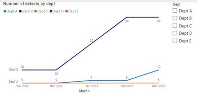
I am using the line chart to display a trend of defects by dept. Some depts has 0 defects but still required to be displayed in the chart.
To do this, I added each dept defects count into the Y-axis.
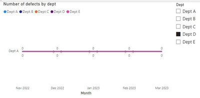
However, when selected a dept that has 0 value, 2 anomalies occurred:
1. Instead of displaying the selected dept, it shows the first dept. The correct dept is shown is selected a dept with values.
2. The 0 on the line appeared more then 1 as shown in the picture.
Are there alternate settings to resolve the above issues?
Thank you in advance!
- Mark as New
- Bookmark
- Subscribe
- Mute
- Subscribe to RSS Feed
- Permalink
- Report Inappropriate Content
Hi, @Anonymous,
have you created a measure, or are you using an implicit measure? Do you have a date-table?
I am not able to recreate your issue, but you could try to write a measure like this:
Measure = SUMX('Table',if(ISBLANK('Table'[value]),0,'Table'[value]))
Cheers,
Sturla
If this post helps, then please consider Accepting it as the solution. Kudos are nice too.
- Mark as New
- Bookmark
- Subscribe
- Mute
- Subscribe to RSS Feed
- Permalink
- Report Inappropriate Content
Hi @sturlaws ,
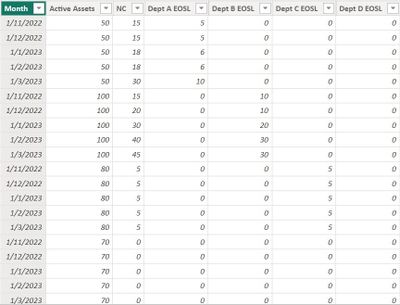
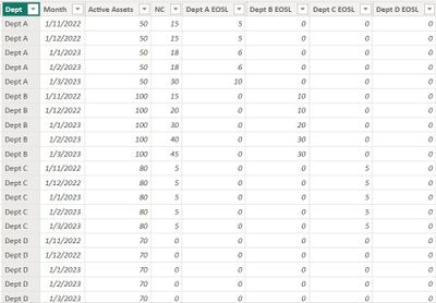
I am getting the data from a table like the following:
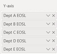
The following columns are selected for the Y-axis:
Cheers!
- Mark as New
- Bookmark
- Subscribe
- Mute
- Subscribe to RSS Feed
- Permalink
- Report Inappropriate Content
How have you created your slicer?
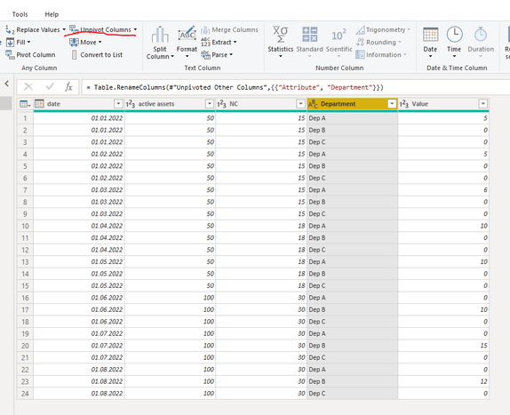
Anyway, the your table is not optimal for what you are trying to do. I would place department on rows instead, like this:
- Mark as New
- Bookmark
- Subscribe
- Mute
- Subscribe to RSS Feed
- Permalink
- Report Inappropriate Content
Hi @sturlaws ,
I use the "Dept" as the field for the slicer.
Sorry, I missed showing that in the table screenshot.
Helpful resources

FabCon Global Hackathon
Join the Fabric FabCon Global Hackathon—running virtually through Nov 3. Open to all skill levels. $10,000 in prizes!

Power BI Monthly Update - October 2025
Check out the October 2025 Power BI update to learn about new features.

| User | Count |
|---|---|
| 76 | |
| 37 | |
| 31 | |
| 27 | |
| 27 |
