FabCon is coming to Atlanta
Join us at FabCon Atlanta from March 16 - 20, 2026, for the ultimate Fabric, Power BI, AI and SQL community-led event. Save $200 with code FABCOMM.
Register now!- Power BI forums
- Get Help with Power BI
- Desktop
- Service
- Report Server
- Power Query
- Mobile Apps
- Developer
- DAX Commands and Tips
- Custom Visuals Development Discussion
- Health and Life Sciences
- Power BI Spanish forums
- Translated Spanish Desktop
- Training and Consulting
- Instructor Led Training
- Dashboard in a Day for Women, by Women
- Galleries
- Data Stories Gallery
- Themes Gallery
- Contests Gallery
- QuickViz Gallery
- Quick Measures Gallery
- Visual Calculations Gallery
- Notebook Gallery
- Translytical Task Flow Gallery
- TMDL Gallery
- R Script Showcase
- Webinars and Video Gallery
- Ideas
- Custom Visuals Ideas (read-only)
- Issues
- Issues
- Events
- Upcoming Events
The Power BI Data Visualization World Championships is back! Get ahead of the game and start preparing now! Learn more
- Power BI forums
- Forums
- Get Help with Power BI
- Desktop
- Data formatting with date
- Subscribe to RSS Feed
- Mark Topic as New
- Mark Topic as Read
- Float this Topic for Current User
- Bookmark
- Subscribe
- Printer Friendly Page
- Mark as New
- Bookmark
- Subscribe
- Mute
- Subscribe to RSS Feed
- Permalink
- Report Inappropriate Content
Data formatting with date
I am trying to create a graphic that shows data for projects where the projects and within time, almost due or overdue and then display this in a graph, pie chart etc but im struggling with the formatting. has anyoine else tried this?
Solved! Go to Solution.
- Mark as New
- Bookmark
- Subscribe
- Mute
- Subscribe to RSS Feed
- Permalink
- Report Inappropriate Content
OK assuming you have a table Proj like this:
| Project | Due | Actual |
| A | 8/1/2017 | 7/30/2017 |
| B | 8/1/2017 | 8/10/2017 |
| C | 8/1/2017 | 8/5/2017 |
| D | 8/1/2017 | 8/10/2017 |
Add two calculated columns to Proj:
Diff = IF(Proj[Due] > Proj[Actual],
          -DATEDIFF(Proj[Actual], Proj[Due], DAY),
          DATEDIFF(Proj[Due], Proj[Actual], DAY))

Status = IF(Proj[Diff] > 6,
            "Overdue",
            IF(Proj[Diff] > 0,
               "Delayed",
               "On Time"))
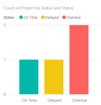
You can now easily display a simple table visual:
by placing the columns of Proj like this and chnaging the data colors appropriately:
- Mark as New
- Bookmark
- Subscribe
- Mute
- Subscribe to RSS Feed
- Permalink
- Report Inappropriate Content
- Mark as New
- Bookmark
- Subscribe
- Mute
- Subscribe to RSS Feed
- Permalink
- Report Inappropriate Content
Hi Erik,
I have an excel sheet with about 100 rows of current projects, each has a due date. In excel i would use conditional formatting to show green if the projects were within delivery time, yellow if they were within 6 days of the due date and red if they were over the due date. I am looking for a way to graphically represent this, even a bar chart of the three categories but I am unsure of the query that is needed...
- Mark as New
- Bookmark
- Subscribe
- Mute
- Subscribe to RSS Feed
- Permalink
- Report Inappropriate Content
OK assuming you have a table Proj like this:
| Project | Due | Actual |
| A | 8/1/2017 | 7/30/2017 |
| B | 8/1/2017 | 8/10/2017 |
| C | 8/1/2017 | 8/5/2017 |
| D | 8/1/2017 | 8/10/2017 |
Add two calculated columns to Proj:
Diff = IF(Proj[Due] > Proj[Actual],
          -DATEDIFF(Proj[Actual], Proj[Due], DAY),
          DATEDIFF(Proj[Due], Proj[Actual], DAY))

Status = IF(Proj[Diff] > 6,
            "Overdue",
            IF(Proj[Diff] > 0,
               "Delayed",
               "On Time"))
You can now easily display a simple table visual:
by placing the columns of Proj like this and chnaging the data colors appropriately:
Helpful resources

Power BI Monthly Update - November 2025
Check out the November 2025 Power BI update to learn about new features.

Fabric Data Days
Advance your Data & AI career with 50 days of live learning, contests, hands-on challenges, study groups & certifications and more!

| User | Count |
|---|---|
| 57 | |
| 44 | |
| 40 | |
| 21 | |
| 18 |


