FabCon is coming to Atlanta
Join us at FabCon Atlanta from March 16 - 20, 2026, for the ultimate Fabric, Power BI, AI and SQL community-led event. Save $200 with code FABCOMM.
Register now!- Power BI forums
- Get Help with Power BI
- Desktop
- Service
- Report Server
- Power Query
- Mobile Apps
- Developer
- DAX Commands and Tips
- Custom Visuals Development Discussion
- Health and Life Sciences
- Power BI Spanish forums
- Translated Spanish Desktop
- Training and Consulting
- Instructor Led Training
- Dashboard in a Day for Women, by Women
- Galleries
- Data Stories Gallery
- Themes Gallery
- Contests Gallery
- Quick Measures Gallery
- Notebook Gallery
- Translytical Task Flow Gallery
- TMDL Gallery
- R Script Showcase
- Webinars and Video Gallery
- Ideas
- Custom Visuals Ideas (read-only)
- Issues
- Issues
- Events
- Upcoming Events
To celebrate FabCon Vienna, we are offering 50% off select exams. Ends October 3rd. Request your discount now.
- Power BI forums
- Forums
- Get Help with Power BI
- Desktop
- Re: Data colors do not save
- Subscribe to RSS Feed
- Mark Topic as New
- Mark Topic as Read
- Float this Topic for Current User
- Bookmark
- Subscribe
- Printer Friendly Page
- Mark as New
- Bookmark
- Subscribe
- Mute
- Subscribe to RSS Feed
- Permalink
- Report Inappropriate Content
Data colors do not save
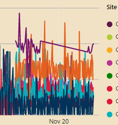
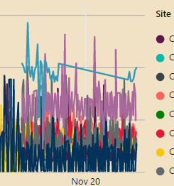
I'm working with a line chart that I have assigned specific data colors to one of the categories. I save the PBIX close and reopen and the colors change!
Before:
After:
Is this a bug or a "feature"? Has anyone else run into this?
Also, this behavior also occurs after publishing to PowerBI.com--the published report has different data colors than the PBIX.
- Mark as New
- Bookmark
- Subscribe
- Mute
- Subscribe to RSS Feed
- Permalink
- Report Inappropriate Content
I am seeing the same annoying behavior - and 3 years later! Definitely need to have manual color override whatever PBI determines is the color.
Has this really not been resolved since this post in 2017?
- Mark as New
- Bookmark
- Subscribe
- Mute
- Subscribe to RSS Feed
- Permalink
- Report Inappropriate Content
Same annoying behaviour here (Dec 2020).
A theme change to alter font colour on 'applied filter' allows the change but, on reopening, the change reverts back.
- Mark as New
- Bookmark
- Subscribe
- Mute
- Subscribe to RSS Feed
- Permalink
- Report Inappropriate Content
The latest version: 2.52.4921.682 seems to work well.
If this post helps, then please consider Accept it as the solution to help the other members find it more quickly.
- Mark as New
- Bookmark
- Subscribe
- Mute
- Subscribe to RSS Feed
- Permalink
- Report Inappropriate Content
Further testing reveals that this still happens with version 2.52.4921.682.
Another odd behavior that's associated:
- Edit line chart data colors
- Save and close
- Open PBIX
- See that data colors have changed
- Change to a different report tab and back again, and the colors change again
Also, the colors don't seem to change if I use a color from the pallette. If I add a custom color, that seems to cause the colors to change when reopening.
- Mark as New
- Bookmark
- Subscribe
- Mute
- Subscribe to RSS Feed
- Permalink
- Report Inappropriate Content
I can not reproduce the issue. Share the .pbix file if convenient.
If this post helps, then please consider Accept it as the solution to help the other members find it more quickly.
- Mark as New
- Bookmark
- Subscribe
- Mute
- Subscribe to RSS Feed
- Permalink
- Report Inappropriate Content
Saw this in another thread:
Colors are selected via the following heuristics
Static measure series will grab colors from the theme starting as position zero. There is no cross-visual sharing of colors for static series.
Dynamic series will use a first-come first-served shared color palette for category. So a specific category will always be the same color (e.g. red) on all visuals. However, depending on load timing, it may be green on all visuals the next time you (or someone else) view it.
Now this makes sense, although I would fully expect that if I manually change a color, that it would take precedence over any "heuristics".
- Mark as New
- Bookmark
- Subscribe
- Mute
- Subscribe to RSS Feed
- Permalink
- Report Inappropriate Content
I haven't noticed this all these days since the Nov update. Even I see this happening to my Line charts.
For me it's not a big issue, but would like find out why is this happening.
Regards,
pxg08680


