A new Data Days event is coming soon!
This time we’re going bigger than ever. Fabric, Power BI, SQL, AI and more. We're covering it all. You won't want to miss it.
Learn more- Power BI forums
- Get Help with Power BI
- Desktop
- Service
- Report Server
- Power Query
- Mobile Apps
- Developer
- DAX Commands and Tips
- Custom Visuals Development Discussion
- Health and Life Sciences
- Power BI Spanish forums
- Translated Spanish Desktop
- Training and Consulting
- Instructor Led Training
- Dashboard in a Day for Women, by Women
- Galleries
- Data Stories Gallery
- Themes Gallery
- Contests Gallery
- QuickViz Gallery
- Quick Measures Gallery
- Visual Calculations Gallery
- Notebook Gallery
- Translytical Task Flow Gallery
- TMDL Gallery
- R Script Showcase
- Webinars and Video Gallery
- Ideas
- Custom Visuals Ideas (read-only)
- Issues
- Issues
- Events
- Upcoming Events
Level up your Power BI skills this month - build one visual each week and tell better stories with data! Get started
- Power BI forums
- Forums
- Get Help with Power BI
- Desktop
- Re: Data Labels on Maps
- Subscribe to RSS Feed
- Mark Topic as New
- Mark Topic as Read
- Float this Topic for Current User
- Bookmark
- Subscribe
- Printer Friendly Page
- Mark as New
- Bookmark
- Subscribe
- Mute
- Subscribe to RSS Feed
- Permalink
- Report Inappropriate Content
Data Labels on Maps
Hi,
Is it possible to have labels of the data on the maps, other than the tooltips? I'd like the labels to show all of them at the same time, same way as, let's say, when I set up the State labels.
Because if I use tooltips, I can only see them if I hover over the map.
Thanks in advance!
Brenda
Solved! Go to Solution.
- Mark as New
- Bookmark
- Subscribe
- Mute
- Subscribe to RSS Feed
- Permalink
- Report Inappropriate Content
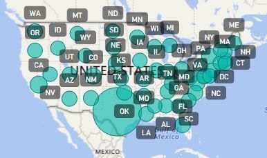
@brendaivett the only way I can think of to do this would be to have some Lat and Long coordinates for each State
You can pick any in each state that plot well on the map you'll be using - see picture
(you may do this in a separate table so you only do it once for each state)
Then create your State Count COLUMN to use in the Location field
State Count COLUMN = 'Table'[State]&" - "&CALCULATE(SUM('Table'[Count]), ALLEXCEPT('Table', 'Table'[State]))
You can look at this post but I don't think it can be applied in your case
I was so looking forward to the ArcGIS Maps but we have even less flexibility there - for now.
I hope they add labels and tooltips soon.
Hope this helps! ![]()
- Mark as New
- Bookmark
- Subscribe
- Mute
- Subscribe to RSS Feed
- Permalink
- Report Inappropriate Content
Hi, I need help on something similar. I don't need any bubbles or shading on a map, but I would like to represent a numeric value in the center of each county. How do I populate a map with those value labels and at the same time not show any bubble or coloring on the map?
- Mark as New
- Bookmark
- Subscribe
- Mute
- Subscribe to RSS Feed
- Permalink
- Report Inappropriate Content
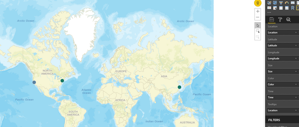
Hi @brendaivett currently only what's in the Location field of a Map can be diplayed at all times!
And unfortunately only a Column can be placed there!
You can concatenate several Columns into 1 field which you can then easily display at all times by placing in the Location field!
So it really depends on what you have in the tooltips?
You may have to convert some Measures into Columns which may or may not be feasible in your case.
Can you give some more details of what you have in mind or some sample data and the expected result.
Also anyone else reading this post - please Vote for either one of these Ideas I've created for MAPs
1) Display another visualization in the Map Labels & Show/Hide Buttons
2) Aerial (Satellite Photo) MAP Background
- Mark as New
- Bookmark
- Subscribe
- Mute
- Subscribe to RSS Feed
- Permalink
- Report Inappropriate Content
@Sean, how do you make what is displayed on the location field show up on the map as a label? I just have the dots, but would like to have the location field text also displayed...


- Mark as New
- Bookmark
- Subscribe
- Mute
- Subscribe to RSS Feed
- Permalink
- Report Inappropriate Content
Curious as well! 🙂
- Mark as New
- Bookmark
- Subscribe
- Mute
- Subscribe to RSS Feed
- Permalink
- Report Inappropriate Content
Hi @Sean,
I have a list similar to the following:
State --- Count
TX --- 10000
CA --- 5000
AK --- 250
OR --- 100
So in Power BI Desktop I convert the State column to the State or Province type, and then include the count in the value for the map, and that way it positions according to the State, but to see the values, I only see them in the tooltips.
If I concatenate State and Count, it won't take the location, if I set Legend with the concatenated field, it gives a different color to each State and I don't want that either, I want the coloration to go by the numerical values and I'm doing that with the Data Colors. And I want the Data Labels to be the numbers of the counts, I want them to show the same way as the state labels are showing in the attached image.
Thanks in advance!
Brenda
- Mark as New
- Bookmark
- Subscribe
- Mute
- Subscribe to RSS Feed
- Permalink
- Report Inappropriate Content
@brendaivett the only way I can think of to do this would be to have some Lat and Long coordinates for each State
You can pick any in each state that plot well on the map you'll be using - see picture
(you may do this in a separate table so you only do it once for each state)
Then create your State Count COLUMN to use in the Location field
State Count COLUMN = 'Table'[State]&" - "&CALCULATE(SUM('Table'[Count]), ALLEXCEPT('Table', 'Table'[State]))
You can look at this post but I don't think it can be applied in your case
I was so looking forward to the ArcGIS Maps but we have even less flexibility there - for now.
I hope they add labels and tooltips soon.
Hope this helps! ![]()
- Mark as New
- Bookmark
- Subscribe
- Mute
- Subscribe to RSS Feed
- Permalink
- Report Inappropriate Content
Hi,excellent solution, but i have a problem. How can I make the count consider the slicers that the report has?
Thank you very much!
- Mark as New
- Bookmark
- Subscribe
- Mute
- Subscribe to RSS Feed
- Permalink
- Report Inappropriate Content
This only works in certain scenarios but more often than not, I am unable to use the average of lat long because each bubble/point is unique and there are multiple points in the same area/state.
Microsoft should just add a way to select whichever field you want in the "Category labels", can't believe they still don't.
- Mark as New
- Bookmark
- Subscribe
- Mute
- Subscribe to RSS Feed
- Permalink
- Report Inappropriate Content
Thank you so much Sean! Your solution worked. Would you mind sharing your list of latitudes and longitudes?
I greatly appreciate your help!
Brenda
Helpful resources

Power BI Monthly Update - April 2026
Check out the April 2026 Power BI update to learn about new features.

Data Days 2026 coming soon!
Sign up to receive a private message when registration opens and key events begin.

New to Fabric Survey
If you have recently started exploring Fabric, we'd love to hear how it's going. Your feedback can help with product improvements.

| User | Count |
|---|---|
| 36 | |
| 28 | |
| 28 | |
| 20 | |
| 18 |
| User | Count |
|---|---|
| 65 | |
| 35 | |
| 34 | |
| 25 | |
| 24 |


