FabCon is coming to Atlanta
Join us at FabCon Atlanta from March 16 - 20, 2026, for the ultimate Fabric, Power BI, AI and SQL community-led event. Save $200 with code FABCOMM.
Register now!- Power BI forums
- Get Help with Power BI
- Desktop
- Service
- Report Server
- Power Query
- Mobile Apps
- Developer
- DAX Commands and Tips
- Custom Visuals Development Discussion
- Health and Life Sciences
- Power BI Spanish forums
- Translated Spanish Desktop
- Training and Consulting
- Instructor Led Training
- Dashboard in a Day for Women, by Women
- Galleries
- Data Stories Gallery
- Themes Gallery
- Contests Gallery
- Quick Measures Gallery
- Notebook Gallery
- Translytical Task Flow Gallery
- TMDL Gallery
- R Script Showcase
- Webinars and Video Gallery
- Ideas
- Custom Visuals Ideas (read-only)
- Issues
- Issues
- Events
- Upcoming Events
To celebrate FabCon Vienna, we are offering 50% off select exams. Ends October 3rd. Request your discount now.
- Power BI forums
- Forums
- Get Help with Power BI
- Desktop
- Data Label - Series Name instead of Value
- Subscribe to RSS Feed
- Mark Topic as New
- Mark Topic as Read
- Float this Topic for Current User
- Bookmark
- Subscribe
- Printer Friendly Page
- Mark as New
- Bookmark
- Subscribe
- Mute
- Subscribe to RSS Feed
- Permalink
- Report Inappropriate Content
Data Label - Series Name instead of Value
Hey guys,
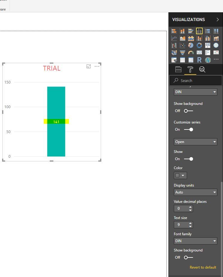
could you please help me with the following Issue: Instead of the Value I want to put the Series Name on the Chart. It is possible to do in Excel, so I'm really wondering where it is hidden in Power BI.
See the Screenshot from Excel and Power BI attached.
Thank you in advance!
Adam
Solved! Go to Solution.
- Mark as New
- Bookmark
- Subscribe
- Mute
- Subscribe to RSS Feed
- Permalink
- Report Inappropriate Content
Hi @Anonymous,
Do you mean the legend? Is that necessary? There are many tips.
Best Regards,
Dale
If this post helps, then please consider Accept it as the solution to help the other members find it more quickly.
- Mark as New
- Bookmark
- Subscribe
- Mute
- Subscribe to RSS Feed
- Permalink
- Report Inappropriate Content
Hi there,
Thought I'd update this with the latest solution if you will - I use Power Bi Report Server Jan 2022 version - on premises, but it has most features the latest desktop PBi has, so:
For some visuals, like line charts you can add the "series label" in the 'format' editing bar - however - you may very well encounter a well known issue a lot of us find where the first value you enter always shows up at the bottom of the chart, no matter if its filtered or not, which is very frustrating and there are few work arounds (covering with a blank shape for example....= not good!!) - but the best work around until this gets fixed is of course my own.
For anyone here looking for a solution to that issue I have an example of the problem (data, measures and screenshot of issue) and my solution:
Re: Serial label error in line chart - Microsoft Power BI Community
Kind regards and good luck 🙂
Clin Epi
- Mark as New
- Bookmark
- Subscribe
- Mute
- Subscribe to RSS Feed
- Permalink
- Report Inappropriate Content
Hi, the series label is a really handy feature to have in PBi as a legend is static - the series label however moves up/down on either side = with the line it is a label for. This is very handy as allows easy interpretation of the line, and the highest value for the value and the period/group.
However there is an issue where the first measure will always show its Series label.... so say you have 10 lines in your line chart, and can filter any lines out, 5 for example, the first measure that was put in "Values" for the line chart will always show no matter what you do, putting it in secondary values makes no difference - this is shown in detail here if anyone cares to try and resolve it?
https://community.powerbi.com/t5/Desktop/Error-in-Series-label-in-line-graph/m-p/2496344
- Mark as New
- Bookmark
- Subscribe
- Mute
- Subscribe to RSS Feed
- Permalink
- Report Inappropriate Content


