Fabric Data Days starts November 4th!
Advance your Data & AI career with 50 days of live learning, dataviz contests, hands-on challenges, study groups & certifications and more!
Get registered- Power BI forums
- Get Help with Power BI
- Desktop
- Service
- Report Server
- Power Query
- Mobile Apps
- Developer
- DAX Commands and Tips
- Custom Visuals Development Discussion
- Health and Life Sciences
- Power BI Spanish forums
- Translated Spanish Desktop
- Training and Consulting
- Instructor Led Training
- Dashboard in a Day for Women, by Women
- Galleries
- Data Stories Gallery
- Themes Gallery
- Contests Gallery
- QuickViz Gallery
- Quick Measures Gallery
- Visual Calculations Gallery
- Notebook Gallery
- Translytical Task Flow Gallery
- TMDL Gallery
- R Script Showcase
- Webinars and Video Gallery
- Ideas
- Custom Visuals Ideas (read-only)
- Issues
- Issues
- Events
- Upcoming Events
Get Fabric Certified for FREE during Fabric Data Days. Don't miss your chance! Request now
- Power BI forums
- Forums
- Get Help with Power BI
- Desktop
- Data Colors option not showing in Shape Maps
- Subscribe to RSS Feed
- Mark Topic as New
- Mark Topic as Read
- Float this Topic for Current User
- Bookmark
- Subscribe
- Printer Friendly Page
- Mark as New
- Bookmark
- Subscribe
- Mute
- Subscribe to RSS Feed
- Permalink
- Report Inappropriate Content
Data Colors option not showing in Shape Maps
I'm experiencing an odd issue here when attempting to use shape maps.
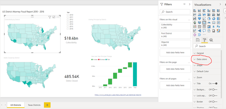
As can be show in the screenshot below, the option is available in the sample provided with the tutorial :
https://docs.microsoft.com/en-us/power-bi/visuals/desktop-shape-map
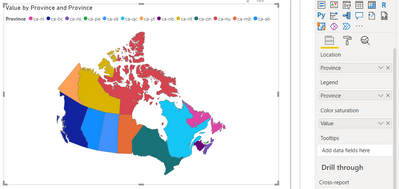
But does not show here in this custom sample I tried building :
If someone has any idea on how to resolve this I would greatly appreciate.
Thank you 🙂
Solved! Go to Solution.
- Mark as New
- Bookmark
- Subscribe
- Mute
- Subscribe to RSS Feed
- Permalink
- Report Inappropriate Content
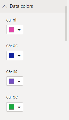
If you want your provinces coloured individually and displayed in the legend (PBI will pick colours based on your theme options and you can change each one if you want under 'Data colors') then make sure you have your legend field populated with the territory and a value field of some kind in the 'Color saturation'. As far as I can tell it will pick up the colours from your legend anyway so the actual value doesn't matter other than that it will appear in your tooltips when hovering over the map. You could just use count of province, or use something meaningful for the tooltip like population.
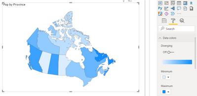
If you want the map to colour each province based on a numeric scale like in the tutorial pictures then you can do that by populating the Color saturation field with a meaningful value but removing your legend. Unfortunately I don't think there is a way to display a legend when using a colour scale, but you could add the province name as a tooltip.
Helpful resources

Fabric Data Days
Advance your Data & AI career with 50 days of live learning, contests, hands-on challenges, study groups & certifications and more!

Power BI Monthly Update - October 2025
Check out the October 2025 Power BI update to learn about new features.


