Become a Certified Power BI Data Analyst!
Join us for an expert-led overview of the tools and concepts you'll need to pass exam PL-300. The first session starts on June 11th. See you there!
Get registered- Power BI forums
- Get Help with Power BI
- Desktop
- Service
- Report Server
- Power Query
- Mobile Apps
- Developer
- DAX Commands and Tips
- Custom Visuals Development Discussion
- Health and Life Sciences
- Power BI Spanish forums
- Translated Spanish Desktop
- Training and Consulting
- Instructor Led Training
- Dashboard in a Day for Women, by Women
- Galleries
- Webinars and Video Gallery
- Data Stories Gallery
- Themes Gallery
- Contests Gallery
- Quick Measures Gallery
- Notebook Gallery
- Translytical Task Flow Gallery
- R Script Showcase
- Ideas
- Custom Visuals Ideas (read-only)
- Issues
- Issues
- Events
- Upcoming Events
Power BI is turning 10! Let’s celebrate together with dataviz contests, interactive sessions, and giveaways. Register now.
- Power BI forums
- Forums
- Get Help with Power BI
- Desktop
- Dashboard
- Subscribe to RSS Feed
- Mark Topic as New
- Mark Topic as Read
- Float this Topic for Current User
- Bookmark
- Subscribe
- Printer Friendly Page
- Mark as New
- Bookmark
- Subscribe
- Mute
- Subscribe to RSS Feed
- Permalink
- Report Inappropriate Content
Dashboard
How do I get, in a dashboard, the x-axis to show individual date (12/01/2022; 12/02/2022; 12/03/2022; etc.) as the legend for the columns that appear above when my source Date field has hundreds of rows with the same date?
Example:
Field 1 (Transaction ID) Field 2 (Model Type) Date
Row 1 1234 20 12/01/2022 3:25:08 PM
Row 2 2345 20 12/01/2022 4:25:18 PM
Row 3 3456 30 12/01/2022 5:05:22 PM
Row 4 4567 20 12/02/2022 1:25:08 PM
Row 5 5678 30 12/02/2022 4:27:08 PM
I want the dashboard to have a separate column for each date and reflect the count of the transaction by Model.
So, would have a 12/01/2022 legend entry and a 12/02/2022 legend entry with stacked bar chart above each date, showing quantity of Model Type for each date. Minutes and seconds not displayed in the date legend of the dashboard.
Thanks, in advance, for your help!
Solved! Go to Solution.
- Mark as New
- Bookmark
- Subscribe
- Mute
- Subscribe to RSS Feed
- Permalink
- Report Inappropriate Content
@GARYSS , Not very clear,
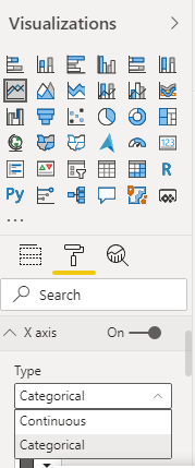
But you can create a date table and use Axis Type = Categorical
New column
Date only = DateValue([Date])
- Mark as New
- Bookmark
- Subscribe
- Mute
- Subscribe to RSS Feed
- Permalink
- Report Inappropriate Content
Hi @GARYSS ,
According to your description, here are my steps you can follow as a solution.
(1)We can create a calculated column.
Date Column = DATE(YEAR('Table'[Date]),MONTH('Table'[Date]),DAY('Table'[Date]))
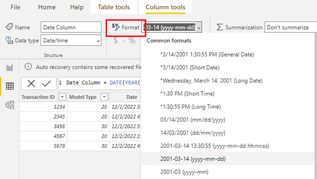
(2)Format date columns.
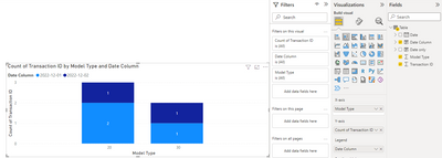
(3)Create a visual and place [Date Column] on the legend field and field selection for y-axis [count].
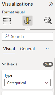
(4)Set the x-axis type to "Categorical" and turn on "Data labels".
Please refer to my PBIX file.
Best Regards,
Neeko Tang
If this post helps, then please consider Accept it as the solution to help the other members find it more quickly.
- Mark as New
- Bookmark
- Subscribe
- Mute
- Subscribe to RSS Feed
- Permalink
- Report Inappropriate Content
Thank you very much, Neeko. Working on it. Will follow-up!
Regards,
Gary
- Mark as New
- Bookmark
- Subscribe
- Mute
- Subscribe to RSS Feed
- Permalink
- Report Inappropriate Content
- Mark as New
- Bookmark
- Subscribe
- Mute
- Subscribe to RSS Feed
- Permalink
- Report Inappropriate Content
Thank you very much, Amitchandak. Will follow-up!
Regards,
Gary
Helpful resources

Join our Fabric User Panel
This is your chance to engage directly with the engineering team behind Fabric and Power BI. Share your experiences and shape the future.

Power BI Monthly Update - June 2025
Check out the June 2025 Power BI update to learn about new features.

| User | Count |
|---|---|
| 81 | |
| 76 | |
| 61 | |
| 37 | |
| 33 |
| User | Count |
|---|---|
| 99 | |
| 56 | |
| 51 | |
| 42 | |
| 40 |


