FabCon is coming to Atlanta
Join us at FabCon Atlanta from March 16 - 20, 2026, for the ultimate Fabric, Power BI, AI and SQL community-led event. Save $200 with code FABCOMM.
Register now!- Power BI forums
- Get Help with Power BI
- Desktop
- Service
- Report Server
- Power Query
- Mobile Apps
- Developer
- DAX Commands and Tips
- Custom Visuals Development Discussion
- Health and Life Sciences
- Power BI Spanish forums
- Translated Spanish Desktop
- Training and Consulting
- Instructor Led Training
- Dashboard in a Day for Women, by Women
- Galleries
- Data Stories Gallery
- Themes Gallery
- Contests Gallery
- QuickViz Gallery
- Quick Measures Gallery
- Visual Calculations Gallery
- Notebook Gallery
- Translytical Task Flow Gallery
- TMDL Gallery
- R Script Showcase
- Webinars and Video Gallery
- Ideas
- Custom Visuals Ideas (read-only)
- Issues
- Issues
- Events
- Upcoming Events
The Power BI Data Visualization World Championships is back! Get ahead of the game and start preparing now! Learn more
- Power BI forums
- Forums
- Get Help with Power BI
- Desktop
- Dashboard for tracking application count changes b...
- Subscribe to RSS Feed
- Mark Topic as New
- Mark Topic as Read
- Float this Topic for Current User
- Bookmark
- Subscribe
- Printer Friendly Page
- Mark as New
- Bookmark
- Subscribe
- Mute
- Subscribe to RSS Feed
- Permalink
- Report Inappropriate Content
Dashboard for tracking application count changes based on Code releases
Hi Guys,
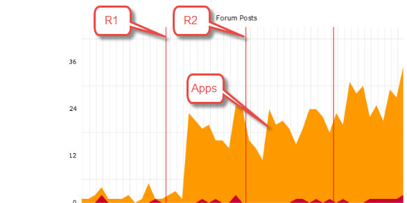
I was recently asked a question if I can create a dashboard where I can show the multiple code releases that happen through the year (mostly once a month) as vertical lines and count of applications received as a line chart.
So, basically identifying if there was an impact on app counts due to a (major/minor)code release. I hvae the dates when the releases happned and will happen in future.
How can I implement such a chart in Power Bi? Any help is really appreciated.
Thanks in advance.
Solved! Go to Solution.
- Mark as New
- Bookmark
- Subscribe
- Mute
- Subscribe to RSS Feed
- Permalink
- Report Inappropriate Content
Hi @Anonymous ,
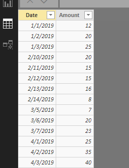
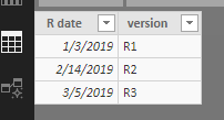
Suppose source tables are similar to below.
New a calendar table first.
Date = CALENDAR(MIN('Fact data'[Date]),MAX('Fact data'[Date]))
Establish relationship between 'Date' table and source tables.
Create measures.
Sum amount = SUM('Fact data'[Amount])
Reference line =
IF (
    SELECTEDVALUE ( 'Release dates'[version] ) <> BLANK (),
    MAXX ( ALLSELECTED ( 'Date'[Date] ), [Sum amount] ),
    0
)
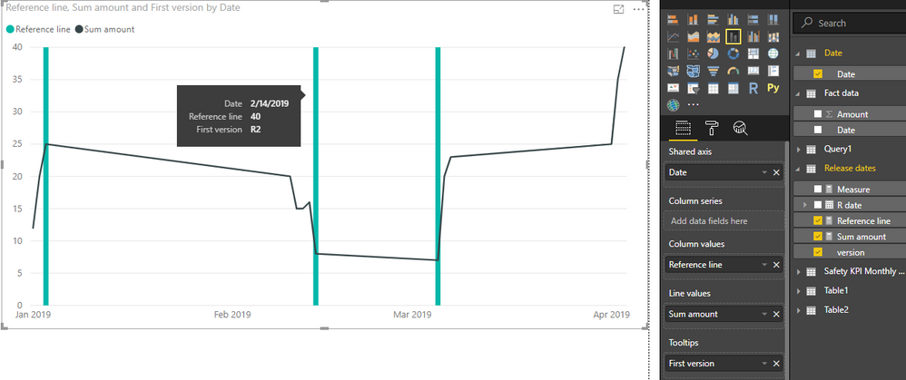
Insert a line and stacked column chart. Place 'Date'[Date] onto X-axis, place above measures into corresponding sections, and place 'Release dates'[version] into tooltip. Remember to set the type of axis to "Continuous".
Best regards,
Yuliana Gu
If this post helps, then please consider Accept it as the solution to help the other members find it more quickly.
- Mark as New
- Bookmark
- Subscribe
- Mute
- Subscribe to RSS Feed
- Permalink
- Report Inappropriate Content
@v-yulgu-msft This is great. Thank you so much!
What if I wanted to add more KPIs ( Apps,Approvals,Fundings etc). Just dragging and dropping into the 'Line Values' section would work fine automatically ?
- Mark as New
- Bookmark
- Subscribe
- Mute
- Subscribe to RSS Feed
- Permalink
- Report Inappropriate Content
Yes, and you could even change the color/formatting of those other KPIs.
- Mark as New
- Bookmark
- Subscribe
- Mute
- Subscribe to RSS Feed
- Permalink
- Report Inappropriate Content
Yup.. It did work. ![]()
Thank you for the quick responses.
Helpful resources

Power BI Dataviz World Championships
The Power BI Data Visualization World Championships is back! Get ahead of the game and start preparing now!

| User | Count |
|---|---|
| 40 | |
| 35 | |
| 34 | |
| 31 | |
| 28 |
| User | Count |
|---|---|
| 137 | |
| 102 | |
| 71 | |
| 67 | |
| 64 |


