FabCon is coming to Atlanta
Join us at FabCon Atlanta from March 16 - 20, 2026, for the ultimate Fabric, Power BI, AI and SQL community-led event. Save $200 with code FABCOMM.
Register now!- Power BI forums
- Get Help with Power BI
- Desktop
- Service
- Report Server
- Power Query
- Mobile Apps
- Developer
- DAX Commands and Tips
- Custom Visuals Development Discussion
- Health and Life Sciences
- Power BI Spanish forums
- Translated Spanish Desktop
- Training and Consulting
- Instructor Led Training
- Dashboard in a Day for Women, by Women
- Galleries
- Data Stories Gallery
- Themes Gallery
- Contests Gallery
- QuickViz Gallery
- Quick Measures Gallery
- Visual Calculations Gallery
- Notebook Gallery
- Translytical Task Flow Gallery
- TMDL Gallery
- R Script Showcase
- Webinars and Video Gallery
- Ideas
- Custom Visuals Ideas (read-only)
- Issues
- Issues
- Events
- Upcoming Events
Get Fabric Certified for FREE during Fabric Data Days. Don't miss your chance! Request now
- Power BI forums
- Forums
- Get Help with Power BI
- Desktop
- Re: DAX to create a Trend line?
- Subscribe to RSS Feed
- Mark Topic as New
- Mark Topic as Read
- Float this Topic for Current User
- Bookmark
- Subscribe
- Printer Friendly Page
- Mark as New
- Bookmark
- Subscribe
- Mute
- Subscribe to RSS Feed
- Permalink
- Report Inappropriate Content
DAX to create a Trend line?
Hi,
I really want to add a Trend Line to a Line and stacked column chart, however the Analytics options aren't availabe for this type of visual. Is it possible to create a Trend using DAX , the same as using TREND function in Excel?
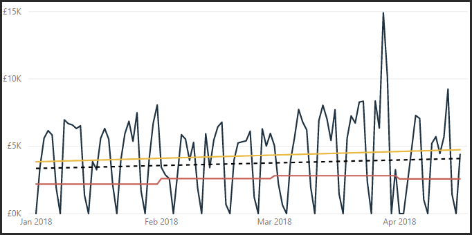
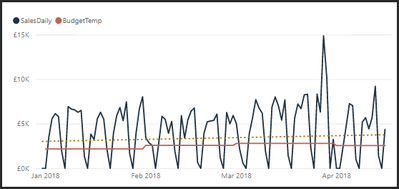
I can add one to a standard line chart:
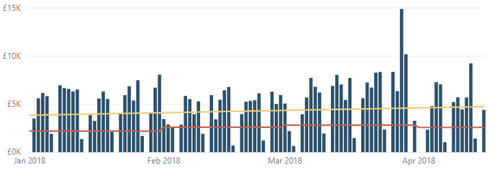
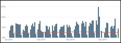
But I would really like it on my Line and Stacked column chart:
The formula would need to take into account any slicers which change the date range.
Any thoughts / tips greatly appreciated!
Mark
Solved! Go to Solution.
- Mark as New
- Bookmark
- Subscribe
- Mute
- Subscribe to RSS Feed
- Permalink
- Report Inappropriate Content
Hi @MarkSL
Just tested it out and the issue is with ALLSELECTED ( 'DateTable'[Date] ). It doesn't work as intended when you filter on a column other that Date, such as Month.
One possible fix is the change in red below.
I have restated your entire code for completeness.
That should work (tested a mock-up model at my end) but let me know if it doesn't
Oh, by the way, there is a "Combine Series" setting for trendlines that determines whether each series gets its own trend line.
Regards,
Owen
Estimated Sales =
VAR Known =
    FILTER (
        SELECTCOLUMNS (
            CALCULATETABLE ( VALUES ( 'DateTable'[Date] ), ALLSELECTED ('DateTable') ),
            "Known[X]", 'DateTable'[Date],
            "Known[Y]", [SalesDaily2]
        ),
        AND ( NOT ( ISBLANK ( Known[X] ) ), NOT ( ISBLANK ( Known[Y] ) ) )
    )
VAR Count_Items =
    COUNTROWS ( Known )
VAR Sum_X =
    SUMX ( Known, Known[X] )
VAR Sum_X2 =
    SUMX ( Known, Known[X] ^ 2 )
VAR Sum_Y =
    SUMX ( Known, Known[Y] )
VAR Sum_XY =
    SUMX ( Known, Known[X] * Known[Y] )
VAR Average_X =
    AVERAGEX ( Known, Known[X] )
VAR Average_Y =
    AVERAGEX ( Known, Known[Y] )
VAR Slope =
    DIVIDE (
        Count_Items * Sum_XY - Sum_X * Sum_Y,
        Count_Items * Sum_X2 - Sum_X ^ 2
    )
VAR Intercept = Average_Y
    - Slope * Average_X
RETURN
    SUMX ( DISTINCT ( 'DateTable'[Date] ),
    Intercept + Slope * 'DateTable'[Date]
)
- Mark as New
- Bookmark
- Subscribe
- Mute
- Subscribe to RSS Feed
- Permalink
- Report Inappropriate Content
Hi all in my case I wanted to get it done in a different context than date. So below you'll find the lines that can be adjusted to any context: Just by changing the measure and the context
Var i=CALCULATE(DISTINCTCOUNT(tMasterCalendar[YearMonth]);ALLSELECTED(tMasterCalendar))
//Calaculates count of month in selected period
Var avgx=CALCULATE(AVERAGEX(VALUES(tMasterCalendar[YearMonth]);[iMonthsinrow]);ALLSELECTED(tMasterCalendar))
//Calaculates avg i value on selected period
Var avgy=CALCULATE(AVERAGEX(VALUES(tMasterCalendar[YearMonth]);[IN]);ALLSELECTED(tMasterCalendar))
// Calaculates avg IN value on selected period
Var Slope=DIVIDE(
//Calculating a in y=ax+b
Var b=avgy-Slope*avgx //Calculating b in y=ax+b
- Mark as New
- Bookmark
- Subscribe
- Mute
- Subscribe to RSS Feed
- Permalink
- Report Inappropriate Content
There are a couple of articles I know of on linear regression with DAX which might cover what you are wanting to do:
- Mark as New
- Bookmark
- Subscribe
- Mute
- Subscribe to RSS Feed
- Permalink
- Report Inappropriate Content
Thanks both for the quick replies.
Owen, I tried the second Dax example from your first link (Other ways to use the pattern) and I seem to have created my trend line as desired! However, it has raised another question about the provided Trend Line provided in Analytics...
I first added my new calculated trend line (yellow) to the my Line chart to check that it matched the previously applied automatic trend line (dashed), but found that it sat above it and not on it:
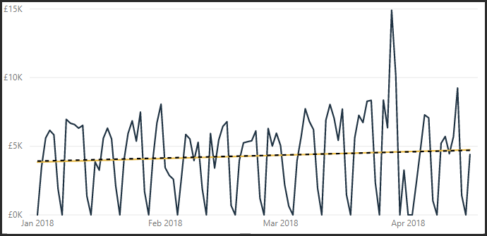
So I initially thought something was not quite right. However, when I removed the Budget line (red) from the chart, the automatic Trend line moved to sit exactly on my created trend line:
On looking at the automatic Trend line provided by Analytics, it doesn't ask which measure (line) on the chart you want the trend to be based on, which seems a bit odd to me? I assume that it must be based on both measures, Sales and Budget?
Anyway, I don't require the Line chart as my trend line is now showing as desired on my Line and Bar chart which is what I really wanted:
I would be interested to hear your thoughts on the automatic Trend line moving though?
Thanks
Mark
- Mark as New
- Bookmark
- Subscribe
- Mute
- Subscribe to RSS Feed
- Permalink
- Report Inappropriate Content
Ah, I may have spoken to soon of success...
It appears that when I filter on month, to reduce the dataset, my calculated trend does not match the automatic trend. However, if I filter on another field, such as customer, the two lines do still match?? I am very new to DAX and so am not sure why this is happening?
Here is the code for the calculated trend:
Estimated Sales =
VAR Known =
    FILTER (
        SELECTCOLUMNS (
            ALLSELECTED ( 'DateTable'[Date] ),
            "Known[X]", 'DateTable'[Date],
            "Known[Y]", [SalesDaily2]
        ),
        AND (
            NOT ( ISBLANK ( Known[X] ) ),
            NOT ( ISBLANK ( Known[Y] ) )
        )
    )
VAR Count_Items =
    COUNTROWS ( Known )
VAR Sum_X =
    SUMX ( Known, Known[X] )
VAR Sum_X2 =
    SUMX ( Known, Known[X] ^ 2 )
VAR Sum_Y =
    SUMX ( Known, Known[Y] )
VAR Sum_XY =
    SUMX ( Known, Known[X] * Known[Y] )
VAR Average_X =
    AVERAGEX ( Known, Known[X] )
VAR Average_Y =
    AVERAGEX ( Known, Known[Y] )
VAR Slope =
    DIVIDE (
        Count_Items * Sum_XY - Sum_X * Sum_Y,
        Count_Items * Sum_X2 - Sum_X ^ 2
    )
VAR Intercept =
    Average_Y - Slope * Average_X
RETURN
    SUMX (
        DISTINCT ( 'DateTable'[Date] ),
        Intercept + Slope * 'DateTable'[Date]
    )
Thanks again.
- Mark as New
- Bookmark
- Subscribe
- Mute
- Subscribe to RSS Feed
- Permalink
- Report Inappropriate Content
Hi @MarkSL
Just tested it out and the issue is with ALLSELECTED ( 'DateTable'[Date] ). It doesn't work as intended when you filter on a column other that Date, such as Month.
One possible fix is the change in red below.
I have restated your entire code for completeness.
That should work (tested a mock-up model at my end) but let me know if it doesn't
Oh, by the way, there is a "Combine Series" setting for trendlines that determines whether each series gets its own trend line.
Regards,
Owen
Estimated Sales =
VAR Known =
    FILTER (
        SELECTCOLUMNS (
            CALCULATETABLE ( VALUES ( 'DateTable'[Date] ), ALLSELECTED ('DateTable') ),
            "Known[X]", 'DateTable'[Date],
            "Known[Y]", [SalesDaily2]
        ),
        AND ( NOT ( ISBLANK ( Known[X] ) ), NOT ( ISBLANK ( Known[Y] ) ) )
    )
VAR Count_Items =
    COUNTROWS ( Known )
VAR Sum_X =
    SUMX ( Known, Known[X] )
VAR Sum_X2 =
    SUMX ( Known, Known[X] ^ 2 )
VAR Sum_Y =
    SUMX ( Known, Known[Y] )
VAR Sum_XY =
    SUMX ( Known, Known[X] * Known[Y] )
VAR Average_X =
    AVERAGEX ( Known, Known[X] )
VAR Average_Y =
    AVERAGEX ( Known, Known[Y] )
VAR Slope =
    DIVIDE (
        Count_Items * Sum_XY - Sum_X * Sum_Y,
        Count_Items * Sum_X2 - Sum_X ^ 2
    )
VAR Intercept = Average_Y
    - Slope * Average_X
RETURN
    SUMX ( DISTINCT ( 'DateTable'[Date] ),
    Intercept + Slope * 'DateTable'[Date]
)
- Mark as New
- Bookmark
- Subscribe
- Mute
- Subscribe to RSS Feed
- Permalink
- Report Inappropriate Content
Hi,
I've tried your exact code but I can't seem to get it to work. What am I doing wrongly? Please help!
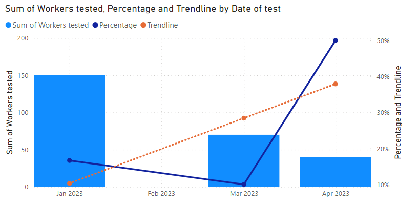
I am plotting a Line and Clustered Column chart with "Sum of 'data'[Workers tested]" as the Column value and a created column "Percentage" = DIVIDE ( 'data'[Abnormal Results], 'data'[Workers tested]) for the Line value.
For the shared axis, I've used 'data'[Date of test].
Below is a sample of the data used.
| Date of test | Workers tested | Abnormal Results | % Abnormal |
| 1 Jan 2023 | 100 | 0 | 0 |
| 1 Jan 2023 | 50 | 25 | 0.5 |
| 1 Mar 2023 | 70 | 7 | 0.1 |
| 1 Apr 2023 | 40 | 20 | 0.5 |
- Mark as New
- Bookmark
- Subscribe
- Mute
- Subscribe to RSS Feed
- Permalink
- Report Inappropriate Content
Hi @matthewtay
Thanks for your patience as I have been a bit busy this month!
I have attached a PBIX containing a suggested approach.
- With the LINEST/LINESTX functions now available, I suggest using these rather than the calculation in the post above. For your example, I would use LINESTX.
- To get this to work, you will need Percentage to be a measure. That's why it wasn't appearing in the intellisense options.
Here are the measure definitions in the attached PBIX:
Percentage =
DIVIDE (
    SUM ( data[Abnormal Results] ),
    SUM ( data[Workers tested] )
)
Trendline =
VAR Known =
FILTER (
SELECTCOLUMNS (
CALCULATETABLE ( VALUES ( 'data'[Date of test] ), ALLSELECTED ( 'data' ) ),
"Known[X]", 'data'[Date of test],
"Known[Y]", [Percentage]
),
AND ( NOT ( ISBLANK ( Known[X] ) ), NOT ( ISBLANK ( Known[Y] ) ) )
)
-- Regression using LINESTX function rather than explicit calculation
VAR Regression =
LINESTX (
Known,
Known[Y],
Known[X]
)
VAR Intercept =
SELECTCOLUMNS ( Regression, "@Intercept", [Intercept] )
VAR Slope =
SELECTCOLUMNS ( Regression, "@Slope", [Slope1] )
RETURN
AVERAGEX ( -- Since the Y-values are percentages, it makes more sense to average than to sum
DISTINCT ( 'data'[Date of test] ),
Intercept + Slope * 'data'[Date of test]
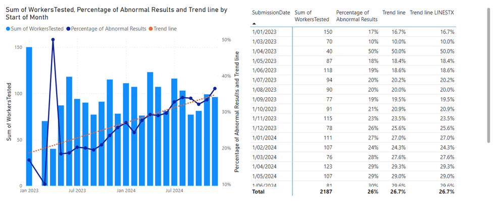
)Putting this into a visual similar to what you've described:
Hope this helps! Please post back if needed.
Kind regards
- Mark as New
- Bookmark
- Subscribe
- Mute
- Subscribe to RSS Feed
- Permalink
- Report Inappropriate Content
No worries! Just glad that you're helping!
Unfortunately my company's IT department has yet to push down the latest Power BI app so I don't have the LINESTX function yet 😞
I've noticed that the main difference is that you've not changed the SUMX function to an AVERAGEX for the last line after the "RETURN" function. I've tried to incorporate this to the previous solution you've provided but to no avail, i still don't get a straight trend line.
Percentage of Abnormal Results =
DIVIDE(
	SUM('data'[AbnormalResults]),
	SUM('data'[WorkersTested])
)
Trend line =
VAR Known =
    FILTER (
        SELECTCOLUMNS (
            CALCULATETABLE ( VALUES ( 'data'[SubmissionDate] ), ALLSELECTED ('data') ),
            "Known[X]", 'data'[SubmissionDate],
            "Known[Y]", [Percentage of Abnormal Results]
        ),
        AND ( NOT ( ISBLANK ( Known[X] ) ), NOT ( ISBLANK ( Known[Y] ) ) )
    )
VAR Count_Items =
    COUNTROWS ( Known )
VAR Sum_X =
    SUMX ( Known, Known[X] )
VAR Sum_X2 =
    SUMX ( Known, Known[X] ^ 2 )
VAR Sum_Y =
    SUMX ( Known, Known[Y] )
VAR Sum_XY =
    SUMX ( Known, Known[X] * Known[Y] )
VAR Average_X =
    AVERAGEX ( Known, Known[X] )
VAR Average_Y =
    AVERAGEX ( Known, Known[Y] )
VAR Slope =
    DIVIDE (
        Count_Items * Sum_XY - Sum_X * Sum_Y,
        Count_Items * Sum_X2 - Sum_X ^ 2
    )
VAR Intercept = Average_Y
    - Slope * Average_X
RETURN
    AVERAGEX ( DISTINCT ( 'data'[SubmissionDate] ),
    Intercept + Slope * 'data'[SubmissionDate]
)
Unfortunately I'm unable to upload my data as it's my companie's data.
Will be uploading the photo of the graph in a second.
- Mark as New
- Bookmark
- Subscribe
- Mute
- Subscribe to RSS Feed
- Permalink
- Report Inappropriate Content
The "Percentage Abnormal Results" is plotted as the yellow line, while the "Trend line" is plotted in the dark blue line. For the life of me I can't seem to figure out how to get it to be a straight line as a trend line should be 😞
Both "Percentage Abnormal Results" and "Trend line" are formatted as "Percentage" under the "Measure tools" tab.
Am I doing something wrongly @OwenAuger ?
- Mark as New
- Bookmark
- Subscribe
- Mute
- Subscribe to RSS Feed
- Permalink
- Report Inappropriate Content
Hi again @matthewtay
Sorry you're stuck on an older Power BI version, but no worries, we can use the older version of the measure.
A few comments:
- The DAX you just posted in principle looks good to me, and works in my test model.
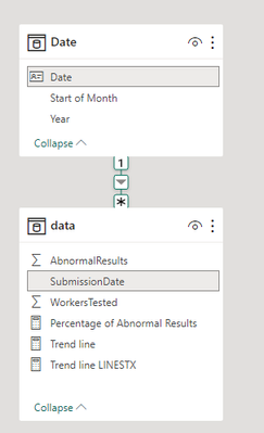
- However (and I'm not sure if this is the issue), to be on the safe side, we should have a 'Date' dimension table, and use that for all date filtering/calculation. It's possible that irregularly spaced SubmissionDate values (or something else) was messing things up.
- The reason for using AVERAGEX rather than SUMX is that when aggregating percentages in a trend line, it makes sense to average them rather than sum them, as this will retain the shape of the trend line. (The original question involved quantities that could logically be summed.)
I've shared a revised PBIX:
- Added a 'Date' table and the Trend Line measure you posted, adjusted to refer to the 'Date' table.
- Tweaked part of the formula involving ALLSELECTED.
Trend line =
VAR Known =
    FILTER (
        SELECTCOLUMNS (
            CALCULATETABLE (
                SUMMARIZE ( 'data', 'Date'[Date] ),
                ALLSELECTED ( 'data' )
            ),
            "Known[X]", 'Date'[Date],
            "Known[Y]", [Percentage of Abnormal Results]
        ),
        AND ( NOT ( ISBLANK ( Known[X] ) ), NOT ( ISBLANK ( Known[Y] ) ) )
    )
VAR Count_Items =
    COUNTROWS ( Known )
VAR Sum_X =
    SUMX ( Known, Known[X] )
VAR Sum_X2 =
    SUMX ( Known, Known[X] ^ 2 )
VAR Sum_Y =
    SUMX ( Known, Known[Y] )
VAR Sum_XY =
    SUMX ( Known, Known[X] * Known[Y] )
VAR Average_X =
    AVERAGEX ( Known, Known[X] )
VAR Average_Y =
    AVERAGEX ( Known, Known[Y] )
VAR Slope =
    DIVIDE (
        Count_Items * Sum_XY - Sum_X * Sum_Y,
        Count_Items * Sum_X2 - Sum_X ^ 2
    )
VAR Intercept = Average_Y
    - Slope * Average_X
RETURN
    AVERAGEX ( DISTINCT ( 'Date'[Date] ),
    Intercept + Slope * 'Date'[Date]
)
I added some dummy data and the trend line indeed appears to be straight. Note that I'm using columns of the 'Date' table on the chart axis.
I'm hoping some of the above will help fix your calcs/visuals!
Regards
- Mark as New
- Bookmark
- Subscribe
- Mute
- Subscribe to RSS Feed
- Permalink
- Report Inappropriate Content
THANK YOU SO MUCH! ABSOLUTE LIFE SAVER! IT WORKED!
I think some how the issue was that I used the submission date from the original data set even though I had created a new table using the "CALENDARAUTO()" function and linked the submission date to the calendarauto date.
Just one last issue, is there anyway I can restrict the data to my actual data set i.e., my data set has data from 1987 to 2023. Currently the trend line is plotted from year 1900 to 3000. While I could manually filter the date range from 1987-2023, just wondering if I could get it to automatically plot between those years where I actually have data.
This is also getting a bit ambitious, is there any way I could get the trend line to auto adjust based on the date range selected via the "Zoom slider" for the x-axis (date range)? Currently the trend line is fixed based on the calculation from all the data I have regardless of how I filter the date range on the visualisation.
Anyway thanks so much for your help once again!!
- Mark as New
- Bookmark
- Subscribe
- Mute
- Subscribe to RSS Feed
- Permalink
- Report Inappropriate Content
@matthewtay you're welcome!
On your questions:
- I would recommend adjusting the Trend Line measure to hide values that are outside the date range present in the data table. One way of doing this is shown below, by comparing the global min/max dates in the data table with the filtered min/max dates.
- The trend calculation line itself should already adjust based on the overall filter context of the visual due to the use of ALLSELECTED. I just tweaked my measures to use ALLSELECTED without arguments, as this should ensure that all filters at the "overall" visual level are retained. When changing the date range, the trend line appears to adjust as you would expect. Does this work for you?
Updated PBIX attached.
Trend line =
VAR DataMinDate =
    CALCULATE ( MIN ( data[SubmissionDate] ), REMOVEFILTERS () )
VAR DataMaxDate =
    CALCULATE ( MAX ( data[SubmissionDate] ), REMOVEFILTERS () )
VAR FilteredMinDate = MIN ( 'Date'[Date] )
VAR FilteredMaxDate = MAX ( 'Date'[Date] )
VAR Result =
    IF (
        AND ( FilteredMinDate <= DataMaxDate, FilteredMaxDate >= DataMinDate ),
        VAR Known =
            FILTER (
                SELECTCOLUMNS (
                    CALCULATETABLE (
                        SUMMARIZE ( 'data', 'Date'[Date] ),
                        ALLSELECTED ( )
                    ),
                    "Known[X]", 'Date'[Date],
                    "Known[Y]", [Percentage of Abnormal Results]
                ),
                AND ( NOT ( ISBLANK ( Known[X] ) ), NOT ( ISBLANK ( Known[Y] ) ) )
            )
        VAR Count_Items =
            COUNTROWS ( Known )
        VAR Sum_X =
            SUMX ( Known, Known[X] )
        VAR Sum_X2 =
            SUMX ( Known, Known[X] ^ 2 )
        VAR Sum_Y =
            SUMX ( Known, Known[Y] )
        VAR Sum_XY =
            SUMX ( Known, Known[X] * Known[Y] )
        VAR Average_X =
            AVERAGEX ( Known, Known[X] )
        VAR Average_Y =
            AVERAGEX ( Known, Known[Y] )
        VAR Slope =
            DIVIDE (
                Count_Items * Sum_XY - Sum_X * Sum_Y,
                Count_Items * Sum_X2 - Sum_X ^ 2
            )
        VAR Intercept = Average_Y
            - Slope * Average_X
        RETURN
            AVERAGEX (
                DISTINCT ( 'Date'[Date] ),
                Intercept + Slope * 'Date'[Date]
            )
    )
RETURN
    Result
Regards
- Mark as New
- Bookmark
- Subscribe
- Mute
- Subscribe to RSS Feed
- Permalink
- Report Inappropriate Content
Many thanks for such a brilliant solution. It works perfectly with my use case.
- Mark as New
- Bookmark
- Subscribe
- Mute
- Subscribe to RSS Feed
- Permalink
- Report Inappropriate Content
Hi Owen,
I know this is an old thread, but I found this solution very interesting.
However, I am haveing issues changing above code, to account for the X-axis being in text format, for example YearMonth (YYYY-MM).
Any chance you have an idea how to accomplish this?
Any help would be highly appreciated,
Espen
- Mark as New
- Bookmark
- Subscribe
- Mute
- Subscribe to RSS Feed
- Permalink
- Report Inappropriate Content
I'm sorry, this is a very late reply to your reply 😓
If you are dealing with YearMonth as a text column, I would sugget adding a YearMonth index to your Date table and using that instead.
To illustrate in DAX, the formula would be something like:
YearMonth Index =
YEAR ( 'Date'[Date] ) * 12 + MONTH ( 'Date'[Date] ) - 1
The reason for subtracting one is that the Year or Month can be recovered from the Index using integer division or the modulo operator.
This index increases by one for each month, so can be used in the regression calculation.
Regards,
Owen
- Mark as New
- Bookmark
- Subscribe
- Mute
- Subscribe to RSS Feed
- Permalink
- Report Inappropriate Content
Hi Owen,
Thanks for the fantastic code!
I used your code to create a trend line, it's working great, but only calculates a trend for the entire dataset. I have a list of facilities, and I want the trend line to dynamically update when I select different facilities using a page level filter. I'm trying to change this so it can adapt to visual filters, but not much luck, and hope you might be able to help. Thanks a lot in advane!
Cheers,
Michael
- Mark as New
- Bookmark
- Subscribe
- Mute
- Subscribe to RSS Feed
- Permalink
- Report Inappropriate Content
Hi @OwenAuger
Brilliant, thank you very much for looking at this and finding the fix. My calculated trend line now matches that of the automatic trend line when using all filters; Customer & Month.
Thanks also for alerting me to the Combine Series option.
Regards
Mark
- Mark as New
- Bookmark
- Subscribe
- Mute
- Subscribe to RSS Feed
- Permalink
- Report Inappropriate Content
Hello @OwenAuger, I wonder if I could get a little help here on what surely seems to be an easy situation but confounding me nonetheless.
I'm looking to create a column in one table with the slope of trended metrics from another.
- One table (on the right) is current values of providers and associated metrics which I use for all sorts of things. I'd like to add a column with the slope of the trend for each provider/metric combination. There are ~600 metrics for each of ~4000 hospitals to compute a slope for.
- The other table (on the left) is a table of trend values...of these provider/metric combinations. So it contains the same ~600 metrics over as many as 8 years for the same ~4000 hospitals.
- Each table has a Variable_Name and Provdrno. I want to use the Provdrno AND Variable name from the row in the Right Table to give me the selection of trend values in the LEFT Table. Seems eacy enough
- So I've read what seem to be the relevant posts....and tried a variety of attacks. Here's the one that does seem promising.
TempSlope =
VAR RowMetric = SelectedValue(HospMeasures[Variable_Name])
VAR RowProviderID = SelectedValue(HospMeasures[PROVDRNO])

VAR Known =
        SELECTCOLUMNS (
            CALCULATETABLE ( ALL(TR_MeasureTrends),  TR_MeasureTrends[PROVDRNO] = RowProviderID , Tr_MeasureTrends[Variable_Name] = RowMetric
			),
            "Known[X]", Tr_MeasureTrends[FY_Trend] ,
            "Known[Y]", Tr_MeasureTrends[Variable_Value]
        )
VAR Count_Items =
    COUNTROWS ( Known )
VAR Sum_X =
    SUMX ( Known, VALUE(Known[X]) )
VAR Sum_X2 =
    SUMX ( Known, VALUE(Known[X]) ^ 2 )
VAR Sum_Y =
    SUMX ( Known, Known[Y] )
VAR Sum_XY =
    SUMX ( Known, VALUE(Known[X]) * Known[Y] )
VAR Average_X =
    AVERAGEX ( Known, VALUE(Known[X]) )
VAR Average_Y =
    AVERAGEX ( Known, Known[Y] )
VAR Slope =
    DIVIDE (
        Count_Items * Sum_XY - Sum_X * Sum_Y,
        Count_Items * Sum_X2 - Sum_X ^ 2
    )
RETURN
Slope
Unfortunately every row has the same value! ugggg.....It's very mysterious.
I believe the codes does the following
- creates VAR's for the relevant row info (ProvdrNo and Variable_Name)
- Select columns from the trend table where I
- clear all filters at the row level,
- filter for the proper provdrno and variable_name
- select the two columns I need for the slope calculation
- convert the FY_date column to a number as required.
- Do the calcs.
Yet every value is identical. As I thrashed around, the table name only did not yield any values, ALLSELECTED in any form did not yield any values (Yes, that was crazy)....so I'm stumped.
Suggestions? Thank you in advance,
Tom
- Mark as New
- Bookmark
- Subscribe
- Mute
- Subscribe to RSS Feed
- Permalink
- Report Inappropriate Content
At a glance, I can see two fixes to make:
- There is no need to use SELECTEDVALUE when defining RowMetric and RowProviderID, as you can access the required values by direct column references. This is by virtue of the row context you have when defining a calculated column. If you use SELECTEDVALUE, you will get blank result as there is an "unfiltered" filter context when defining a calculated column.
- The expression CALCULATETABLE ( ALL(TR_MeasureTrends), ... ) will always return all rows of TR_MeasureTrends, effectively ignoring the filter arguments provided to CALCULATETABLE. Get rid of the ALL and this should work as intended.
I am assuming there are not relationships between the two tables by the way (appeared to be the case from the screenshot).
The first few rows of the corrected DAX should look like this:
TempSlope =
VAR RowMetric = HospMeasures[Variable_Name]
VAR RowProviderID = HospMeasures[PROVDRNO]

VAR Known =
        SELECTCOLUMNS (
            CALCULATETABLE ( TR_MeasureTrends,  TR_MeasureTrends[PROVDRNO] = RowProviderID , Tr_MeasureTrends[Variable_Name] = RowMetric
			),
            "Known[X]", Tr_MeasureTrends[FY_Trend] ,
            "Known[Y]", Tr_MeasureTrends[Variable_Value]
        )
...
Does that fix the problem?
Regards,
Owen
- Mark as New
- Bookmark
- Subscribe
- Mute
- Subscribe to RSS Feed
- Permalink
- Report Inappropriate Content
Helpful resources

Power BI Monthly Update - November 2025
Check out the November 2025 Power BI update to learn about new features.

Fabric Data Days
Advance your Data & AI career with 50 days of live learning, contests, hands-on challenges, study groups & certifications and more!

