FabCon is coming to Atlanta
Join us at FabCon Atlanta from March 16 - 20, 2026, for the ultimate Fabric, Power BI, AI and SQL community-led event. Save $200 with code FABCOMM.
Register now!- Power BI forums
- Get Help with Power BI
- Desktop
- Service
- Report Server
- Power Query
- Mobile Apps
- Developer
- DAX Commands and Tips
- Custom Visuals Development Discussion
- Health and Life Sciences
- Power BI Spanish forums
- Translated Spanish Desktop
- Training and Consulting
- Instructor Led Training
- Dashboard in a Day for Women, by Women
- Galleries
- Data Stories Gallery
- Themes Gallery
- Contests Gallery
- Quick Measures Gallery
- Notebook Gallery
- Translytical Task Flow Gallery
- TMDL Gallery
- R Script Showcase
- Webinars and Video Gallery
- Ideas
- Custom Visuals Ideas (read-only)
- Issues
- Issues
- Events
- Upcoming Events
Join the Fabric FabCon Global Hackathon—running virtually through Nov 3. Open to all skill levels. $10,000 in prizes! Register now.
- Power BI forums
- Forums
- Get Help with Power BI
- Desktop
- Re: Customisation of Line and clustered column tab...
- Subscribe to RSS Feed
- Mark Topic as New
- Mark Topic as Read
- Float this Topic for Current User
- Bookmark
- Subscribe
- Printer Friendly Page
- Mark as New
- Bookmark
- Subscribe
- Mute
- Subscribe to RSS Feed
- Permalink
- Report Inappropriate Content
Customisation of Line and clustered column table
Hi,
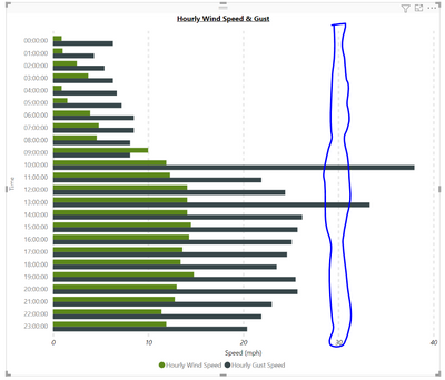
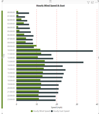
I have created a weather dashboard to look at wind speed and gust speed over a period of 24 hours using API informaiton from VisualCrossing.
I am trying to customise the line and clustered colum table to that when a result of over 30 is shown on the table by wind gust, this line would turn red (currently black) OR the scale line of the graph would turn red/different colour (circled in blue).
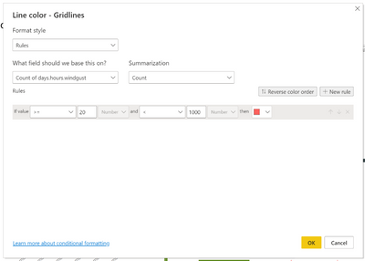
I have attempted conditional formatting on the vertical line however it just ends up changing all the lines in the graph similar to the one circuled. It also doesnt allow me to change the SUM/Count of the wind gust data. Is this because it is coming from a "live" source?
Any help would be greatly appreciated.
L
- Mark as New
- Bookmark
- Subscribe
- Mute
- Subscribe to RSS Feed
- Permalink
- Report Inappropriate Content
Hi @lcairney
Unfortunately for some reason when you add more than 1 value to the bar and column charts, you no longer have the ability to apply conditional formatting.
There may be some 3rd pary visual that does what you want but I'm not aware of any.
Regards
Phil
Did I answer your question? Then please mark my post as the solution.
If I helped you, click on the Thumbs Up to give Kudos.
Blog :: YouTube Channel :: Connect on Linkedin
Proud to be a Super User!
- Mark as New
- Bookmark
- Subscribe
- Mute
- Subscribe to RSS Feed
- Permalink
- Report Inappropriate Content
Thanks again for the information Phil.
If there is anyone who knows of a third party app that can do this, please let me know.
Many Thanks
Liam
- Mark as New
- Bookmark
- Subscribe
- Mute
- Subscribe to RSS Feed
- Permalink
- Report Inappropriate Content
Hi @lcairney
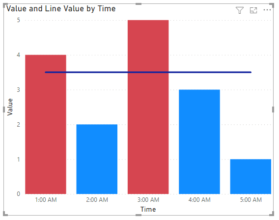
I'm a bit confused as you mention a Column chart but your image is of a bar chart. There isn't a built-in clustered bar and line in PBI so you'll need to use a clustered column and line.
Theres no way to format the color of the line in such a chart though. But you can format the color of the bars
Regards
Phil
Did I answer your question? Then please mark my post as the solution.
If I helped you, click on the Thumbs Up to give Kudos.
Blog :: YouTube Channel :: Connect on Linkedin
Proud to be a Super User!
- Mark as New
- Bookmark
- Subscribe
- Mute
- Subscribe to RSS Feed
- Permalink
- Report Inappropriate Content
Hi Phil,
Thanks for your help.
Unfortunately, this solution does not work. I am using a clustered bar chart so apologies for the miscommunication.
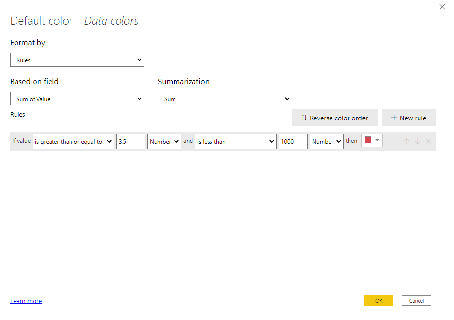
When I look to format the chart, there is no function button and instead I have the format button up top. However, when I look to apply the same function as you have shown, it does not change the colour of the bars nor the gridlines. Either it changes all the gridlines or none of the gridlines which is not what I wish to happen.
Any additonal help would be greatly appreciated.
Many Thanks,
L
Helpful resources

FabCon Global Hackathon
Join the Fabric FabCon Global Hackathon—running virtually through Nov 3. Open to all skill levels. $10,000 in prizes!

Power BI Monthly Update - September 2025
Check out the September 2025 Power BI update to learn about new features.

