FabCon is coming to Atlanta
Join us at FabCon Atlanta from March 16 - 20, 2026, for the ultimate Fabric, Power BI, AI and SQL community-led event. Save $200 with code FABCOMM.
Register now!- Power BI forums
- Get Help with Power BI
- Desktop
- Service
- Report Server
- Power Query
- Mobile Apps
- Developer
- DAX Commands and Tips
- Custom Visuals Development Discussion
- Health and Life Sciences
- Power BI Spanish forums
- Translated Spanish Desktop
- Training and Consulting
- Instructor Led Training
- Dashboard in a Day for Women, by Women
- Galleries
- Data Stories Gallery
- Themes Gallery
- Contests Gallery
- QuickViz Gallery
- Quick Measures Gallery
- Visual Calculations Gallery
- Notebook Gallery
- Translytical Task Flow Gallery
- TMDL Gallery
- R Script Showcase
- Webinars and Video Gallery
- Ideas
- Custom Visuals Ideas (read-only)
- Issues
- Issues
- Events
- Upcoming Events
The Power BI Data Visualization World Championships is back! Get ahead of the game and start preparing now! Learn more
- Power BI forums
- Forums
- Get Help with Power BI
- Desktop
- Re: Customer cohort analysis
- Subscribe to RSS Feed
- Mark Topic as New
- Mark Topic as Read
- Float this Topic for Current User
- Bookmark
- Subscribe
- Printer Friendly Page
- Mark as New
- Bookmark
- Subscribe
- Mute
- Subscribe to RSS Feed
- Permalink
- Report Inappropriate Content
Customer cohort analysis
I have a challenge I cannot wrap my head around properly.
I have a pretty common ecommerce/ordersystem database with customers, orders, and orderitems tables in it.
A customer has a created_at datefield. The order table has a delivery date and items are related to the order. (and I have a datetable that is related to the order/delivery_date field)
I would like to make a cohort analysis similar to this mockup:
I need to make a cohort churn analysis where I count the actual customers that signed up in a isoweek, and the percentage of the same customers that continues ordering the consequent weeks. Not neccessary like the mockup, but maybe like x customers signed up in 2016 week 34, 80% of theese still ordered in week 35, 65% in week 36 etc. For Week 35 we start the same series of calculation for customers that signed up in that week etc.
Anyone have a suggestion on how to solve this?
Solved! Go to Solution.
- Mark as New
- Bookmark
- Subscribe
- Mute
- Subscribe to RSS Feed
- Permalink
- Report Inappropriate Content
Hi @thoberre,
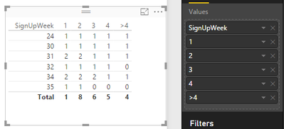
In PowerBI, it seems that we can not create a visual exactly the same as the structure of the mockup you post to show the cohort analysis. But you can try the following workaround to make a customer cohort analysis.
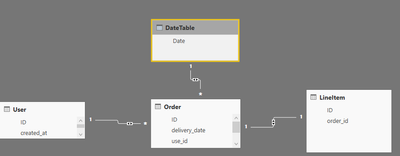
The relationships between these tables are like below:
Then, in User table, create some calculated columns and measures, please refer to the below formulas.
Calculated columns:
SignUpWeek = WEEKNUM(User[created_at])

Diff = [LastOrderWeek]-User[SignUpWeek]

Week1 = IF(User[Diff]>=1,1,0)
Week2 = IF(User[Diff]>=2,1,0)
Week3 = IF(User[Diff]>=3,1,0)
Week4 = IF(User[Diff]>=4,1,0)
Measures:
LastOrderWeek = WEEKNUM(MAX('Order'[delivery_date]))

1 =
    CALCULATE (
        COUNTA ( User[ID] ),
        FILTER (
            ALL ( User ),
            ( WEEKNUM ( User[created_at] ) = WEEKNUM ( MAX ( User[created_at] ) ) )
        )
    )
2 = SUM(User[Week1])
3 = SUM(User[Week2])
4 = SUM(User[Week3])
>4 = SUM(User[Week4])
Insert a table visual, drag relative columns to it.
If you have any question, please feel free to ask.
Best regards,
Yuliana Gu
If this post helps, then please consider Accept it as the solution to help the other members find it more quickly.
- Mark as New
- Bookmark
- Subscribe
- Mute
- Subscribe to RSS Feed
- Permalink
- Report Inappropriate Content
hi, i have a similar problem like this but i cannot figure out how to solve it.
can someone help?
- Mark as New
- Bookmark
- Subscribe
- Mute
- Subscribe to RSS Feed
- Permalink
- Report Inappropriate Content
I think the solution is not correct I have the same concept but the results are wrong, please revise.
- Mark as New
- Bookmark
- Subscribe
- Mute
- Subscribe to RSS Feed
- Permalink
- Report Inappropriate Content
Hi Please go threw with the below link
http://community.powerbi.com/t5/Desktop/Cohort-Analysis/m-p/10217#M2088
Thanks
Abhi
Helpful resources

Power BI Dataviz World Championships
The Power BI Data Visualization World Championships is back! Get ahead of the game and start preparing now!

| User | Count |
|---|---|
| 37 | |
| 37 | |
| 33 | |
| 32 | |
| 29 |
| User | Count |
|---|---|
| 130 | |
| 88 | |
| 82 | |
| 68 | |
| 64 |


