Fabric Data Days starts November 4th!
Advance your Data & AI career with 50 days of live learning, dataviz contests, hands-on challenges, study groups & certifications and more!
Get registered- Power BI forums
- Get Help with Power BI
- Desktop
- Service
- Report Server
- Power Query
- Mobile Apps
- Developer
- DAX Commands and Tips
- Custom Visuals Development Discussion
- Health and Life Sciences
- Power BI Spanish forums
- Translated Spanish Desktop
- Training and Consulting
- Instructor Led Training
- Dashboard in a Day for Women, by Women
- Galleries
- Data Stories Gallery
- Themes Gallery
- Contests Gallery
- QuickViz Gallery
- Quick Measures Gallery
- Visual Calculations Gallery
- Notebook Gallery
- Translytical Task Flow Gallery
- TMDL Gallery
- R Script Showcase
- Webinars and Video Gallery
- Ideas
- Custom Visuals Ideas (read-only)
- Issues
- Issues
- Events
- Upcoming Events
Get Fabric Certified for FREE during Fabric Data Days. Don't miss your chance! Request now
- Power BI forums
- Forums
- Get Help with Power BI
- Desktop
- Custom line chart with background shading differen...
- Subscribe to RSS Feed
- Mark Topic as New
- Mark Topic as Read
- Float this Topic for Current User
- Bookmark
- Subscribe
- Printer Friendly Page
- Mark as New
- Bookmark
- Subscribe
- Mute
- Subscribe to RSS Feed
- Permalink
- Report Inappropriate Content
Custom line chart with background shading differentiating last year vs this year
Hi All,
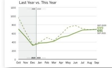
I have a requirement to compare last year data with current year data with a line chart and show the differentiation using background color shading. For ex, all the months in the last year 2020 should have a background shading with one color and current year 2021 with a different color shading. Sample attached. If exactly the same is not possible then, any other closeby ideas also appreciated.
Thanks
Raj
- Mark as New
- Bookmark
- Subscribe
- Mute
- Subscribe to RSS Feed
- Permalink
- Report Inappropriate Content
Hello,
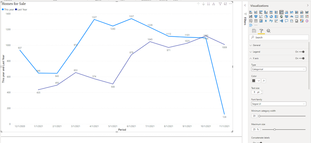
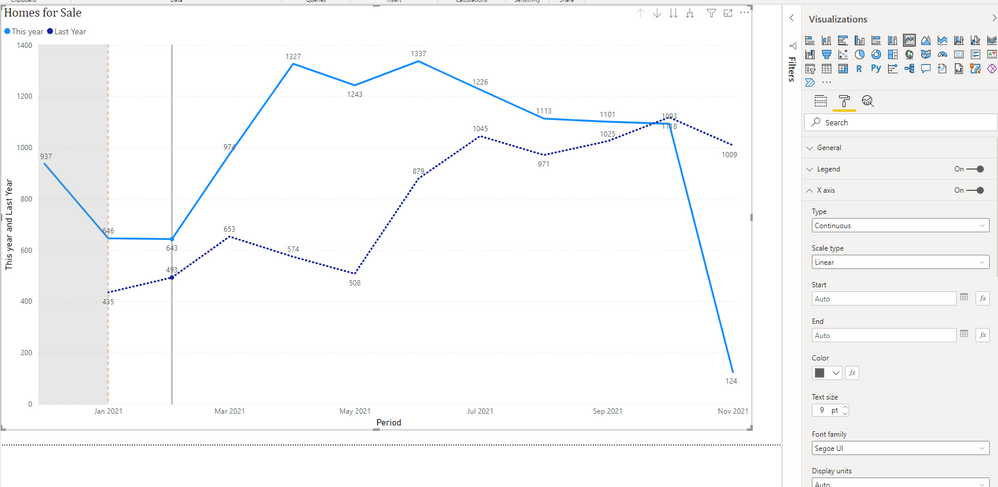
Thanks for your reply. I have tried the X-Axis Constant line and I got the background shade for the last year. I am looking for 2 lines with the current year and last year but I am missing all month's information on X-Axis. I have attached the latest screenshots.
When I apply Type Continuous, I am able to see the background and missing Feb 2021 on X-Axis.
When I apply Type Categorical, I am able to see All month's information but not the background.
Please let me know if I missing anything here.
Thanks,
Rajesh
- Mark as New
- Bookmark
- Subscribe
- Mute
- Subscribe to RSS Feed
- Permalink
- Report Inappropriate Content
Howdy, I'm please it worked 🙂
That is expected behaviour for continuous axes, as they are continuous, there is no need to plot all values, especially if it is a measure that can be split into fractions.
Data: Continuous vs. Categorical (eagereyes.org)
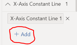
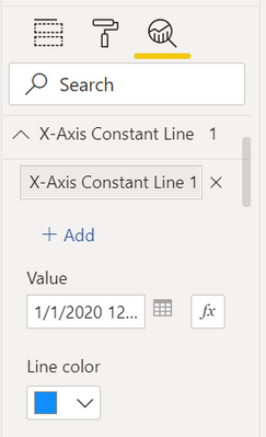
You should be able to add a second constant line on a continuous axis:
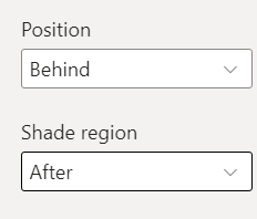
and then add shade after
Did I answer your question? Mark my post as a solution!
Proud to be a Super User!
- Mark as New
- Bookmark
- Subscribe
- Mute
- Subscribe to RSS Feed
- Permalink
- Report Inappropriate Content
Hello,
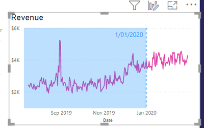
You can do this with the X-Axis Constant line:
With the in-built line visual, in the Analytics Pane:
Add a line, set the date hardcoded or using a formula.
Add shading and data label.
Let me know how you go 🙂
Did I answer your question? Mark my post as a solution!
Proud to be a Super User!
Helpful resources

Power BI Monthly Update - November 2025
Check out the November 2025 Power BI update to learn about new features.

Fabric Data Days
Advance your Data & AI career with 50 days of live learning, contests, hands-on challenges, study groups & certifications and more!

| User | Count |
|---|---|
| 98 | |
| 72 | |
| 50 | |
| 50 | |
| 43 |
