FabCon is coming to Atlanta
Join us at FabCon Atlanta from March 16 - 20, 2026, for the ultimate Fabric, Power BI, AI and SQL community-led event. Save $200 with code FABCOMM.
Register now!- Power BI forums
- Get Help with Power BI
- Desktop
- Service
- Report Server
- Power Query
- Mobile Apps
- Developer
- DAX Commands and Tips
- Custom Visuals Development Discussion
- Health and Life Sciences
- Power BI Spanish forums
- Translated Spanish Desktop
- Training and Consulting
- Instructor Led Training
- Dashboard in a Day for Women, by Women
- Galleries
- Data Stories Gallery
- Themes Gallery
- Contests Gallery
- QuickViz Gallery
- Quick Measures Gallery
- Visual Calculations Gallery
- Notebook Gallery
- Translytical Task Flow Gallery
- TMDL Gallery
- R Script Showcase
- Webinars and Video Gallery
- Ideas
- Custom Visuals Ideas (read-only)
- Issues
- Issues
- Events
- Upcoming Events
Learn from the best! Meet the four finalists headed to the FINALS of the Power BI Dataviz World Championships! Register now
- Power BI forums
- Forums
- Get Help with Power BI
- Desktop
- Re: Custom X-axis
- Subscribe to RSS Feed
- Mark Topic as New
- Mark Topic as Read
- Float this Topic for Current User
- Bookmark
- Subscribe
- Printer Friendly Page
- Mark as New
- Bookmark
- Subscribe
- Mute
- Subscribe to RSS Feed
- Permalink
- Report Inappropriate Content
Custom X-axis
Hello,
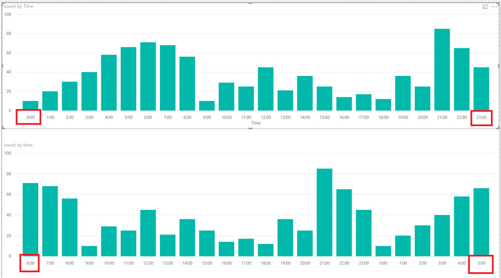
I have a bar chart, with daily count as bars and hours on x-axis, by default x-axis starts at 12:00am to 11:00pm but I want to start from 6:00am to 5:00am
Is it possible to do that
Current x-axis:
12:00 -- 1:00 -- 2:00 -- 3:00 ------ -----------------------11:00
Want
6:00 -- 7:00 -- 8:00 -----------------------------------------5:00
Solved! Go to Solution.
- Mark as New
- Bookmark
- Subscribe
- Mute
- Subscribe to RSS Feed
- Permalink
- Report Inappropriate Content
Hi @Anonymous,
You could create another table like below.
time Index
| 6:00 | 1 |
| 7:00 | 2 |
| 8:00 | 3 |
| 9:00 | 4 |
| 10:00 | 5 |
| 11:00 | 6 |
| 12:00 | 7 |
| 13:00 | 8 |
| 14:00 | 9 |
| 15:00 | 10 |
| 16:00 | 11 |
| 17:00 | 12 |
| 18:00 | 13 |
| 19:00 | 14 |
| 20:00 | 15 |
| 21:00 | 16 |
| 22:00 | 17 |
| 23:00 | 18 |
| 0:00 | 19 |
| 1:00 | 20 |
| 2:00 | 21 |
| 3:00 | 22 |
| 4:00 | 23 |
| 5:00 | 24 |
Then create the relationship between the two tables and go to data view, click time column>>sort by column>>select index like below.
Here is the output.
More details, you could refer to the attachment.
Best Regards,
Cherry
If this post helps, then please consider Accept it as the solution to help the other members find it more quickly.
- Mark as New
- Bookmark
- Subscribe
- Mute
- Subscribe to RSS Feed
- Permalink
- Report Inappropriate Content
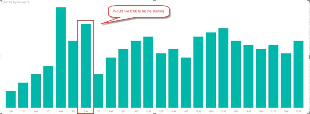
I just wanted to add a graphical representation of what I'm trying to do.
- Mark as New
- Bookmark
- Subscribe
- Mute
- Subscribe to RSS Feed
- Permalink
- Report Inappropriate Content
I just wanted to add a graphical representation of what I'm trying to do.
Helpful resources

Join our Fabric User Panel
Share feedback directly with Fabric product managers, participate in targeted research studies and influence the Fabric roadmap.

Power BI Monthly Update - February 2026
Check out the February 2026 Power BI update to learn about new features.

| User | Count |
|---|---|
| 66 | |
| 60 | |
| 45 | |
| 19 | |
| 15 |
| User | Count |
|---|---|
| 108 | |
| 108 | |
| 41 | |
| 30 | |
| 27 |


