FabCon is coming to Atlanta
Join us at FabCon Atlanta from March 16 - 20, 2026, for the ultimate Fabric, Power BI, AI and SQL community-led event. Save $200 with code FABCOMM.
Register now!- Power BI forums
- Get Help with Power BI
- Desktop
- Service
- Report Server
- Power Query
- Mobile Apps
- Developer
- DAX Commands and Tips
- Custom Visuals Development Discussion
- Health and Life Sciences
- Power BI Spanish forums
- Translated Spanish Desktop
- Training and Consulting
- Instructor Led Training
- Dashboard in a Day for Women, by Women
- Galleries
- Data Stories Gallery
- Themes Gallery
- Contests Gallery
- QuickViz Gallery
- Quick Measures Gallery
- Visual Calculations Gallery
- Notebook Gallery
- Translytical Task Flow Gallery
- TMDL Gallery
- R Script Showcase
- Webinars and Video Gallery
- Ideas
- Custom Visuals Ideas (read-only)
- Issues
- Issues
- Events
- Upcoming Events
Get Fabric Certified for FREE during Fabric Data Days. Don't miss your chance! Request now
- Power BI forums
- Forums
- Get Help with Power BI
- Desktop
- Re: Curve are not smooth
- Subscribe to RSS Feed
- Mark Topic as New
- Mark Topic as Read
- Float this Topic for Current User
- Bookmark
- Subscribe
- Printer Friendly Page
- Mark as New
- Bookmark
- Subscribe
- Mute
- Subscribe to RSS Feed
- Permalink
- Report Inappropriate Content
Curve are not smooth
Same Data Same Graph, Different Visualization.
But in the first graph lines are not smooth and round curves.
I want smooth curves lines.
Solved! Go to Solution.
- Mark as New
- Bookmark
- Subscribe
- Mute
- Subscribe to RSS Feed
- Permalink
- Report Inappropriate Content
Download custom visual "Power KPI" and in formatting set line type to monotous.
Below is screenshot: left image classic line chart, right image Power KPI chart.
* Note: i am not sure if you will be able to display same x axis value (in my example year-month), as i think it will always display kpi value so i hidden x axis.
- Mark as New
- Bookmark
- Subscribe
- Mute
- Subscribe to RSS Feed
- Permalink
- Report Inappropriate Content
Hello @nabeelmukhtar and @nandic
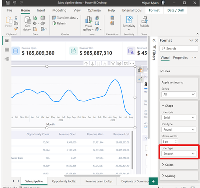
You may be aware of this, but from the july 2023 release smooth lines are available.
See release note :
Release note july 2023
or the snippet from the release note below to see how you can change line type to smooth:
Kind regards!
If this solved your problem, consider marking this answer as a solution.
- Mark as New
- Bookmark
- Subscribe
- Mute
- Subscribe to RSS Feed
- Permalink
- Report Inappropriate Content
Think of it this way. When you have a bar in the top chart it starts exactly at one point of line. So if the line is smoothly curved on the bar that means at some point on the bar it will represent that it was bit low or bit high and increases or decreases gradually.
But, Where ever that bar starts after the previous bar ends, the line chart data suddenly chages to some x value.
So, you and I will understand, the person using looking at the chart will not and perceive it in a wrong way, To correctly represent the data and bar together the top chart looks like it should.
Did I resolve your issue? Mark my post as a solution!
Appreciate your Kudos, Press the thumbs up button!!
Regards,
Pranit
- Mark as New
- Bookmark
- Subscribe
- Mute
- Subscribe to RSS Feed
- Permalink
- Report Inappropriate Content
Actually both of the graphs are the same with the same data. the only difference is visuals are different. Also, these graphs are also working well but suddenly it shows like corner edges.
- Mark as New
- Bookmark
- Subscribe
- Mute
- Subscribe to RSS Feed
- Permalink
- Report Inappropriate Content
Download custom visual "Power KPI" and in formatting set line type to monotous.
Below is screenshot: left image classic line chart, right image Power KPI chart.
* Note: i am not sure if you will be able to display same x axis value (in my example year-month), as i think it will always display kpi value so i hidden x axis.
Helpful resources

Power BI Monthly Update - November 2025
Check out the November 2025 Power BI update to learn about new features.

Fabric Data Days
Advance your Data & AI career with 50 days of live learning, contests, hands-on challenges, study groups & certifications and more!


