Join us at the 2025 Microsoft Fabric Community Conference
March 31 - April 2, 2025, in Las Vegas, Nevada. Use code MSCUST for a $150 discount! Early bird discount ends December 31.
Register Now- Power BI forums
- Get Help with Power BI
- Desktop
- Service
- Report Server
- Power Query
- Mobile Apps
- Developer
- DAX Commands and Tips
- Custom Visuals Development Discussion
- Health and Life Sciences
- Power BI Spanish forums
- Translated Spanish Desktop
- Training and Consulting
- Instructor Led Training
- Dashboard in a Day for Women, by Women
- Galleries
- Community Connections & How-To Videos
- COVID-19 Data Stories Gallery
- Themes Gallery
- Data Stories Gallery
- R Script Showcase
- Webinars and Video Gallery
- Quick Measures Gallery
- 2021 MSBizAppsSummit Gallery
- 2020 MSBizAppsSummit Gallery
- 2019 MSBizAppsSummit Gallery
- Events
- Ideas
- Custom Visuals Ideas
- Issues
- Issues
- Events
- Upcoming Events
Be one of the first to start using Fabric Databases. View on-demand sessions with database experts and the Microsoft product team to learn just how easy it is to get started. Watch now
- Power BI forums
- Forums
- Get Help with Power BI
- Desktop
- Cumulative total of day categories (Dax measure an...
- Subscribe to RSS Feed
- Mark Topic as New
- Mark Topic as Read
- Float this Topic for Current User
- Bookmark
- Subscribe
- Printer Friendly Page
- Mark as New
- Bookmark
- Subscribe
- Mute
- Subscribe to RSS Feed
- Permalink
- Report Inappropriate Content
Cumulative total of day categories (Dax measure and Calculated column)
I am trying to create a bar graph that along the x axis we have the categories: 5 days +. 6 days +, 7 days +, 8 days +, 9 days +, 10+ days.
Along the Y axis we have Count of repairs.
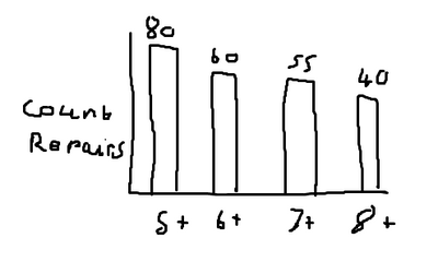
The purpose is to show how many repairs at each stage there are. This should be cumulative so the first category should always be the tallest bar. For example (apologies for the crude drawing):
all repairs in 6+ should also be counted in 5+, because they have also been in repair more than 5 days.
Currently I have:
[Count of Repairs]
'table'[Days in repair] (this is the number of days the job has been in repair.
How do i create a measure/columns to give me a group that sorts my repairs into categories (5days+,6days+ etc) and how do I write a measure to group my repairs cumulatively?
Thanks so much for any help.
Solved! Go to Solution.
- Mark as New
- Bookmark
- Subscribe
- Mute
- Subscribe to RSS Feed
- Permalink
- Report Inappropriate Content
Hi @Anonymous ,
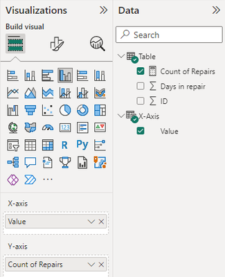
Based on your description, I have created a simple sample:
Please try:
First create a new table for x-axis:
X-Axis = {"5+","6+","7+","8+"}Then apply the measure to the column visual:
Count of Repairs =
var _a = VALUE(LEFT(MAX('X-Axis'[Value]),LEN(MAX('X-Axis'[Value])-1)))
return CALCULATE(DISTINCTCOUNT('Table'[ID]),FILTER('Table',[Days in repair]>_a))
Final output:
Best Regards,
Jianbo Li
If this post helps, then please consider Accept it as the solution to help the other members find it more quickly.
- Mark as New
- Bookmark
- Subscribe
- Mute
- Subscribe to RSS Feed
- Permalink
- Report Inappropriate Content
Hi,
I am not sure how much i can help but i would like to try. Share the download link of the PBI file. Only keep tables/columns there which are necessary to solve this question. Remove all irrelevant tables/columns.
Regards,
Ashish Mathur
http://www.ashishmathur.com
https://www.linkedin.com/in/excelenthusiasts/
- Mark as New
- Bookmark
- Subscribe
- Mute
- Subscribe to RSS Feed
- Permalink
- Report Inappropriate Content
Hi @Anonymous ,
Based on your description, I have created a simple sample:
Please try:
First create a new table for x-axis:
X-Axis = {"5+","6+","7+","8+"}Then apply the measure to the column visual:
Count of Repairs =
var _a = VALUE(LEFT(MAX('X-Axis'[Value]),LEN(MAX('X-Axis'[Value])-1)))
return CALCULATE(DISTINCTCOUNT('Table'[ID]),FILTER('Table',[Days in repair]>_a))
Final output:
Best Regards,
Jianbo Li
If this post helps, then please consider Accept it as the solution to help the other members find it more quickly.
- Mark as New
- Bookmark
- Subscribe
- Mute
- Subscribe to RSS Feed
- Permalink
- Report Inappropriate Content
Amazing, works like a charm, thank you so much!
Helpful resources

Join us at the Microsoft Fabric Community Conference
March 31 - April 2, 2025, in Las Vegas, Nevada. Use code MSCUST for a $150 discount!

Microsoft Fabric Community Conference 2025
Arun Ulag shares exciting details about the Microsoft Fabric Conference 2025, which will be held in Las Vegas, NV.

| User | Count |
|---|---|
| 114 | |
| 76 | |
| 57 | |
| 52 | |
| 44 |
| User | Count |
|---|---|
| 168 | |
| 116 | |
| 63 | |
| 57 | |
| 50 |


