Become a Certified Power BI Data Analyst!
Join us for an expert-led overview of the tools and concepts you'll need to pass exam PL-300. The first session starts on June 11th. See you there!
Get registered- Power BI forums
- Get Help with Power BI
- Desktop
- Service
- Report Server
- Power Query
- Mobile Apps
- Developer
- DAX Commands and Tips
- Custom Visuals Development Discussion
- Health and Life Sciences
- Power BI Spanish forums
- Translated Spanish Desktop
- Training and Consulting
- Instructor Led Training
- Dashboard in a Day for Women, by Women
- Galleries
- Webinars and Video Gallery
- Data Stories Gallery
- Themes Gallery
- Contests Gallery
- Quick Measures Gallery
- Notebook Gallery
- Translytical Task Flow Gallery
- R Script Showcase
- Ideas
- Custom Visuals Ideas (read-only)
- Issues
- Issues
- Events
- Upcoming Events
Power BI is turning 10! Let’s celebrate together with dataviz contests, interactive sessions, and giveaways. Register now.
- Power BI forums
- Forums
- Get Help with Power BI
- Desktop
- Re: Cumulative total in stacked bar graph
- Subscribe to RSS Feed
- Mark Topic as New
- Mark Topic as Read
- Float this Topic for Current User
- Bookmark
- Subscribe
- Printer Friendly Page
- Mark as New
- Bookmark
- Subscribe
- Mute
- Subscribe to RSS Feed
- Permalink
- Report Inappropriate Content
Cumulative total in stacked bar graph
Hi everyone, I am quite new to Power BI.
I'm trying to present a graph that adds the cumulative total of a column over each month. The data set is from April 2020 to March 2021.
I have used the following Measure to calculate the running total:

However, I would like to split this by category in a stacked bar graph. Whenever I try and add a data field in the legend, it doesn't seem to be splitting up the allocations correctly:

This second graph should ideally show the same total values as the first one, only split by status, ideally looking something like this:

Any help would be appreciated, thank you!
Solved! Go to Solution.
- Mark as New
- Bookmark
- Subscribe
- Mute
- Subscribe to RSS Feed
- Permalink
- Report Inappropriate Content
Hi @Anonymous ,
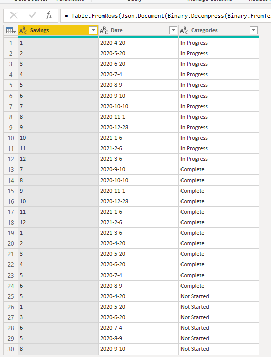
Here is my sample data.
1. Create three calculated columns to sort the months of the chart by year.
Month = MONTH([Date])

Year = YEAR([Date])

Year-Month = [Year]&"-"&[Month]
2. You can write your measure as below. I changed ALLSELECTED to ALLEXCEPT.
Running Total MEASURE =
CALCULATE (
    SUM ( 'Data'[Savings] ),
    FILTER (
        ALLEXCEPT ( Data, Data[Categories] ),
        Data[Date] <= MAX ( Data[Date] )
    )
)
You can check more details from here.
Best Regards,
Icey
If this post helps, then please consider Accept it as the solution to help the other members find it more quickly.
- Mark as New
- Bookmark
- Subscribe
- Mute
- Subscribe to RSS Feed
- Permalink
- Report Inappropriate Content
@Icey
That was smart !
Another alternative will be
Running Total MEASURE =
CALCULATE (
    SUM ( 'Data'[Savings] ),
    FILTER (
        ALL(Data[Date],Data[Year-Month]),
        Data[Date] <= MAX ( Data[Date] )
    )
)
Thanks
Fowmy
⭕ Subscribe and learn Power BI from these videos
⚪ Website ⚪ LinkedIn ⚪ PBI User Group
- Mark as New
- Bookmark
- Subscribe
- Mute
- Subscribe to RSS Feed
- Permalink
- Report Inappropriate Content
@Anonymous
Each category will have its own data and will not allocate into anything. insert a slicer for the category, select each and check it works when the graph has only one. It stacks one on top of the other. Change the graph to line or area chart to what you are expecting.
________________________
Did I answer your question? Mark this post as a solution, this will help others!.
Click on the Thumbs-Up icon on the right if you like this reply 🙂
⭕ Subscribe and learn Power BI from these videos
⚪ Website ⚪ LinkedIn ⚪ PBI User Group
- Mark as New
- Bookmark
- Subscribe
- Mute
- Subscribe to RSS Feed
- Permalink
- Report Inappropriate Content
@Anonymous , Create a date table and join date with date and try like
Running Total MEASURE = CALCULATE (SUM ( 'Data'[Savings] ), FILTER (ALLSELECTED( 'Date' ), Date[Date] <= MAX(Date[Date])))
To get the best of the time intelligence function. Make sure you have a date calendar and it has been marked as the date in model view. Also, join it with the date column of your fact/s. Refer :
https://radacad.com/creating-calendar-table-in-power-bi-using-dax-functions
https://www.archerpoint.com/blog/Posts/creating-date-table-power-bi
https://www.sqlbi.com/articles/creating-a-simple-date-table-in-dax/
See if my webinar on Time Intelligence can help: https://community.powerbi.com/t5/Webinars-and-Video-Gallery/PowerBI-Time-Intelligence-Calendar-WTD-YTD-LYTD-Week-Over-Week/m-p/1051626#M184
Appreciate your Kudos.
Helpful resources
| User | Count |
|---|---|
| 84 | |
| 79 | |
| 71 | |
| 48 | |
| 43 |
| User | Count |
|---|---|
| 111 | |
| 54 | |
| 50 | |
| 40 | |
| 40 |


