FabCon is coming to Atlanta
Join us at FabCon Atlanta from March 16 - 20, 2026, for the ultimate Fabric, Power BI, AI and SQL community-led event. Save $200 with code FABCOMM.
Register now!- Power BI forums
- Get Help with Power BI
- Desktop
- Service
- Report Server
- Power Query
- Mobile Apps
- Developer
- DAX Commands and Tips
- Custom Visuals Development Discussion
- Health and Life Sciences
- Power BI Spanish forums
- Translated Spanish Desktop
- Training and Consulting
- Instructor Led Training
- Dashboard in a Day for Women, by Women
- Galleries
- Data Stories Gallery
- Themes Gallery
- Contests Gallery
- QuickViz Gallery
- Quick Measures Gallery
- Visual Calculations Gallery
- Notebook Gallery
- Translytical Task Flow Gallery
- TMDL Gallery
- R Script Showcase
- Webinars and Video Gallery
- Ideas
- Custom Visuals Ideas (read-only)
- Issues
- Issues
- Events
- Upcoming Events
The Power BI Data Visualization World Championships is back! Get ahead of the game and start preparing now! Learn more
- Power BI forums
- Forums
- Get Help with Power BI
- Desktop
- Cumulative line chart
- Subscribe to RSS Feed
- Mark Topic as New
- Mark Topic as Read
- Float this Topic for Current User
- Bookmark
- Subscribe
- Printer Friendly Page
- Mark as New
- Bookmark
- Subscribe
- Mute
- Subscribe to RSS Feed
- Permalink
- Report Inappropriate Content
Cumulative line chart
Hi all,
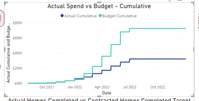
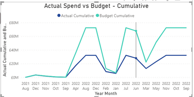
I've having issues with this measure. The line chart is cumulative for some months but not for others. Here's what I've got.
Actual Cumulative = CALCULATE(SUM(InvoiceDetails[Total LAD Funding]),FILTER(ALL('Date'),'Date'[Date]<=MAX(InvoiceDetails[Month invoiced])))
Budget Cumulative = CALCULATE(SUM(Spendperlot[Total]),FILTER(ALL('Date'),'Date'[Date]<=MAX(InvoiceDetails[Month invoiced])))
The figures are contained in separate tables and should include all of the values in those tables.
Chart looks like this.
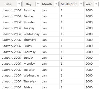
I've set up a date table following this guide https://docs.microsoft.com/en-us/power-bi/guidance/model-date-tables and looks like this for example:
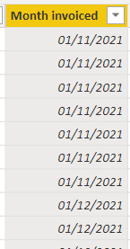
Data in the Month Invoiced table looks like this
There is a relationship with "month invoiced" and "Date" so it works perfectly if i wasn't trying to make a cumulative line chart.
Has any one got ideas to why this isn't working properly?
- Mark as New
- Bookmark
- Subscribe
- Mute
- Subscribe to RSS Feed
- Permalink
- Report Inappropriate Content
@mwinds , You should date/period from date table on axis and measure should be like
Budget Cumulative =
var _max = maxx(allselected(InvoiceDetails) , InvoiceDetails[Month invoiced])
return
CALCULATE(SUM(Spendperlot[Total]),FILTER(ALL('Date'),'Date'[Date]<=MAX('Date'[Date]) && 'Date'[Date]<= _max ))
- Mark as New
- Bookmark
- Subscribe
- Mute
- Subscribe to RSS Feed
- Permalink
- Report Inappropriate Content
Hey,
Thanks for the reply.
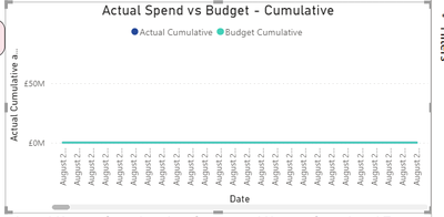
The chart looks like this now if i chose catergorical in the x-axis type
or like this if i choose continuous in the x-axis type.
Any way i can get it to show every month and for the line to go up gradually rather than in chunks.
If i choose to add Month name and year in the x-axis, sort by month and drill down, i get this. Not too sure what's going on here.
File is here https://drive.google.com/file/d/1yXye3LVBp-ZA3Bz31-9_notHQXTaPTQh/view?usp=sharing
- Mark as New
- Bookmark
- Subscribe
- Mute
- Subscribe to RSS Feed
- Permalink
- Report Inappropriate Content
@mwinds , You should date/period from date table on axis and measure should be like
Budget Cumulative =
var _max = maxx(allselected(InvoiceDetails) , InvoiceDetails[Month invoiced])
return
CALCULATE(SUM(Spendperlot[Total]),FILTER(ALL('Date'),'Date'[Date]<=MAX('Date'[Date]) && 'Date'[Date]<= _max ))
Helpful resources

Power BI Dataviz World Championships
The Power BI Data Visualization World Championships is back! Get ahead of the game and start preparing now!

| User | Count |
|---|---|
| 39 | |
| 37 | |
| 33 | |
| 32 | |
| 29 |
| User | Count |
|---|---|
| 132 | |
| 88 | |
| 82 | |
| 68 | |
| 64 |

