FabCon is coming to Atlanta
Join us at FabCon Atlanta from March 16 - 20, 2026, for the ultimate Fabric, Power BI, AI and SQL community-led event. Save $200 with code FABCOMM.
Register now!- Power BI forums
- Get Help with Power BI
- Desktop
- Service
- Report Server
- Power Query
- Mobile Apps
- Developer
- DAX Commands and Tips
- Custom Visuals Development Discussion
- Health and Life Sciences
- Power BI Spanish forums
- Translated Spanish Desktop
- Training and Consulting
- Instructor Led Training
- Dashboard in a Day for Women, by Women
- Galleries
- Data Stories Gallery
- Themes Gallery
- Contests Gallery
- QuickViz Gallery
- Quick Measures Gallery
- Visual Calculations Gallery
- Notebook Gallery
- Translytical Task Flow Gallery
- TMDL Gallery
- R Script Showcase
- Webinars and Video Gallery
- Ideas
- Custom Visuals Ideas (read-only)
- Issues
- Issues
- Events
- Upcoming Events
The Power BI Data Visualization World Championships is back! Get ahead of the game and start preparing now! Learn more
- Power BI forums
- Forums
- Get Help with Power BI
- Desktop
- Re: Cumulative items
- Subscribe to RSS Feed
- Mark Topic as New
- Mark Topic as Read
- Float this Topic for Current User
- Bookmark
- Subscribe
- Printer Friendly Page
- Mark as New
- Bookmark
- Subscribe
- Mute
- Subscribe to RSS Feed
- Permalink
- Report Inappropriate Content
Cumulative items
Hi,
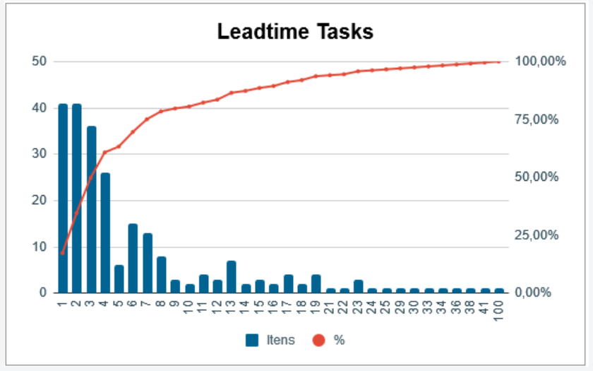
I need to do a histogram with 3 values:
Axis X = Leadtime
Axis Y = Number of itens with the leadtime showed
Axis Y(2) = Percentage of itens on leadtime
I count how many items are in leadtime 1, 2, 3, 4.....
But now i need to trace a line with percent to know how many items i delivery with 80% sure in leadtime.
To do this count i have to do something like this:
| Days | Items | Cumulative | % |
| 1 | 2 | 2 | 25% |
| 2 | 3 | 5 | 63% |
| 3 | 2 | 7 | 88% |
| 4 | 1 | 8 | 100% |
Cumulative/ SUM(Items) = %
I don´t know how to do this cumulative.
I´ve done this:
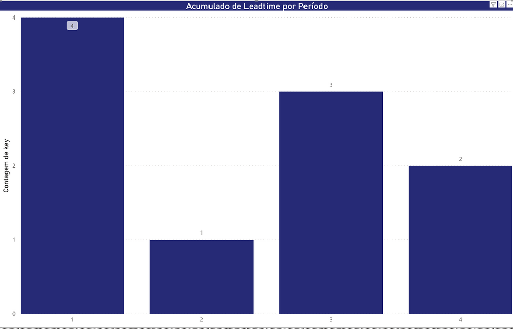
Where Axis X is Leadtime and Axis y is total of items
I need to do this:
Solved! Go to Solution.
- Mark as New
- Bookmark
- Subscribe
- Mute
- Subscribe to RSS Feed
- Permalink
- Report Inappropriate Content
Hi @mgastalho ,
Based on your sample data, we can create two measures to meet your requirement.
Cumulative =
CALCULATE(SUM('Table'[Items]),FILTER(ALLSELECTED('Table'),'Table'[Days]<=MAX('Table'[Days])))
% =
var _cum = CALCULATE(SUM('Table'[Items]),FILTER(ALLSELECTED('Table'),'Table'[Days]<=MAX('Table'[Days])))
var _Total = CALCULATE(SUM('Table'[Items]),ALLSELECTED('Table'))
return
DIVIDE(_cum,_Total)
If it doesn’t meet your requirement, could you please show the exact expected result based on the table that you have shared?
Best regards,
Community Support Team _ zhenbw
If this post helps, then please consider Accept it as the solution to help the other members find it more quickly.
BTW, pbix as attached.
- Mark as New
- Bookmark
- Subscribe
- Mute
- Subscribe to RSS Feed
- Permalink
- Report Inappropriate Content
based on your sample data, you need to create two columns.
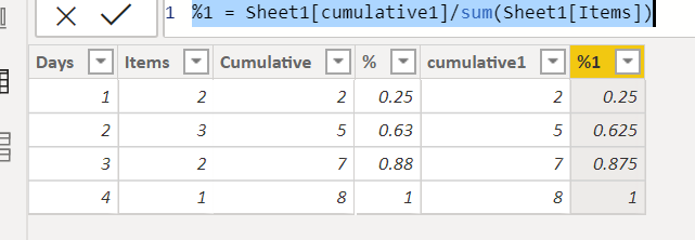
cumulative1 = SUMX(FILTER(Sheet1,Sheet1[Days]<=EARLIER(Sheet1[Days])),Sheet1[Items])

%1 = Sheet1[cumulative1]/sum(Sheet1[Items])
I am not sure if this also works for your real data. please let me know if you have any questions.
Did I answer your question? Mark my post as a solution!
Proud to be a Super User!
- Mark as New
- Bookmark
- Subscribe
- Mute
- Subscribe to RSS Feed
- Permalink
- Report Inappropriate Content
Hi @mgastalho
What you are looking for is pareto chart, once pareto chart is done you will need to conditionally format the color of the days bar to a different color when it is more than equal to 80%.
Check this link, it explain to do the same.
https://www.youtube.com/watch?v=FPckiBv657c
I think you have almost got it, might just be missing just few details.
Helpful resources

Power BI Dataviz World Championships
The Power BI Data Visualization World Championships is back! Get ahead of the game and start preparing now!

| User | Count |
|---|---|
| 38 | |
| 36 | |
| 33 | |
| 32 | |
| 29 |
| User | Count |
|---|---|
| 129 | |
| 88 | |
| 79 | |
| 68 | |
| 63 |


