FabCon is coming to Atlanta
Join us at FabCon Atlanta from March 16 - 20, 2026, for the ultimate Fabric, Power BI, AI and SQL community-led event. Save $200 with code FABCOMM.
Register now!- Power BI forums
- Get Help with Power BI
- Desktop
- Service
- Report Server
- Power Query
- Mobile Apps
- Developer
- DAX Commands and Tips
- Custom Visuals Development Discussion
- Health and Life Sciences
- Power BI Spanish forums
- Translated Spanish Desktop
- Training and Consulting
- Instructor Led Training
- Dashboard in a Day for Women, by Women
- Galleries
- Data Stories Gallery
- Themes Gallery
- Contests Gallery
- Quick Measures Gallery
- Notebook Gallery
- Translytical Task Flow Gallery
- TMDL Gallery
- R Script Showcase
- Webinars and Video Gallery
- Ideas
- Custom Visuals Ideas (read-only)
- Issues
- Issues
- Events
- Upcoming Events
Join the Fabric FabCon Global Hackathon—running virtually through Nov 3. Open to all skill levels. $10,000 in prizes! Register now.
- Power BI forums
- Forums
- Get Help with Power BI
- Desktop
- Cumulative data and Filter
- Subscribe to RSS Feed
- Mark Topic as New
- Mark Topic as Read
- Float this Topic for Current User
- Bookmark
- Subscribe
- Printer Friendly Page
- Mark as New
- Bookmark
- Subscribe
- Mute
- Subscribe to RSS Feed
- Permalink
- Report Inappropriate Content
Cumulative data and Filter
Hi Everyone!
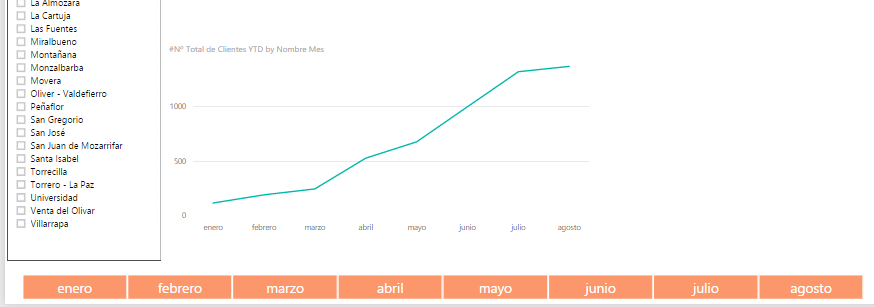
I want to combine cumulative data and a filter of month in a report so that I could show in a graph or table the sum of amount till the month that I filtered.
I mean, if I filter by May I don´t want to see only May, I want to show January, February and May.
There is any way?
Thanks!
Solved! Go to Solution.
- Mark as New
- Bookmark
- Subscribe
- Mute
- Subscribe to RSS Feed
- Permalink
- Report Inappropriate Content
@Anonymous
With the slicer visual, you cannot do it now. There is no way to create a dynamic month column/table according to your selection in the slicer.
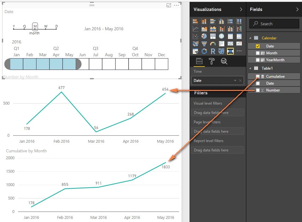
However, you can try to use the Timeline visual. Just drag the progress bar to include January to May.
I create a calendar table and a cumulative measure with following formulas. And create relationship between Calendar and Table1 with Date key.
Calendar =
CALENDAR ( "1/1/2016", "12/31/2016" )
Cumulative =
IF (
    SUM ( Table1[Number] ) <> BLANK (),
    CALCULATE (
        SUM ( Table1[Number] ),
        FILTER ( ALL ( 'Calendar' ), 'Calendar'[Date] <= MAX ( 'Calendar'[Date] ) )
    )
)
Best Regards,
Herbert
- Mark as New
- Bookmark
- Subscribe
- Mute
- Subscribe to RSS Feed
- Permalink
- Report Inappropriate Content


