Get Fabric certified for FREE!
Don't miss your chance to take the Fabric Data Engineer (DP-600) exam for FREE! Find out how by attending the DP-600 session on April 23rd (pacific time), live or on-demand.
Learn more- Power BI forums
- Get Help with Power BI
- Desktop
- Service
- Report Server
- Power Query
- Mobile Apps
- Developer
- DAX Commands and Tips
- Custom Visuals Development Discussion
- Health and Life Sciences
- Power BI Spanish forums
- Translated Spanish Desktop
- Training and Consulting
- Instructor Led Training
- Dashboard in a Day for Women, by Women
- Galleries
- Data Stories Gallery
- Themes Gallery
- Contests Gallery
- QuickViz Gallery
- Quick Measures Gallery
- Visual Calculations Gallery
- Notebook Gallery
- Translytical Task Flow Gallery
- TMDL Gallery
- R Script Showcase
- Webinars and Video Gallery
- Ideas
- Custom Visuals Ideas (read-only)
- Issues
- Issues
- Events
- Upcoming Events
Next up in the FabCon + SQLCon recap series: The roadmap for Microsoft SQL and Maximizing Developer experiences in Fabric. All sessions are available on-demand after the live show. Register now
- Power BI forums
- Forums
- Get Help with Power BI
- Desktop
- Re: Cumulative chart
- Subscribe to RSS Feed
- Mark Topic as New
- Mark Topic as Read
- Float this Topic for Current User
- Bookmark
- Subscribe
- Printer Friendly Page
- Mark as New
- Bookmark
- Subscribe
- Mute
- Subscribe to RSS Feed
- Permalink
- Report Inappropriate Content
Cumulative chart
Hi all,
I am new to PowerBI tool and I just wanted to test it for automation of the standard test that I do normally in Excel.
CURRENT EXCEL SOLUTION
It's quite simple - it's a chart as follows:
Y axis - monetary value
X axis - month.year (e.g. 12.2018)
values - number of lines on the chart depends on the number of salesmen. For each month.year X, Y equals to this month sales + cumulative values from previous months
So in result I obtain few cumulative lines on one chart and those lines show me which salesman sales dynamic is the "strongest".
For now, in Excel, I simply make a pivot and then I copy this table to another sheet, then I apply appropriate sum formula and then I just make a line chart of the outcome.
POWERBI MODEL?
The idea behind is to build one file that will draw for me this cumulative chart based on input files (.xls) which I will replace with another set of data for another scope.
Entry data are SAP tables, therefore HEADER table and LINE_ITEM table.
In HEADER I have:
- Salesman name
- Sales date
- Sales order number
In LINE_ITEM table I have:
- Sales order number
- Line items sold (many lines with the same sales order no)
- Value of each line
In excel I just vlookup those three HEADER columns into LINE_ITEM table and the proceed to pivot.
In PowerBI I have 4 tables loaded:
- HEADER
- LINE_ITEM
- Salesman code = name reference
- Customer code = name reference
And here's the point: I arrive to proper PowerBI matrix having salesman, date of sales and value of sales order. But this is not cumulated data. My questions is how to achieve the same outcome in PowerBI as in excel? If can cumualte the data in matrix then, I would just apply line chart as in Excel. Do you have any ideas how to do that or maybe, can you propose me other approach?
Solved! Go to Solution.
- Mark as New
- Bookmark
- Subscribe
- Mute
- Subscribe to RSS Feed
- Permalink
- Report Inappropriate Content
Hi @Anonymous,
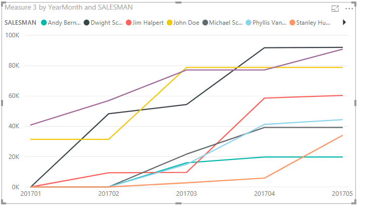
Change the relationshiop between date table and the 2LINE ITEMS + data_from_HEADER table to single. And create the measure as below.
Measure 3 =
var m =CALCULATE(MAX('2LINE ITEMS + data_from_HEADER'[Yearmonth]),ALL('2LINE ITEMS + data_from_HEADER'))
VAR re =
    CALCULATE(SUM('2LINE ITEMS + data_from_HEADER'[VALUE]),FILTER(ALLEXCEPT('2LINE ITEMS + data_from_HEADER','2LINE ITEMS + data_from_HEADER'[SALESMAN]),'2LINE ITEMS + data_from_HEADER'[Yearmonth]
            <= MAX('CALENDAR'[YearMonth])))
RETURN
   IF (
        MAX ( 'CALENDAR'[YearMonth] ) > m,
        BLANK (),
        IF ( ISBLANK ( re ), 0, re )
    )
Then we can get the result same as yours.
Also please find the pbix as attached.
Regards,
Frank
If this post helps, then please consider Accept it as the solution to help the others find it more quickly.
- Mark as New
- Bookmark
- Subscribe
- Mute
- Subscribe to RSS Feed
- Permalink
- Report Inappropriate Content
Hi @Anonymous,
Could you please share your sample data and excepted result to me. You can upload your files to onedrive and share the link here.
Reagrads,
Frank
If this post helps, then please consider Accept it as the solution to help the others find it more quickly.
- Mark as New
- Bookmark
- Subscribe
- Mute
- Subscribe to RSS Feed
- Permalink
- Report Inappropriate Content
Hi @v-frfei-msft,
Please find below the link to sample excel file, with the steps that I normally perform and the output result. In this case there are only few months.
https://1drv.ms/x/s!Al4POElXYEpThOE7uGCVRFvf-dHUfw
- Mark as New
- Bookmark
- Subscribe
- Mute
- Subscribe to RSS Feed
- Permalink
- Report Inappropriate Content
Hi @Anonymous,
Please check the following steps as below.
1. Create a calculated column.
Yearmonth = YEAR('2LINE ITEMS + data_from_HEADER'[SALESDATE])*100+MONTH('2LINE ITEMS + data_from_HEADER'[SALESDATE])
2. To create a measure as below.
Measure =
CALCULATE (
    SUM ( '2LINE ITEMS + data_from_HEADER'[VALUE] ),
    FILTER (
        ALLEXCEPT (
            '2LINE ITEMS + data_from_HEADER',
            '2LINE ITEMS + data_from_HEADER'[SALESMAN]
        ),
        '2LINE ITEMS + data_from_HEADER'[Yearmonth]
            <= MAX ( '2LINE ITEMS + data_from_HEADER'[Yearmonth] )
    )
)
For more details, please check the pbix as attached.
Regards,
Frank
If this post helps, then please consider Accept it as the solution to help the others find it more quickly.
- Mark as New
- Bookmark
- Subscribe
- Mute
- Subscribe to RSS Feed
- Permalink
- Report Inappropriate Content
Hi @Anonymous,
Does that make sense? If so, kindly mark my answer as a solution to close the case.
Regards,
Frank
If this post helps, then please consider Accept it as the solution to help the others find it more quickly.
- Mark as New
- Bookmark
- Subscribe
- Mute
- Subscribe to RSS Feed
- Permalink
- Report Inappropriate Content
Hi @Anonymous,
Change the relationshiop between date table and the 2LINE ITEMS + data_from_HEADER table to single. And create the measure as below.
Measure 3 =
var m =CALCULATE(MAX('2LINE ITEMS + data_from_HEADER'[Yearmonth]),ALL('2LINE ITEMS + data_from_HEADER'))
VAR re =
    CALCULATE(SUM('2LINE ITEMS + data_from_HEADER'[VALUE]),FILTER(ALLEXCEPT('2LINE ITEMS + data_from_HEADER','2LINE ITEMS + data_from_HEADER'[SALESMAN]),'2LINE ITEMS + data_from_HEADER'[Yearmonth]
            <= MAX('CALENDAR'[YearMonth])))
RETURN
   IF (
        MAX ( 'CALENDAR'[YearMonth] ) > m,
        BLANK (),
        IF ( ISBLANK ( re ), 0, re )
    )
Then we can get the result same as yours.
Also please find the pbix as attached.
Regards,
Frank
If this post helps, then please consider Accept it as the solution to help the others find it more quickly.
- Mark as New
- Bookmark
- Subscribe
- Mute
- Subscribe to RSS Feed
- Permalink
- Report Inappropriate Content
This is excellent!
Thank you
- Mark as New
- Bookmark
- Subscribe
- Mute
- Subscribe to RSS Feed
- Permalink
- Report Inappropriate Content
Hi @v-frfei-msft,
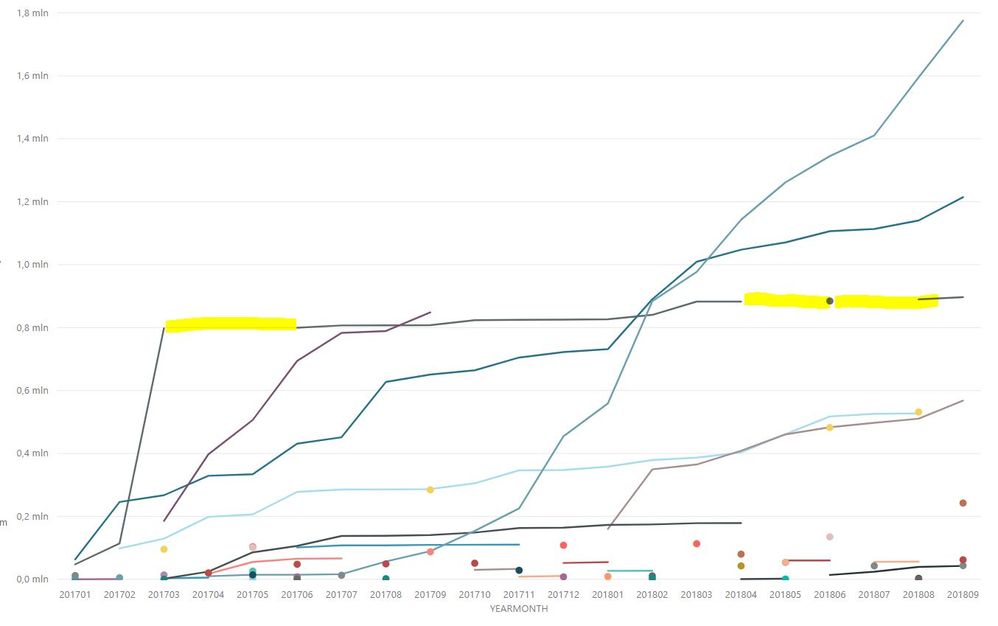
I have a problem - my outcome chart doesn not keep consistency of lines - there are signle dots for some series of data. I thoroughly, applied you solution to my real data. I marked in yellow the "missing line"
Helpful resources

New to Fabric Survey
If you have recently started exploring Fabric, we'd love to hear how it's going. Your feedback can help with product improvements.

Power BI DataViz World Championships - June 2026
A new Power BI DataViz World Championship is coming this June! Don't miss out on submitting your entry.

| User | Count |
|---|---|
| 45 | |
| 43 | |
| 38 | |
| 19 | |
| 15 |
| User | Count |
|---|---|
| 67 | |
| 66 | |
| 31 | |
| 28 | |
| 24 |


