Join us at FabCon Vienna from September 15-18, 2025
The ultimate Fabric, Power BI, SQL, and AI community-led learning event. Save €200 with code FABCOMM.
Get registered- Power BI forums
- Get Help with Power BI
- Desktop
- Service
- Report Server
- Power Query
- Mobile Apps
- Developer
- DAX Commands and Tips
- Custom Visuals Development Discussion
- Health and Life Sciences
- Power BI Spanish forums
- Translated Spanish Desktop
- Training and Consulting
- Instructor Led Training
- Dashboard in a Day for Women, by Women
- Galleries
- Data Stories Gallery
- Themes Gallery
- Contests Gallery
- Quick Measures Gallery
- Notebook Gallery
- Translytical Task Flow Gallery
- TMDL Gallery
- R Script Showcase
- Webinars and Video Gallery
- Ideas
- Custom Visuals Ideas (read-only)
- Issues
- Issues
- Events
- Upcoming Events
Enhance your career with this limited time 50% discount on Fabric and Power BI exams. Ends August 31st. Request your voucher.
- Power BI forums
- Forums
- Get Help with Power BI
- Desktop
- Re: Cumulative chart on multiple filters, not date...
- Subscribe to RSS Feed
- Mark Topic as New
- Mark Topic as Read
- Float this Topic for Current User
- Bookmark
- Subscribe
- Printer Friendly Page
- Mark as New
- Bookmark
- Subscribe
- Mute
- Subscribe to RSS Feed
- Permalink
- Report Inappropriate Content
Cumulative chart on multiple filters, not dates
Hi Power PI Community
I'm having trouble finding a way to generate cumulative total charts. Here is the structure of my data:
| Project no | Region | Market | Margin |
| 132 | USA | A | 100 |
| 432 | Canada | B | 200 |
| 243235 | Canada | B | 150 |
| 2432 | Asia | A | 2 |
| ads23 | Asia | B | 23 |
| 43DT | USA | B | 343 |
| 234 | USA | C | 453 |
| 345 | Canada | A | 344 |
| A234 | Asia | A | 23 |
| D45 | Canada | B | 24 |
| 36457 | USA | B | 345 |
| 57467 | USA | A | 234 |
| 54325 | Asia | C | 123 |
| ... | ... | ... | ... |
I want to generate a chart showing the cumulative total Margin for each market/region I select, RANKED in decreasing order of Margin. For example I might want to show on a graph the cumulative margin for the USA for all 3 markets:
X axis is just the number of projects. Largest margins are to the left.
I'm pretty sure there is not easy way to achieve this... Any hints?
- Mark as New
- Bookmark
- Subscribe
- Mute
- Subscribe to RSS Feed
- Permalink
- Report Inappropriate Content
Hi SRioux ,
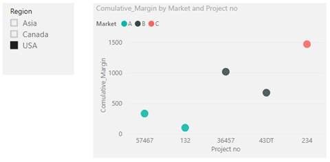
You can create measure "Comulative_Margin" to get the cumulative total Margin.
Comulative_Margin = CALCULATE(SUM(Table1[Margin]),FILTER(ALLSELECTED(Table1),ISONORAFTER (Table1[Margin], MAX ( Table1[Margin]), DESC )))
Then, create Scatter chart to display the cumulative total Margin for each market/region selected, ranked in descend order of Margin. For example, when select USA in Slicer, return the result showing below picture.
Here is my pbix test file link: https://qiuyunus-my.sharepoint.com/:u:/g/personal/pbipro_qiuyunus_onmicrosoft_com/Eb3IJv9Au1RKsVTyzG...
Best Regards,
Amy
If this post helps, then please consider Accept it as the solution to help the other members find it more quickly.
- Mark as New
- Bookmark
- Subscribe
- Mute
- Subscribe to RSS Feed
- Permalink
- Report Inappropriate Content
Thanks Amy
The ranking in descending order of Margin is not working. Every dot of a given market should be above the one on its left (strictly increasing function). The X axis of the scatter plot needs to be Number of projects, not project number.


