FabCon is coming to Atlanta
Join us at FabCon Atlanta from March 16 - 20, 2026, for the ultimate Fabric, Power BI, AI and SQL community-led event. Save $200 with code FABCOMM.
Register now!- Power BI forums
- Get Help with Power BI
- Desktop
- Service
- Report Server
- Power Query
- Mobile Apps
- Developer
- DAX Commands and Tips
- Custom Visuals Development Discussion
- Health and Life Sciences
- Power BI Spanish forums
- Translated Spanish Desktop
- Training and Consulting
- Instructor Led Training
- Dashboard in a Day for Women, by Women
- Galleries
- Data Stories Gallery
- Themes Gallery
- Contests Gallery
- Quick Measures Gallery
- Notebook Gallery
- Translytical Task Flow Gallery
- TMDL Gallery
- R Script Showcase
- Webinars and Video Gallery
- Ideas
- Custom Visuals Ideas (read-only)
- Issues
- Issues
- Events
- Upcoming Events
Calling all Data Engineers! Fabric Data Engineer (Exam DP-700) live sessions are back! Starting October 16th. Sign up.
- Power BI forums
- Forums
- Get Help with Power BI
- Desktop
- Re: Cumulative Totals for Map Visualization
- Subscribe to RSS Feed
- Mark Topic as New
- Mark Topic as Read
- Float this Topic for Current User
- Bookmark
- Subscribe
- Printer Friendly Page
- Mark as New
- Bookmark
- Subscribe
- Mute
- Subscribe to RSS Feed
- Permalink
- Report Inappropriate Content
Cumulative Totals for Map Visualization
Hi All,
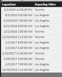
My data set is logon activity (for an application) by month by office
Columns are:
LogonDate (datetime)
Reporting Office (i.e. <cityname> Toronto, Los Angeles, etc)
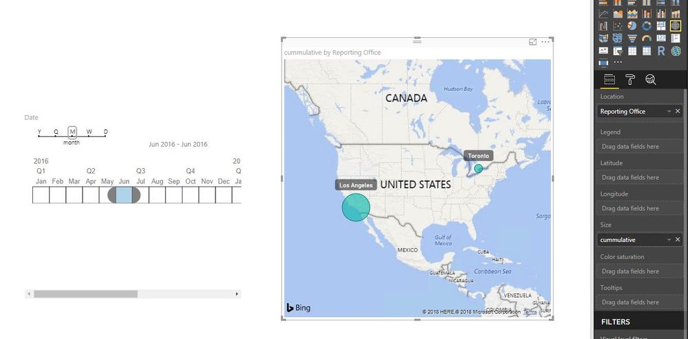
I would like to show the progression of logon activity from the beginning of my dataset (2016) to current (2018), using a slider (Timeline perhaps), and as i slide across by month, the circles representing the total count of LogonActivity in a location gets larger.
So it would show how the activity/usage of this application has grown over the past 15-16 months by location.
I've tried to use the Map visualization and the Timeline slicer and the only way i can 'hack' this, is if i hold SHIFT down while starting at the first date, and then clicking the subsequent month one at a time.
Is there a better way to show this? Can it be animated or automated?
Thanks in advance.
Solved! Go to Solution.
- Mark as New
- Bookmark
- Subscribe
- Mute
- Subscribe to RSS Feed
- Permalink
- Report Inappropriate Content
@dnaman,
I create a sample table named Logon, firstly create a Date column and count column using DAX below in the table.
Date = DATE(YEAR(Logon[LogonDate]),MONTH(Logon[LogonDate]),DAY(Logon[LogonDate]))
Count = CALCULATE(COUNTA(Logon[Reporting Office]))
Secondly, create a calendar table using DAX below. Create relationship between the calendar table and Logon table using date field.
Date = CALENDAR(DATE(2016,1,1),DATE(2018,12,31))
Thirdly, create the following measure to calculate cummulative count of logon activity in the Logon table.
cummulative = CALCULATE(SUM(Logon[Count]),FILTER(ALL('Date'),'Date'[Date]<=MAX('Date'[Date])))
Create a map visual as shown in the following screenshot. You still need to click Month in the timeline slicer to filter the map, but don't need to hold SHIFT to select all months to calculate cummulative value in map.
Regards,
Lydia
- Mark as New
- Bookmark
- Subscribe
- Mute
- Subscribe to RSS Feed
- Permalink
- Report Inappropriate Content
Hi
I am having the same problem and was hoping to use your solution, but creating the date column i get the error "A single value for column x cannot be determined"
Any ideas on how to solve this?
Thanks
Chris
- Mark as New
- Bookmark
- Subscribe
- Mute
- Subscribe to RSS Feed
- Permalink
- Report Inappropriate Content
@Anonymous that works! The only grip i have now is that the size of the circles do not really 'grow' or scale relative to the other circles. Meaning the size of the circle for cumulative value 10 is basially the same cirzle size for cumulative value 100


