A new Data Days event is coming soon!
This time we’re going bigger than ever. Fabric, Power BI, SQL, AI and more. We're covering it all. You won't want to miss it.
Learn more- Power BI forums
- Get Help with Power BI
- Desktop
- Service
- Report Server
- Power Query
- Mobile Apps
- Developer
- DAX Commands and Tips
- Custom Visuals Development Discussion
- Health and Life Sciences
- Power BI Spanish forums
- Translated Spanish Desktop
- Training and Consulting
- Instructor Led Training
- Dashboard in a Day for Women, by Women
- Galleries
- Data Stories Gallery
- Themes Gallery
- Contests Gallery
- QuickViz Gallery
- Quick Measures Gallery
- Visual Calculations Gallery
- Notebook Gallery
- Translytical Task Flow Gallery
- TMDL Gallery
- R Script Showcase
- Webinars and Video Gallery
- Ideas
- Custom Visuals Ideas (read-only)
- Issues
- Issues
- Events
- Upcoming Events
Did you hear? There's a new SQL AI Developer certification (DP-800). Start preparing now and be one of the first to get certified. Register now
- Power BI forums
- Forums
- Get Help with Power BI
- Desktop
- Cumulative Count
- Subscribe to RSS Feed
- Mark Topic as New
- Mark Topic as Read
- Float this Topic for Current User
- Bookmark
- Subscribe
- Printer Friendly Page
- Mark as New
- Bookmark
- Subscribe
- Mute
- Subscribe to RSS Feed
- Permalink
- Report Inappropriate Content
Cumulative Count
Hey,
I have a column called Hired In which gives the number of days back an employee was hired in. Hired in = DATEDIFF(Hire[Hire Date], Today(),Day)
I have grouped them as follows : Last 30 Days, Last 60 Days and Last 90 Days. The formula I used is as follows:
Hired in buckets = SWITCH(TRUE(), Hires[Hired in]<0, "Others", Hires[Hired in]>=0 && Hires[Hired in]<=30, "Last 30 days", Hires[Hired in]>=0 && Hires[Hired in]<=60, "Last 60 days", Hires[Hired in]>=0 && Hires[Hired in]<=90, "Last 90 days")
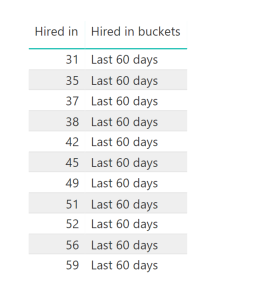
Basically I want the count of hires in Last 60 days = Combination of 0 - 60 Days and similarly Last 90 Days to give the total count so far ( Hence >=0 && <=90). But when I make a visual of it, the values do not show that way. In the following Image it only considers days 31 - 59 under it and not from 0. Hence, it does not give the cumulative count.
Any suggestions to make this work? Thank you!
Solved! Go to Solution.
- Mark as New
- Bookmark
- Subscribe
- Mute
- Subscribe to RSS Feed
- Permalink
- Report Inappropriate Content
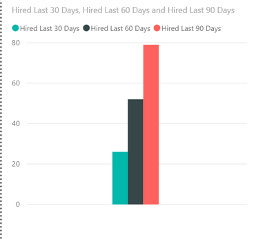
I just dropped the three measures into a bar chart and got this:
Is that not what you want?
Did I answer your question? Mark my post as a solution!
Did my answers help arrive at a solution? Give it a kudos by clicking the Thumbs Up!
DAX is for Analysis. Power Query is for Data Modeling
Proud to be a Super User!
MCSA: BI Reporting- Mark as New
- Bookmark
- Subscribe
- Mute
- Subscribe to RSS Feed
- Permalink
- Report Inappropriate Content
I don't think you can use SWITCH like that as you want someone hired 1 day ago to appear in the 30, 60 and 90 day bucket. SWITCH puts it in one bucket only, not multiple.
Try multiple measures. For example:
Hired Last 30 Days =
CALCULATE(
    COUNT('Hire Dates'[Hired Days Ago]),
    FILTER('Hire Dates','Hire Dates'[Hired Days Ago] <= 30)
)
Hired Last 60 Days =
CALCULATE(
COUNT('Hire Dates'[Hired Days Ago]),
FILTER('Hire Dates','Hire Dates'[Hired Days Ago] <= 60)
)Etc. Drop those measures in a table.
IS that what you are looking for?
Did I answer your question? Mark my post as a solution!
Did my answers help arrive at a solution? Give it a kudos by clicking the Thumbs Up!
DAX is for Analysis. Power Query is for Data Modeling
Proud to be a Super User!
MCSA: BI Reporting- Mark as New
- Bookmark
- Subscribe
- Mute
- Subscribe to RSS Feed
- Permalink
- Report Inappropriate Content
@edhans This calculation would give the right answer but I would not get an appropriate bar chart hat shows me those values right?
I want the axis to show "LAst 30 Days", "LAst 60 Days", "Last 90 Days" and the values are those which are calcualted as you mentioned
- Mark as New
- Bookmark
- Subscribe
- Mute
- Subscribe to RSS Feed
- Permalink
- Report Inappropriate Content
I just dropped the three measures into a bar chart and got this:
Is that not what you want?
Did I answer your question? Mark my post as a solution!
Did my answers help arrive at a solution? Give it a kudos by clicking the Thumbs Up!
DAX is for Analysis. Power Query is for Data Modeling
Proud to be a Super User!
MCSA: BI Reporting- Mark as New
- Bookmark
- Subscribe
- Mute
- Subscribe to RSS Feed
- Permalink
- Report Inappropriate Content
- Mark as New
- Bookmark
- Subscribe
- Mute
- Subscribe to RSS Feed
- Permalink
- Report Inappropriate Content
Great @Anonymous - glad my idea helped.
Did I answer your question? Mark my post as a solution!
Did my answers help arrive at a solution? Give it a kudos by clicking the Thumbs Up!
DAX is for Analysis. Power Query is for Data Modeling
Proud to be a Super User!
MCSA: BI Reporting- Mark as New
- Bookmark
- Subscribe
- Mute
- Subscribe to RSS Feed
- Permalink
- Report Inappropriate Content
If that is not what you want, look at this file and then tell me how you would want it to be and why the 3 measures (30/60/90) aren't working for you correctly. I'll check back in in an hour or so, or someone else could jump in with the solution you are seeking.
Did I answer your question? Mark my post as a solution!
Did my answers help arrive at a solution? Give it a kudos by clicking the Thumbs Up!
DAX is for Analysis. Power Query is for Data Modeling
Proud to be a Super User!
MCSA: BI Reporting- Mark as New
- Bookmark
- Subscribe
- Mute
- Subscribe to RSS Feed
- Permalink
- Report Inappropriate Content
As per the image above, you need to show count as 11 for "Last 60 Days" isn't it ?
If you had your grouping done already, then it should be a straight-forward approach.... please make sure that you are changing the aggregation to "Count" instead of "Sum" (which is the default behaviour for Numeric fields)
Did I answer your question? Mark my post as a solution!
Proud to be a PBI Community Champion
- Mark as New
- Bookmark
- Subscribe
- Mute
- Subscribe to RSS Feed
- Permalink
- Report Inappropriate Content
Helpful resources

Power BI Monthly Update - April 2026
Check out the April 2026 Power BI update to learn about new features.

Data Days 2026 coming soon!
Sign up to receive a private message when registration opens and key events begin.

New to Fabric Survey
If you have recently started exploring Fabric, we'd love to hear how it's going. Your feedback can help with product improvements.

| User | Count |
|---|---|
| 34 | |
| 31 | |
| 25 | |
| 20 | |
| 16 |
| User | Count |
|---|---|
| 60 | |
| 48 | |
| 29 | |
| 23 | |
| 23 |


