Fabric Data Days starts November 4th!
Advance your Data & AI career with 50 days of live learning, dataviz contests, hands-on challenges, study groups & certifications and more!
Get registered- Power BI forums
- Get Help with Power BI
- Desktop
- Service
- Report Server
- Power Query
- Mobile Apps
- Developer
- DAX Commands and Tips
- Custom Visuals Development Discussion
- Health and Life Sciences
- Power BI Spanish forums
- Translated Spanish Desktop
- Training and Consulting
- Instructor Led Training
- Dashboard in a Day for Women, by Women
- Galleries
- Data Stories Gallery
- Themes Gallery
- Contests Gallery
- QuickViz Gallery
- Quick Measures Gallery
- Visual Calculations Gallery
- Notebook Gallery
- Translytical Task Flow Gallery
- TMDL Gallery
- R Script Showcase
- Webinars and Video Gallery
- Ideas
- Custom Visuals Ideas (read-only)
- Issues
- Issues
- Events
- Upcoming Events
Get Fabric Certified for FREE during Fabric Data Days. Don't miss your chance! Request now
- Power BI forums
- Forums
- Get Help with Power BI
- Desktop
- Re: Cross-Filtering between bar chart and table us...
- Subscribe to RSS Feed
- Mark Topic as New
- Mark Topic as Read
- Float this Topic for Current User
- Bookmark
- Subscribe
- Printer Friendly Page
- Mark as New
- Bookmark
- Subscribe
- Mute
- Subscribe to RSS Feed
- Permalink
- Report Inappropriate Content
Cross-Filtering between bar chart and table using measures in bar chart
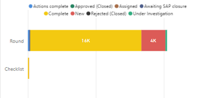
I needed to have the legend on my chart that does not change based on report filtering so I created measures to calculate the count of ID’s for each Status. This allowed the legend to stay static no matter what filters are applied to the report page. The problem I now have is that when I select one of the counts in the bar chart (i.e. Actions Complete for DB1), it no longer filters the table with the same data. So the measures I created are not allowing any cross-filtering to the table. One of the measures I created was:
Count of Id for Actions complete =
CALCULATE(COUNTA('Case'[Id]), 'Case'[Status] IN { "Actions complete" })
And I have 7 other measures with different status’s.
The Bar chart has Type for the Axis (which is DB1 and DB2), and each of the measures for values.
The Table shows Type, Status, and a bunch of other values.
Is there a better way to make sure the legend doesn’t change based on filtering or is there a better measure I can write that allows cross-filtering to the table?
Solved! Go to Solution.
- Mark as New
- Bookmark
- Subscribe
- Mute
- Subscribe to RSS Feed
- Permalink
- Report Inappropriate Content
Not sure why you would want to confuse your users this way but here's an implementation
- Mark as New
- Bookmark
- Subscribe
- Mute
- Subscribe to RSS Feed
- Permalink
- Report Inappropriate Content
I agree this isn't ideal but this is what the customer wants... a static legend so they know what other status's are available. Your suggestion is a good one. I will take that to them as a solution. Thanks!
- Mark as New
- Bookmark
- Subscribe
- Mute
- Subscribe to RSS Feed
- Permalink
- Report Inappropriate Content
Please provide sanitized sample data that fully covers your issue. If you paste the data into a table in your post or use one of the file services it will be easier to work with. Avoid posting screenshots of your source data if possible.
Please show the expected outcome based on the sample data you provided. Screenshots of the expected outcome are ok.
- Mark as New
- Bookmark
- Subscribe
- Mute
- Subscribe to RSS Feed
- Permalink
- Report Inappropriate Content
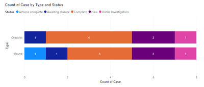
Sorry for the late reply. Here is a sample of the data. This sample is also what would be shown in the Table Graph. The picture of the bar chart is included. If I use measures for each status in the bar chart, It no longer filters the table chart. For instance, if I select "Completed" in the bar chart, the table graph still shows all status's (does not filter just the ones that are "Completed"). I need the legend to stay static so on the main page filters, if someone selects location = MB, the legend in the bar chart stays the same.
| Type | Status | Case | Created Date | Location | ID |
| Round | New | 134493 | 7/25/2019 18:22 | MB | 12aTgQAI |
| Round | Complete | 134494 | 7/25/2019 18:22 | MB | 12aTRQAY |
| Round | Complete | 142618 | 8/16/2019 0:36 | B | 1fuIqQAI |
| Round | Under Investigation | 167650 | 10/10/2019 5:17 | A | 3VhnbQAC |
| Round | Complete | 170935 | 10/17/2019 8:17 | A | 3jWqEQAU |
| Round | New | 172259 | 10/20/2019 21:12 | MB | 3lr9uQAA |
| Round | Actions complete | 291820 | 5/12/2020 4:45 | SA | 9UxwKQAS |
| Round | Awaiting closure | 295885 | 5/19/2020 2:37 | SA | 9jMTwQAM |
| Checklist | Complete | 409993 | 11/21/2020 4:39 | C | Dpj1gQAB |
| Checklist | New | 446899 | 1/15/2021 10:25 | W | F1gu9QAB |
| Checklist | Complete | 451779 | 1/23/2021 18:04 | S1 | F47vvQAB |
| Checklist | Complete | 451780 | 1/23/2021 18:04 | S1 | F47w4QAB |
| Checklist | New | 516331 | 5/8/2021 9:13 | W | Hcbg5QAB |
| Checklist | Complete | 528455 | 5/29/2021 22:55 | S2 | 9ECdrQAG |
| Checklist | Awaiting closure | 671056 | 12/3/2021 14:54 | G | MnkbkQAB |
| Checklist | Under Investigation | 671376 | 12/4/2021 6:03 | G | MnspKQAR |
- Mark as New
- Bookmark
- Subscribe
- Mute
- Subscribe to RSS Feed
- Permalink
- Report Inappropriate Content
What is your expected outcome? Here is an example that doesn't use measures at all
How is this insufficient for what you are trying to achieve? How do you expect users to interact with the visual?
- Mark as New
- Bookmark
- Subscribe
- Mute
- Subscribe to RSS Feed
- Permalink
- Report Inappropriate Content
If you have a slicer on the page for Location and you select G, I want the legend to still show everything. Creating measures allows this to happen but when I then add a table of the data to the page and when I select one of the bars (completed), the table is not filtering to just show completed. That is the consequence I found with the measures. It fixes one problem (keeping legend intact) but does not solve the cross filtering function between the table and the bar chart. Maybe the measures need to be written differently or maybe there is no fix that will keep legend intact and allow the cross-filtering.
- Mark as New
- Bookmark
- Subscribe
- Mute
- Subscribe to RSS Feed
- Permalink
- Report Inappropriate Content
Helpful resources

Power BI Monthly Update - November 2025
Check out the November 2025 Power BI update to learn about new features.

Fabric Data Days
Advance your Data & AI career with 50 days of live learning, contests, hands-on challenges, study groups & certifications and more!

| User | Count |
|---|---|
| 97 | |
| 74 | |
| 50 | |
| 48 | |
| 46 |


