Get Fabric certified for FREE!
Don't miss your chance to take the Fabric Data Engineer (DP-600) exam for FREE! Find out how by watching the DP-600 session on-demand now through April 28th.
Learn more- Power BI forums
- Get Help with Power BI
- Desktop
- Service
- Report Server
- Power Query
- Mobile Apps
- Developer
- DAX Commands and Tips
- Custom Visuals Development Discussion
- Health and Life Sciences
- Power BI Spanish forums
- Translated Spanish Desktop
- Training and Consulting
- Instructor Led Training
- Dashboard in a Day for Women, by Women
- Galleries
- Data Stories Gallery
- Themes Gallery
- Contests Gallery
- QuickViz Gallery
- Quick Measures Gallery
- Visual Calculations Gallery
- Notebook Gallery
- Translytical Task Flow Gallery
- TMDL Gallery
- R Script Showcase
- Webinars and Video Gallery
- Ideas
- Custom Visuals Ideas (read-only)
- Issues
- Issues
- Events
- Upcoming Events
Join the FabCon + SQLCon recap series. Up next: Power BI, Real-Time Intelligence, IQ and AI, and Data Factory take center stage. All sessions are available on-demand after the live show. Register now
- Power BI forums
- Forums
- Get Help with Power BI
- Desktop
- Creating my first Chart
- Subscribe to RSS Feed
- Mark Topic as New
- Mark Topic as Read
- Float this Topic for Current User
- Bookmark
- Subscribe
- Printer Friendly Page
- Mark as New
- Bookmark
- Subscribe
- Mute
- Subscribe to RSS Feed
- Permalink
- Report Inappropriate Content
Creating my first Chart
I am a new user.
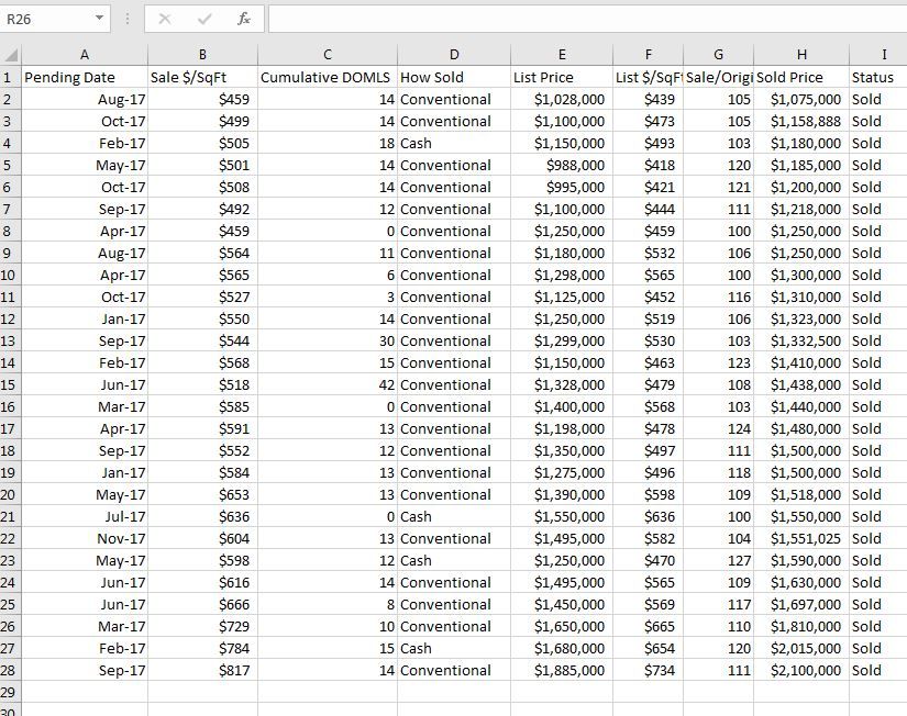
I have a small dataset in excel that I imported to Power BI
The data is in Power BI adn I can see the field. When I select 2 fields, such as "Pending Date" and 'Sale $/SF", I get a line chart that doesnt seem to relate to the data.
I just want a simple Chart with the date on the Horizontal axis and the Sale $ / SF on the vertical Axis.
Help is appreciated.
- Mark as New
- Bookmark
- Subscribe
- Mute
- Subscribe to RSS Feed
- Permalink
- Report Inappropriate Content
Hi @ablackburn21,
When I select 2 fields, such as "Pending Date" and 'Sale $/SF", I get a line chart that doesnt seem to relate to the data.
What do you say the line chart is not related to the dataset data? Could you explain with an example?
I just want a simple Chart with the date on the Horizontal axis and the Sale $ / SF on the vertical Axis.
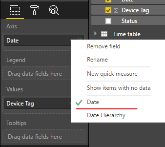
From above line chart, everything looks correct. Date is shown as X-axis and Sale $ / SF on the vertical Axis. If you want to display Date rather than Month on X-axis, please change "Date hierarchy" to "Date".
Besides, any numeric fields added to Y-axis will be aggregated (sum, max, average, etc). That may be why the data values shown in chart looks different from source table.
Regards,
Yuliana Gu
If this post helps, then please consider Accept it as the solution to help the other members find it more quickly.
Helpful resources

Power BI Monthly Update - April 2026
Check out the April 2026 Power BI update to learn about new features.

New to Fabric Survey
If you have recently started exploring Fabric, we'd love to hear how it's going. Your feedback can help with product improvements.

Power BI DataViz World Championships - June 2026
A new Power BI DataViz World Championship is coming this June! Don't miss out on submitting your entry.

| User | Count |
|---|---|
| 43 | |
| 35 | |
| 33 | |
| 21 | |
| 15 |
| User | Count |
|---|---|
| 64 | |
| 59 | |
| 31 | |
| 27 | |
| 25 |


