FabCon is coming to Atlanta
Join us at FabCon Atlanta from March 16 - 20, 2026, for the ultimate Fabric, Power BI, AI and SQL community-led event. Save $200 with code FABCOMM.
Register now!- Power BI forums
- Get Help with Power BI
- Desktop
- Service
- Report Server
- Power Query
- Mobile Apps
- Developer
- DAX Commands and Tips
- Custom Visuals Development Discussion
- Health and Life Sciences
- Power BI Spanish forums
- Translated Spanish Desktop
- Training and Consulting
- Instructor Led Training
- Dashboard in a Day for Women, by Women
- Galleries
- Data Stories Gallery
- Themes Gallery
- Contests Gallery
- QuickViz Gallery
- Quick Measures Gallery
- Visual Calculations Gallery
- Notebook Gallery
- Translytical Task Flow Gallery
- TMDL Gallery
- R Script Showcase
- Webinars and Video Gallery
- Ideas
- Custom Visuals Ideas (read-only)
- Issues
- Issues
- Events
- Upcoming Events
The Power BI Data Visualization World Championships is back! Get ahead of the game and start preparing now! Learn more
- Power BI forums
- Forums
- Get Help with Power BI
- Desktop
- Creating funnel charts from awkward data
- Subscribe to RSS Feed
- Mark Topic as New
- Mark Topic as Read
- Float this Topic for Current User
- Bookmark
- Subscribe
- Printer Friendly Page
- Mark as New
- Bookmark
- Subscribe
- Mute
- Subscribe to RSS Feed
- Permalink
- Report Inappropriate Content
Creating funnel charts from awkward data
Hi
I have a problem from the world of British Further Eduction(FE):
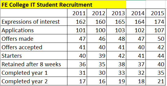
I've demonstrated how Funnel Charts could be useful in FE, from this sample data I created:
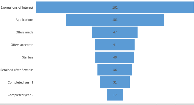
Giving a funnel chart like this:
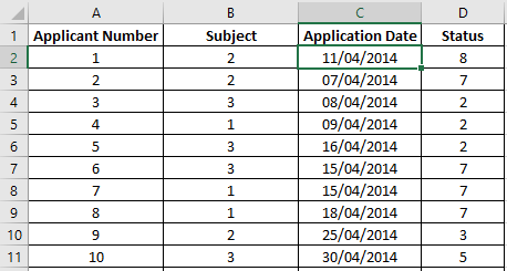
Which is great BUT, unfortunately, in the real world the source data isn't in such a convenient format. Here are 2 sample files of more realistic data formats:
(a) in this format, the "Status" column shows which stage the applicant has achieved; (full file can be found at
https://1drv.ms/x/s!AmxJyApgEAcYgo8NoDs8mx7lBf-Hxg)
(b) In this file, a "Y" indicates the status stated in the column header has been achieved (file is at https://1drv.ms/x/s!AmxJyApgEAcYgo8OZ7cZXMHgwEI70A)
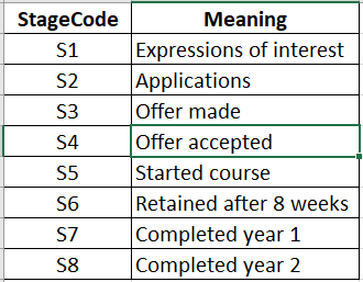
Statuses are defined on the following file (at https://1drv.ms/x/s!AmxJyApgEAcYgo8PLoR2pPl2qJbUtg)
I've tried using Power BI, with the Funnel Chart desktop visualisation, to get a meaningful funnel chart (i.e. like the first one in this post that I generated from my own test data) from either real-world input file formats, without success - could anyone advise me how I might achieve this without resorting to VBA to reformat the input data?
Thanks for your help!
Solved! Go to Solution.
- Mark as New
- Bookmark
- Subscribe
- Mute
- Subscribe to RSS Feed
- Permalink
- Report Inappropriate Content
Hi @Anonymous
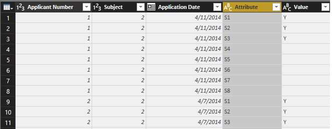
You may try to use 'Unpivot Only Selected Columns' in Query Editor as below. Then create relationships for the 3 sheets. Last, you may create measure or drag the columns to Funnel Visual as requested.
Regards,
Cherie
If this post helps, then please consider Accept it as the solution to help the other members find it more quickly.
- Mark as New
- Bookmark
- Subscribe
- Mute
- Subscribe to RSS Feed
- Permalink
- Report Inappropriate Content
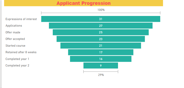
Thank you Cherie - easy when you know how, I've used my data to produce the following Funel Diagram:
Helpful resources

Power BI Dataviz World Championships
The Power BI Data Visualization World Championships is back! Get ahead of the game and start preparing now!

| User | Count |
|---|---|
| 37 | |
| 37 | |
| 33 | |
| 32 | |
| 29 |
| User | Count |
|---|---|
| 130 | |
| 88 | |
| 82 | |
| 68 | |
| 64 |
