FabCon is coming to Atlanta
Join us at FabCon Atlanta from March 16 - 20, 2026, for the ultimate Fabric, Power BI, AI and SQL community-led event. Save $200 with code FABCOMM.
Register now!- Power BI forums
- Get Help with Power BI
- Desktop
- Service
- Report Server
- Power Query
- Mobile Apps
- Developer
- DAX Commands and Tips
- Custom Visuals Development Discussion
- Health and Life Sciences
- Power BI Spanish forums
- Translated Spanish Desktop
- Training and Consulting
- Instructor Led Training
- Dashboard in a Day for Women, by Women
- Galleries
- Data Stories Gallery
- Themes Gallery
- Contests Gallery
- Quick Measures Gallery
- Visual Calculations Gallery
- Notebook Gallery
- Translytical Task Flow Gallery
- TMDL Gallery
- R Script Showcase
- Webinars and Video Gallery
- Ideas
- Custom Visuals Ideas (read-only)
- Issues
- Issues
- Events
- Upcoming Events
Calling all Data Engineers! Fabric Data Engineer (Exam DP-700) live sessions are back! Starting October 16th. Sign up.
- Power BI forums
- Forums
- Get Help with Power BI
- Desktop
- Creating a table of Recurring Costs in Power Query
- Subscribe to RSS Feed
- Mark Topic as New
- Mark Topic as Read
- Float this Topic for Current User
- Bookmark
- Subscribe
- Printer Friendly Page
- Mark as New
- Bookmark
- Subscribe
- Mute
- Subscribe to RSS Feed
- Permalink
- Report Inappropriate Content
Creating a table of Recurring Costs in Power Query
Good Afternoon All!
I was hoping someone could help provide the most efficient method of creating a Life Cycle Cost data table based on task frequency and cost data across a defined time period.
I have a table called "Task_Frequency" which contains the task frequency in days and the associated cost:
What I would like to do is create another table that would show these costs across a timeperiod, say 200 days, and then from that I can plot a chart of the costs across the time period.
I should note that the Task_Frequency table may have more or fewer rows depending on data source, so the query would need to be flexible with this.
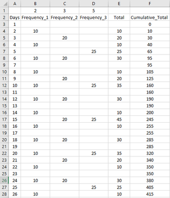
An example of the table would be below (excluding row 1 which was for visual purposes):
In Excel I could use the following formula to determine the occurance of cost for Frequency_1:
=IF($A3/B$1=INT($A3/B$1),10,"")
Ideally, if any Days do not contain any costs then these shouldn't be present in the table as there could be task frequencies that are far and few between so there'd be many empty rows.
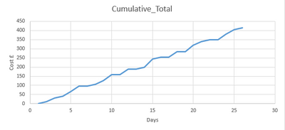
Here's what my expected chart would look like:
Any help would be greatly appreciated and thanks in advance 🙂
Alex
- Mark as New
- Bookmark
- Subscribe
- Mute
- Subscribe to RSS Feed
- Permalink
- Report Inappropriate Content
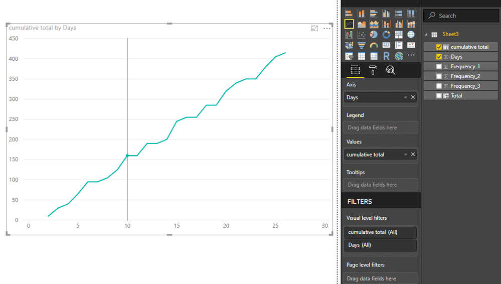
With your example table (the second picture), I can easily create a chart as you expected.
It is created in the Report View, while "Power Query" refered in your title is in the "Home->edit queries" where can shape and construct data model but can't create visuals.
If you have any question, please feel free to ask me.
Best Regards
Maggie
- Mark as New
- Bookmark
- Subscribe
- Mute
- Subscribe to RSS Feed
- Permalink
- Report Inappropriate Content
Hi Maggie @v-juanli-msft,
Thanks for your input! However, my goal is to create the data table from the Frequency_Days table:
Any method to turn the data from the above table to the below table (which I mocked up in Excel) would be greatly appreciated and then I can create the chart in report view.
Thanks, Alex
- Mark as New
- Bookmark
- Subscribe
- Mute
- Subscribe to RSS Feed
- Permalink
- Report Inappropriate Content
Helpful resources

FabCon Global Hackathon
Join the Fabric FabCon Global Hackathon—running virtually through Nov 3. Open to all skill levels. $10,000 in prizes!

Power BI Monthly Update - October 2025
Check out the October 2025 Power BI update to learn about new features.


