FabCon is coming to Atlanta
Join us at FabCon Atlanta from March 16 - 20, 2026, for the ultimate Fabric, Power BI, AI and SQL community-led event. Save $200 with code FABCOMM.
Register now!- Power BI forums
- Get Help with Power BI
- Desktop
- Service
- Report Server
- Power Query
- Mobile Apps
- Developer
- DAX Commands and Tips
- Custom Visuals Development Discussion
- Health and Life Sciences
- Power BI Spanish forums
- Translated Spanish Desktop
- Training and Consulting
- Instructor Led Training
- Dashboard in a Day for Women, by Women
- Galleries
- Data Stories Gallery
- Themes Gallery
- Contests Gallery
- QuickViz Gallery
- Quick Measures Gallery
- Visual Calculations Gallery
- Notebook Gallery
- Translytical Task Flow Gallery
- TMDL Gallery
- R Script Showcase
- Webinars and Video Gallery
- Ideas
- Custom Visuals Ideas (read-only)
- Issues
- Issues
- Events
- Upcoming Events
The Power BI Data Visualization World Championships is back! Get ahead of the game and start preparing now! Learn more
- Power BI forums
- Forums
- Get Help with Power BI
- Desktop
- Re: Creating a milestone slippage chart
- Subscribe to RSS Feed
- Mark Topic as New
- Mark Topic as Read
- Float this Topic for Current User
- Bookmark
- Subscribe
- Printer Friendly Page
- Mark as New
- Bookmark
- Subscribe
- Mute
- Subscribe to RSS Feed
- Permalink
- Report Inappropriate Content
Creating a milestone slippage chart
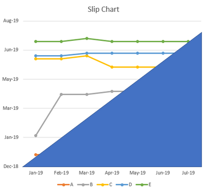
Hi I have a data set similar to the below
| Months | |||||||
| Milestone | 01/01/2019 | 01/02/2019 | 01/03/2019 | 01/04/2019 | 01/05/2019 | 01/06/2019 | 01/07/2019 |
| A | 01/01/2019 | 01/01/2019 | 01/01/2019 | 01/01/2019 | 01/01/2019 | 01/01/2019 | 01/01/2019 |
| B | 03/02/2019 | 15/04/2019 | 15/04/2019 | 20/04/2019 | 20/04/2019 | 20/04/2019 | 20/04/2019 |
| C | 15/06/2019 | 15/06/2019 | 20/06/2019 | 01/06/2019 | 01/06/2019 | 01/06/2019 | 01/06/2019 |
| D | 20/06/2019 | 20/06/2019 | 25/06/2019 | 25/06/2019 | 25/06/2019 | 25/06/2019 | 25/06/2019 |
| E | 15/07/2019 | 15/07/2019 | 20/07/2019 | 15/07/2019 | 15/07/2019 | 15/07/2019 | 15/07/2019 |
Each month, I get an update for milestones A-E (Months are the row headers)
and I want to build a chart like this:
I can't seem to add in a 2nd date for the Y axis, I'm guessing people don't usually do this sort of thing, so probably needs to be in python or R?
- Mark as New
- Bookmark
- Subscribe
- Mute
- Subscribe to RSS Feed
- Permalink
- Report Inappropriate Content
Could you please share how you solved this problem? I seem to need something similar.
- Mark as New
- Bookmark
- Subscribe
- Mute
- Subscribe to RSS Feed
- Permalink
- Report Inappropriate Content
Hi timneo
Yep I don't think thats possible with the default visuals and I don't know of a custom visual for a slippage chart yet.
You could be the pioneer!
I'd be looking to R or building something custom to solve this one.
Cheers
Greg
- Mark as New
- Bookmark
- Subscribe
- Mute
- Subscribe to RSS Feed
- Permalink
- Report Inappropriate Content
Cheers,
Just so I understand this, both R and PY require a non default install for use. So anyone with the desktop client will need R or Python install to view the output.
I assume if the server has python installed, anyone can view it on the server, just not desktop? Our IT is locked down, so I'll have to get them to install R/python before I can make any changes.
- Mark as New
- Bookmark
- Subscribe
- Mute
- Subscribe to RSS Feed
- Permalink
- Report Inappropriate Content
nb the blue triangle is a nice to have and isn't in the data set - it covers the data points that have effectively happened to show no further updates will happen for that data set. its data points would be the same on each axis, ie X:01-Jan-19 Y:01-Jan-19, X:01-Feb-19 Y:01-Feb-19 etc
Helpful resources

Power BI Dataviz World Championships
The Power BI Data Visualization World Championships is back! Get ahead of the game and start preparing now!

| User | Count |
|---|---|
| 39 | |
| 37 | |
| 33 | |
| 33 | |
| 29 |
| User | Count |
|---|---|
| 134 | |
| 96 | |
| 78 | |
| 67 | |
| 65 |


