FabCon is coming to Atlanta
Join us at FabCon Atlanta from March 16 - 20, 2026, for the ultimate Fabric, Power BI, AI and SQL community-led event. Save $200 with code FABCOMM.
Register now!- Power BI forums
- Get Help with Power BI
- Desktop
- Service
- Report Server
- Power Query
- Mobile Apps
- Developer
- DAX Commands and Tips
- Custom Visuals Development Discussion
- Health and Life Sciences
- Power BI Spanish forums
- Translated Spanish Desktop
- Training and Consulting
- Instructor Led Training
- Dashboard in a Day for Women, by Women
- Galleries
- Data Stories Gallery
- Themes Gallery
- Contests Gallery
- QuickViz Gallery
- Quick Measures Gallery
- Visual Calculations Gallery
- Notebook Gallery
- Translytical Task Flow Gallery
- TMDL Gallery
- R Script Showcase
- Webinars and Video Gallery
- Ideas
- Custom Visuals Ideas (read-only)
- Issues
- Issues
- Events
- Upcoming Events
The Power BI Data Visualization World Championships is back! Get ahead of the game and start preparing now! Learn more
- Power BI forums
- Forums
- Get Help with Power BI
- Desktop
- Creating a combo stacked Bar and Line Graph
- Subscribe to RSS Feed
- Mark Topic as New
- Mark Topic as Read
- Float this Topic for Current User
- Bookmark
- Subscribe
- Printer Friendly Page
- Mark as New
- Bookmark
- Subscribe
- Mute
- Subscribe to RSS Feed
- Permalink
- Report Inappropriate Content
Creating a combo stacked Bar and Line Graph
Good day!
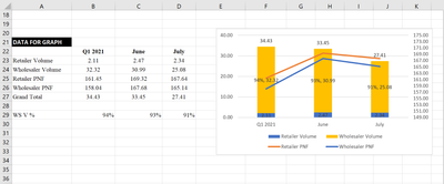
This is the given data used to create the following combo stacked bar and line graph in Microsoft Excel. Does anyone know how to recreate the same in Power BI?
- Mark as New
- Bookmark
- Subscribe
- Mute
- Subscribe to RSS Feed
- Permalink
- Report Inappropriate Content
@Anonymous , I think this measure split into both sides.
For that, you need create a table with dimensions as group bys which you want to filter
examples
union(
summarize('Table',"Measure","sales","This period",[SALES YTD],"Last period",[SALES LYTD],"POP",[SALES YOY])
summarize('Table',"Measure","unit","This period",[unit YTD],"Last period",[unit LYTD],"POP",[unit YOY])
)
or
union(
summarize('Table',"Measure parent","Measure1","Measure",[Measure1])
summarize('Table',"Measure parent","Measure2","Measure",[Meausre2])
)
or
union(
summarize('Table',"Measure","App","Last 7 Days",[APP 7 Day],"Last 14 days",[APP 14 days],"last 21 Days",[APP 21 Days])
summarize('Table',"Measure","App","Last 7 Days",[Leads 7 Day],"Last 14 days",[Leads 14 days],"last 21 Days",[Leads 21 Days])
)
Helpful resources

Power BI Dataviz World Championships
The Power BI Data Visualization World Championships is back! Get ahead of the game and start preparing now!

| User | Count |
|---|---|
| 38 | |
| 37 | |
| 33 | |
| 32 | |
| 29 |
| User | Count |
|---|---|
| 129 | |
| 88 | |
| 79 | |
| 68 | |
| 63 |


