FabCon is coming to Atlanta
Join us at FabCon Atlanta from March 16 - 20, 2026, for the ultimate Fabric, Power BI, AI and SQL community-led event. Save $200 with code FABCOMM.
Register now!- Power BI forums
- Get Help with Power BI
- Desktop
- Service
- Report Server
- Power Query
- Mobile Apps
- Developer
- DAX Commands and Tips
- Custom Visuals Development Discussion
- Health and Life Sciences
- Power BI Spanish forums
- Translated Spanish Desktop
- Training and Consulting
- Instructor Led Training
- Dashboard in a Day for Women, by Women
- Galleries
- Data Stories Gallery
- Themes Gallery
- Contests Gallery
- Quick Measures Gallery
- Notebook Gallery
- Translytical Task Flow Gallery
- TMDL Gallery
- R Script Showcase
- Webinars and Video Gallery
- Ideas
- Custom Visuals Ideas (read-only)
- Issues
- Issues
- Events
- Upcoming Events
To celebrate FabCon Vienna, we are offering 50% off select exams. Ends October 3rd. Request your discount now.
- Power BI forums
- Forums
- Get Help with Power BI
- Desktop
- Re: Creating a Clustered Chart similar to EXCEL
- Subscribe to RSS Feed
- Mark Topic as New
- Mark Topic as Read
- Float this Topic for Current User
- Bookmark
- Subscribe
- Printer Friendly Page
- Mark as New
- Bookmark
- Subscribe
- Mute
- Subscribe to RSS Feed
- Permalink
- Report Inappropriate Content
Creating a Clustered Chart similar to EXCEL
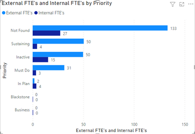
Hello I am trying to recreate this chart exactly how it is in EXCEL in Power BI. In EXCEL it just gives us the choice of this style of chart. Is there a simple method of doing it in Power BI? I have not been able to do it so far.
Solved! Go to Solution.
- Mark as New
- Bookmark
- Subscribe
- Mute
- Subscribe to RSS Feed
- Permalink
- Report Inappropriate Content
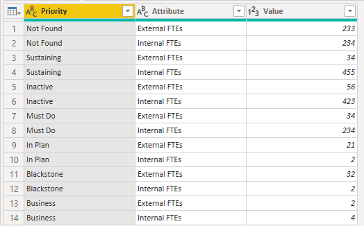
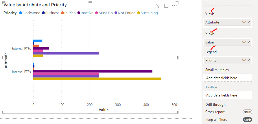
Hi Walker - Your data table needs to be reformatted. To render the visualization you want in Power BI, start to think about the structure of your data models and tables: e.g., row values which can be referenced on axes, etc.
As such, if you're loading the dataset into PowerQuery in the exact same format as the table above, it needs to be unpivoted to render the view you want.
So, try right-clicking on the "Priority" column in the PowerQuery Editor and select "Unpivot Other Columns" so that the two FTE column headers are transformed as values in rows. Once the FTE designations are listed in the data table as values in the "Attribute" column, they can be dropped into the Y-Axis on the Clustered Bar Chart, with the figures in Value being on the X-Axis and the data being broken out by the Priority types in the Legend.
- Mark as New
- Bookmark
- Subscribe
- Mute
- Subscribe to RSS Feed
- Permalink
- Report Inappropriate Content
Hey @walker8888 ,
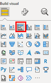
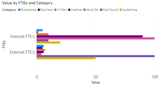
you can do that with the clustered bar chart:
Here a quick trial with similar data than yours:
If you need any help please let me know.
If I answered your question I would be happy if you could mark my post as a solution ✔️ and give it a thumbs up 👍
Best regards
Denis
Blog: WhatTheFact.bi
Follow me: twitter.com/DenSelimovic
- Mark as New
- Bookmark
- Subscribe
- Mute
- Subscribe to RSS Feed
- Permalink
- Report Inappropriate Content
Or this
- Mark as New
- Bookmark
- Subscribe
- Mute
- Subscribe to RSS Feed
- Permalink
- Report Inappropriate Content
@walker8888 - You can't render the view you want without unpivoting the FTE columns in your dataset in PowerQuery. Do this first and reference the unpivoited Attribute of FTE types in the Y-Axis.
- Mark as New
- Bookmark
- Subscribe
- Mute
- Subscribe to RSS Feed
- Permalink
- Report Inappropriate Content
Ok, I will give that a try
- Mark as New
- Bookmark
- Subscribe
- Mute
- Subscribe to RSS Feed
- Permalink
- Report Inappropriate Content
@selimovd - Just telling him to use a clustered bar chart with some screengrabs isn't an actual solution, and more importantly, it teaches him nothing he can subsequently apply to other data transformation or visualization challenges he may encounter.
The data in its current formatted table cannot be rendered in the desired visualization without unpivoting the FTE columns in Power Query first.
- Mark as New
- Bookmark
- Subscribe
- Mute
- Subscribe to RSS Feed
- Permalink
- Report Inappropriate Content
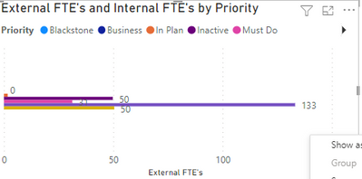
How did you do that. When I try that it does not split the External FTE and Internal FTE. It gives me something like this
- Mark as New
- Bookmark
- Subscribe
- Mute
- Subscribe to RSS Feed
- Permalink
- Report Inappropriate Content
Hi Walker - Your data table needs to be reformatted. To render the visualization you want in Power BI, start to think about the structure of your data models and tables: e.g., row values which can be referenced on axes, etc.
As such, if you're loading the dataset into PowerQuery in the exact same format as the table above, it needs to be unpivoted to render the view you want.
So, try right-clicking on the "Priority" column in the PowerQuery Editor and select "Unpivot Other Columns" so that the two FTE column headers are transformed as values in rows. Once the FTE designations are listed in the data table as values in the "Attribute" column, they can be dropped into the Y-Axis on the Clustered Bar Chart, with the figures in Value being on the X-Axis and the data being broken out by the Priority types in the Legend.
- Mark as New
- Bookmark
- Subscribe
- Mute
- Subscribe to RSS Feed
- Permalink
- Report Inappropriate Content
- Mark as New
- Bookmark
- Subscribe
- Mute
- Subscribe to RSS Feed
- Permalink
- Report Inappropriate Content
Thanks, @walker8888 - If you could, please mark this post as a solution for others to reference.

