FabCon is coming to Atlanta
Join us at FabCon Atlanta from March 16 - 20, 2026, for the ultimate Fabric, Power BI, AI and SQL community-led event. Save $200 with code FABCOMM.
Register now!- Power BI forums
- Get Help with Power BI
- Desktop
- Service
- Report Server
- Power Query
- Mobile Apps
- Developer
- DAX Commands and Tips
- Custom Visuals Development Discussion
- Health and Life Sciences
- Power BI Spanish forums
- Translated Spanish Desktop
- Training and Consulting
- Instructor Led Training
- Dashboard in a Day for Women, by Women
- Galleries
- Data Stories Gallery
- Themes Gallery
- Contests Gallery
- QuickViz Gallery
- Quick Measures Gallery
- Visual Calculations Gallery
- Notebook Gallery
- Translytical Task Flow Gallery
- TMDL Gallery
- R Script Showcase
- Webinars and Video Gallery
- Ideas
- Custom Visuals Ideas (read-only)
- Issues
- Issues
- Events
- Upcoming Events
The Power BI Data Visualization World Championships is back! Get ahead of the game and start preparing now! Learn more
- Power BI forums
- Forums
- Get Help with Power BI
- Desktop
- Creating a Bar Graph with Main Groups and Their Su...
- Subscribe to RSS Feed
- Mark Topic as New
- Mark Topic as Read
- Float this Topic for Current User
- Bookmark
- Subscribe
- Printer Friendly Page
- Mark as New
- Bookmark
- Subscribe
- Mute
- Subscribe to RSS Feed
- Permalink
- Report Inappropriate Content
Creating a Bar Graph with Main Groups and Their Sub Groups
Hi all,
I need to calculate total sales figures for each main sales group. One main sales group has three sub groups within it. I need to show each sub groups numbers as well as the main group's total within one bar chart.
Is this possible?
Here is a data sample. In theory, the bar graph should show Group 3 with the most sales (1260) with subgroup 3.3 in second, etc.
I have an issue when grouping the groups and subgroups, the graph looks messy.
Group Sales
1 100
2 200
3 300
3.1 310 <-- subgroup
3.2 320 <-- subgroup
3.3 330 <-- subgroup
Thank you
Solved! Go to Solution.
- Mark as New
- Bookmark
- Subscribe
- Mute
- Subscribe to RSS Feed
- Permalink
- Report Inappropriate Content
Hi @Bridgewater,
If your problem is answered appropriately, welcome to share your solution or mark the right reply as answer. More people will benefit from here.
Best Regards,
Angelia
- Mark as New
- Bookmark
- Subscribe
- Mute
- Subscribe to RSS Feed
- Permalink
- Report Inappropriate Content
Hi @Bridgewater,
I create the sample table in my Power Bi desktop, and get expected result, please review the following steps.
1. Create a new calculated column to display the Gruop, the original group shows the sub-group.
Group = LEFT(Table6[Sub-Group],1)
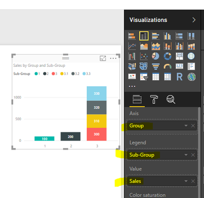
2. Create a Stacked column chart, select the Group as Axis, the sub-group as Legend, Sales as value. You will get the following result.
Best Regards,
Angelia
- Mark as New
- Bookmark
- Subscribe
- Mute
- Subscribe to RSS Feed
- Permalink
- Report Inappropriate Content
@v-huizhn-msft Thank you so much for that help!
Separating the Main Groups and Sub Groups into different colums helped.
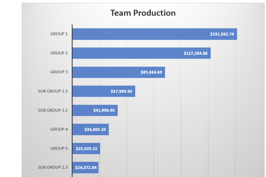
One more question. Is it possible to do what you did, but also have the subgroups as their own bar? Below is what I'm trying to acheive ultimately. This was done in excel and transfered to a word doc but it is way too time consuming, hence why I'm trying to use PBI for this. In this example, the dollar numbers aren't necessarily important, only that Group 2 is the combined value of Sub Group 2.1, 2.2, and 2.3. Those subgroups also have their own bar.
Thank you again
- Mark as New
- Bookmark
- Subscribe
- Mute
- Subscribe to RSS Feed
- Permalink
- Report Inappropriate Content
Hi @Bridgewater,
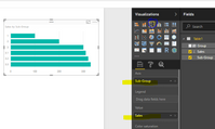
Yes, you can create a clustered bar chart and select the sub-group as X-axis, the sales as value, please see more details in the screenshot below.
Best Regards,
Angelia
- Mark as New
- Bookmark
- Subscribe
- Mute
- Subscribe to RSS Feed
- Permalink
- Report Inappropriate Content
Hi @Bridgewater,
If your problem is answered appropriately, welcome to share your solution or mark the right reply as answer. More people will benefit from here.
Best Regards,
Angelia
Helpful resources

Power BI Dataviz World Championships
The Power BI Data Visualization World Championships is back! Get ahead of the game and start preparing now!

| User | Count |
|---|---|
| 41 | |
| 39 | |
| 37 | |
| 29 | |
| 24 |
| User | Count |
|---|---|
| 122 | |
| 111 | |
| 83 | |
| 69 | |
| 68 |


