A new Data Days event is coming soon!
This time we’re going bigger than ever. Fabric, Power BI, SQL, AI and more. We're covering it all. You won't want to miss it.
Learn more- Power BI forums
- Get Help with Power BI
- Desktop
- Service
- Report Server
- Power Query
- Mobile Apps
- Developer
- DAX Commands and Tips
- Custom Visuals Development Discussion
- Health and Life Sciences
- Power BI Spanish forums
- Translated Spanish Desktop
- Training and Consulting
- Instructor Led Training
- Dashboard in a Day for Women, by Women
- Galleries
- Data Stories Gallery
- Themes Gallery
- Contests Gallery
- QuickViz Gallery
- Quick Measures Gallery
- Visual Calculations Gallery
- Notebook Gallery
- Translytical Task Flow Gallery
- TMDL Gallery
- R Script Showcase
- Webinars and Video Gallery
- Ideas
- Custom Visuals Ideas (read-only)
- Issues
- Issues
- Events
- Upcoming Events
Level up your Power BI skills this month - build one visual each week and tell better stories with data! Get started
- Power BI forums
- Forums
- Get Help with Power BI
- Desktop
- Creating Trends as a Visual
- Subscribe to RSS Feed
- Mark Topic as New
- Mark Topic as Read
- Float this Topic for Current User
- Bookmark
- Subscribe
- Printer Friendly Page
- Mark as New
- Bookmark
- Subscribe
- Mute
- Subscribe to RSS Feed
- Permalink
- Report Inappropriate Content
Creating Trends as a Visual
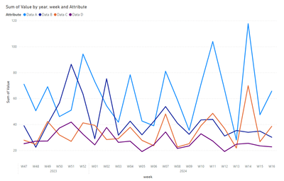
In a BI, I have generated a summary page, in which I show data, weekly and monthly of a time series, on that time series I calculate the 80th percentile. What I try to do is done automatically, in graphs, but I want to create somehow, that on that percentile select 8 data (the last 😎 and calculate a trend, indicate the trend, which in some cases, will be good or bad (sometimes positive and sometimes negative) marking 5%, 10%. The idea is to create it with two visual objects, one that shows the difference in % of the highest and lowest value of the series of 8 data and the other that shows an arrow with the characteristic of 5% orange, 10% red and if it improves more than 5% in green, as I say some values are good to decrease and others to increase.
Can you think of how to do it? It's giving me a lot of headaches.
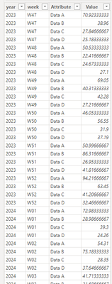
| year | week | given A | Data B | Data C | given D |
| 2023 | W47 | 70,92333333 | 38,96 | 27,84666667 | 25,18333333 |
| 2023 | W48 | 50,53333333 | 22,41666667 | 24,67333333 | 27,1 |
| 2023 | W49 | 69,05 | 40,31333333 | 42,28 | 27,21666667 |
| 2023 | W50 | 46,05333333 | 56,55 | 31,9 | 37,19 |
| 2023 | W51 | 50,99666667 | 86,31666667 | 26,95333333 | 41,81666667 |
| 2023 | W52 | 94,21666667 | 63,45 | 41,20666667 | 32,46666667 |
| 2024 | W01 | 72,98333333 | 28,98666667 | 39,3 | 24,26 |
| 2024 | W02 | 54,31 | 75,18333333 | 28,35 | 37,64666667 |
| 2024 | W03 | 41,71333333 | 31,68666667 | 29,08333333 | 26,2 |
| 2024 | W04 | 78,27 | 42,52333333 | 37,81666667 | 27,09333333 |
| 2024 | W05 | 42,63333333 | 32,01333333 | 27,74 | 19,08666667 |
| 2024 | W06 | 38,95333333 | 42,31333333 | 23,62 | 24,35666667 |
| 2024 | W07 | 80,97 | 53,76 | 48,02333333 | 34,18666667 |
| 2024 | W08 | 59,03333333 | 41,01666667 | 22,57666667 | 21,49 |
| 2024 | W09 | 35,45 | 32,39666667 | 25,17333333 | 23,4 |
| 2024 | W10 | 70,99333333 | 43,47 | 39,03666667 | 32,78333333 |
| 2024 | W11 | 103,91 | 43,89333333 | 48,54666667 | 27,20666667 |
| 2024 | W12 | 66,77 | 31,10666667 | 36,86333333 | 19,11666667 |
| 2024 | W13 | 28,02666667 | 35,32666667 | 21,86 | 24,75 |
| 2024 | W14 | 117,67 | 33,95 | 69,88666667 | 25,45 |
| 2024 | W15 | 47,46666667 | 34,82 | 26,68666667 | 23,47 |
| 2024 | W16 | 65,64333333 | 30,15333333 | 38,54 | 22,74333333 |
Thanks in advance.
- Mark as New
- Bookmark
- Subscribe
- Mute
- Subscribe to RSS Feed
- Permalink
- Report Inappropriate Content
Good afternoon, It would be something similar to this composition: The arrow would be the calculation of the hypothetical trend line with the values of the percentile (which BI calculates when filtering, of the P80, I have the raw data) positive or negative and the data would be the percentage of difference between those values.
Thank you
- Mark as New
- Bookmark
- Subscribe
- Mute
- Subscribe to RSS Feed
- Permalink
- Report Inappropriate Content
Helpful resources

Power BI Monthly Update - April 2026
Check out the April 2026 Power BI update to learn about new features.

Data Days 2026 coming soon!
Sign up to receive a private message when registration opens and key events begin.

New to Fabric Survey
If you have recently started exploring Fabric, we'd love to hear how it's going. Your feedback can help with product improvements.

| User | Count |
|---|---|
| 35 | |
| 27 | |
| 26 | |
| 22 | |
| 18 |
| User | Count |
|---|---|
| 66 | |
| 36 | |
| 32 | |
| 26 | |
| 23 |


