Fabric Data Days starts November 4th!
Advance your Data & AI career with 50 days of live learning, dataviz contests, hands-on challenges, study groups & certifications and more!
Get registered- Power BI forums
- Get Help with Power BI
- Desktop
- Service
- Report Server
- Power Query
- Mobile Apps
- Developer
- DAX Commands and Tips
- Custom Visuals Development Discussion
- Health and Life Sciences
- Power BI Spanish forums
- Translated Spanish Desktop
- Training and Consulting
- Instructor Led Training
- Dashboard in a Day for Women, by Women
- Galleries
- Data Stories Gallery
- Themes Gallery
- Contests Gallery
- QuickViz Gallery
- Quick Measures Gallery
- Visual Calculations Gallery
- Notebook Gallery
- Translytical Task Flow Gallery
- TMDL Gallery
- R Script Showcase
- Webinars and Video Gallery
- Ideas
- Custom Visuals Ideas (read-only)
- Issues
- Issues
- Events
- Upcoming Events
Get Fabric Certified for FREE during Fabric Data Days. Don't miss your chance! Request now
- Power BI forums
- Forums
- Get Help with Power BI
- Desktop
- Creating Run chart with monthly cost data at multi...
- Subscribe to RSS Feed
- Mark Topic as New
- Mark Topic as Read
- Float this Topic for Current User
- Bookmark
- Subscribe
- Printer Friendly Page
- Mark as New
- Bookmark
- Subscribe
- Mute
- Subscribe to RSS Feed
- Permalink
- Report Inappropriate Content
Creating Run chart with monthly cost data at multiple locations
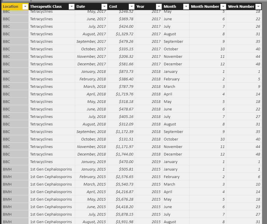
All, I am noobie trying to develop a "run chart" with cost data. Here is a screenshot of my data table below.
I have 4 seperate locations (BMH, BBC, BLH, BSH) that have monthly cost data that is reported by therapeutic class. My goal is to develop a run chart that can aggregate this data into a monthly total of all four locations with all the classes combined. So the goal would be a trend line with monthly data points and a second trend line with the cost "goal" as a flat line that trends by month up to the total.
Example: Say the cost of all sites per month is $100,000 in Jan $120,000 in Feb ect....and then have a trend line that averages 110,000 of cost each month which trends to a yearly goal of $1,320,000 ($110,000 x 12).
Can anyone help? Or point me to a reference? I am trying to learn
Solved! Go to Solution.
- Mark as New
- Bookmark
- Subscribe
- Mute
- Subscribe to RSS Feed
- Permalink
- Report Inappropriate Content
@warnera ,
You may try measure uising DAX below:
Average =
CALCULATE ( SUM ( Table[Cost] ), ALLEXCEPT ( Table, Table[Year] ) ) / 12
Community Support Team _ Jimmy Tao
If this post helps, then please consider Accept it as the solution to help the other members find it more quickly.
Helpful resources

Fabric Data Days
Advance your Data & AI career with 50 days of live learning, contests, hands-on challenges, study groups & certifications and more!

Power BI Monthly Update - October 2025
Check out the October 2025 Power BI update to learn about new features.


