FabCon is coming to Atlanta
Join us at FabCon Atlanta from March 16 - 20, 2026, for the ultimate Fabric, Power BI, AI and SQL community-led event. Save $200 with code FABCOMM.
Register now!- Power BI forums
- Get Help with Power BI
- Desktop
- Service
- Report Server
- Power Query
- Mobile Apps
- Developer
- DAX Commands and Tips
- Custom Visuals Development Discussion
- Health and Life Sciences
- Power BI Spanish forums
- Translated Spanish Desktop
- Training and Consulting
- Instructor Led Training
- Dashboard in a Day for Women, by Women
- Galleries
- Data Stories Gallery
- Themes Gallery
- Contests Gallery
- QuickViz Gallery
- Quick Measures Gallery
- Visual Calculations Gallery
- Notebook Gallery
- Translytical Task Flow Gallery
- TMDL Gallery
- R Script Showcase
- Webinars and Video Gallery
- Ideas
- Custom Visuals Ideas (read-only)
- Issues
- Issues
- Events
- Upcoming Events
Learn from the best! Meet the four finalists headed to the FINALS of the Power BI Dataviz World Championships! Register now
- Power BI forums
- Forums
- Get Help with Power BI
- Desktop
- Create two average lines in one graph chart
- Subscribe to RSS Feed
- Mark Topic as New
- Mark Topic as Read
- Float this Topic for Current User
- Bookmark
- Subscribe
- Printer Friendly Page
- Mark as New
- Bookmark
- Subscribe
- Mute
- Subscribe to RSS Feed
- Permalink
- Report Inappropriate Content
Create two average lines in one graph chart
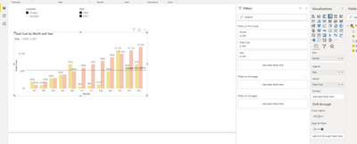
good day guys. i am struggling to have two average lines in a graph and it should be dynamic.
The average figure should be calculated based on same year. When i tick both years, the average line calculated as total cost frm 2020 to 2021 and divided by 24 mths. I wanted to have separate average lines.
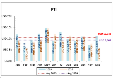
Eg: Average 2020 (calculated based on total cost of 2020 and divided by 12 mths)
Average 2021 (calculated based on total cost of 2021 and divided by 12 mths)
- Mark as New
- Bookmark
- Subscribe
- Mute
- Subscribe to RSS Feed
- Permalink
- Report Inappropriate Content
@Anonymous , if you are using staked line visual you need to two measures
you can have measure like
//Only year vs Year, not a level below
This Year = CALCULATE([Avg Measure],filter(ALL('Date'),'Date'[Year]=max('Date'[Year])))
Last Year = CALCULATE([Avg Measure],filter(ALL('Date'),'Date'[Year]=max('Date'[Year])-1))
- Mark as New
- Bookmark
- Subscribe
- Mute
- Subscribe to RSS Feed
- Permalink
- Report Inappropriate Content
Dear @amitchandak
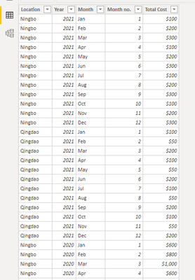
Thanks for the reply. My data is quite basic and straightforward.
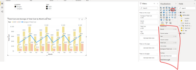
I was thinking to use line and clustered column chart. However, if i select default Average Total Cost, the line is kind of weird (2nd photo). i am wishing to have something like 3rd photo, showing 2 dotted average lines.
i am a beginner for this pbi and not familiar with DAX. Thanks to guide and advise.
below is line & clustered column chart
Helpful resources

Join our Fabric User Panel
Share feedback directly with Fabric product managers, participate in targeted research studies and influence the Fabric roadmap.

Power BI Monthly Update - February 2026
Check out the February 2026 Power BI update to learn about new features.

| User | Count |
|---|---|
| 52 | |
| 51 | |
| 35 | |
| 15 | |
| 14 |
| User | Count |
|---|---|
| 92 | |
| 75 | |
| 41 | |
| 26 | |
| 25 |


