Fabric Data Days starts November 4th!
Advance your Data & AI career with 50 days of live learning, dataviz contests, hands-on challenges, study groups & certifications and more!
Get registered- Power BI forums
- Get Help with Power BI
- Desktop
- Service
- Report Server
- Power Query
- Mobile Apps
- Developer
- DAX Commands and Tips
- Custom Visuals Development Discussion
- Health and Life Sciences
- Power BI Spanish forums
- Translated Spanish Desktop
- Training and Consulting
- Instructor Led Training
- Dashboard in a Day for Women, by Women
- Galleries
- Data Stories Gallery
- Themes Gallery
- Contests Gallery
- QuickViz Gallery
- Quick Measures Gallery
- Visual Calculations Gallery
- Notebook Gallery
- Translytical Task Flow Gallery
- TMDL Gallery
- R Script Showcase
- Webinars and Video Gallery
- Ideas
- Custom Visuals Ideas (read-only)
- Issues
- Issues
- Events
- Upcoming Events
Get Fabric Certified for FREE during Fabric Data Days. Don't miss your chance! Request now
- Power BI forums
- Forums
- Get Help with Power BI
- Desktop
- Re: Create two average lines in one graph chart
- Subscribe to RSS Feed
- Mark Topic as New
- Mark Topic as Read
- Float this Topic for Current User
- Bookmark
- Subscribe
- Printer Friendly Page
- Mark as New
- Bookmark
- Subscribe
- Mute
- Subscribe to RSS Feed
- Permalink
- Report Inappropriate Content
Create two average lines in one graph chart
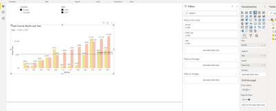
good day guys. i am struggling to have two average lines in a graph and it should be dynamic.
The average figure should be calculated based on same year. When i tick both years, the average line calculated as total cost frm 2020 to 2021 and divided by 24 mths. I wanted to have separate average lines.
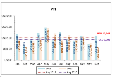
Eg: Average 2020 (calculated based on total cost of 2020 and divided by 12 mths)
Average 2021 (calculated based on total cost of 2021 and divided by 12 mths)
- Mark as New
- Bookmark
- Subscribe
- Mute
- Subscribe to RSS Feed
- Permalink
- Report Inappropriate Content
@Anonymous , if you are using staked line visual you need to two measures
you can have measure like
//Only year vs Year, not a level below
This Year = CALCULATE([Avg Measure],filter(ALL('Date'),'Date'[Year]=max('Date'[Year])))
Last Year = CALCULATE([Avg Measure],filter(ALL('Date'),'Date'[Year]=max('Date'[Year])-1))
- Mark as New
- Bookmark
- Subscribe
- Mute
- Subscribe to RSS Feed
- Permalink
- Report Inappropriate Content
Dear @amitchandak
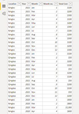
Thanks for the reply. My data is quite basic and straightforward.
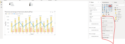
I was thinking to use line and clustered column chart. However, if i select default Average Total Cost, the line is kind of weird (2nd photo). i am wishing to have something like 3rd photo, showing 2 dotted average lines.
i am a beginner for this pbi and not familiar with DAX. Thanks to guide and advise.
below is line & clustered column chart
Helpful resources

Power BI Monthly Update - November 2025
Check out the November 2025 Power BI update to learn about new features.

Fabric Data Days
Advance your Data & AI career with 50 days of live learning, contests, hands-on challenges, study groups & certifications and more!


