Fabric Data Days starts November 4th!
Advance your Data & AI career with 50 days of live learning, dataviz contests, hands-on challenges, study groups & certifications and more!
Get registered- Power BI forums
- Get Help with Power BI
- Desktop
- Service
- Report Server
- Power Query
- Mobile Apps
- Developer
- DAX Commands and Tips
- Custom Visuals Development Discussion
- Health and Life Sciences
- Power BI Spanish forums
- Translated Spanish Desktop
- Training and Consulting
- Instructor Led Training
- Dashboard in a Day for Women, by Women
- Galleries
- Data Stories Gallery
- Themes Gallery
- Contests Gallery
- Quick Measures Gallery
- Visual Calculations Gallery
- Notebook Gallery
- Translytical Task Flow Gallery
- TMDL Gallery
- R Script Showcase
- Webinars and Video Gallery
- Ideas
- Custom Visuals Ideas (read-only)
- Issues
- Issues
- Events
- Upcoming Events
Join us at FabCon Atlanta from March 16 - 20, 2026, for the ultimate Fabric, Power BI, AI and SQL community-led event. Save $200 with code FABCOMM. Register now.
- Power BI forums
- Forums
- Get Help with Power BI
- Desktop
- Re: Create scatter chart with date on x axis
- Subscribe to RSS Feed
- Mark Topic as New
- Mark Topic as Read
- Float this Topic for Current User
- Bookmark
- Subscribe
- Printer Friendly Page
- Mark as New
- Bookmark
- Subscribe
- Mute
- Subscribe to RSS Feed
- Permalink
- Report Inappropriate Content
Create scatter chart with date on x axis
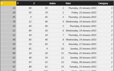
Hello I have got simple test data set:
I would like to create scatter chart I am used to do in R with plot (x,y).
I have got on problem
Chart is still aggregating values on x and y axis. I got over it by creating index column and using it in details.
But how to create chart when I want to use my Date column in x axis? (I do not want to create separate columns for day,month,quarter as it will show you only number in mousehover ).
My idea is to use directly date column to have 1-Jan, 2-Jan etc on x axis.
Is it possible? if yes, how?
Thanks
To have all
- Mark as New
- Bookmark
- Subscribe
- Mute
- Subscribe to RSS Feed
- Permalink
- Report Inappropriate Content
Hi @mstefancik
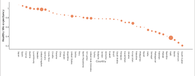
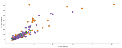
Here is Scatter Plot - Categorical X Axis chart which will help to get categorical variable on X-axis and on Y-axis with or without aggregating them( you can change it by summarizing or not summarizing them).

Download link for the custom visual file in this page
https://pbivizedit.com/gallery/scatter-plot-with-categorical-data
This was made with our Custom Visual creator tool PBIVizEdit.com. With this tool,
- anyone, irrespective of technical skills, can create their own visuals
- 15 minutes to create a visual from scratch
- opens up many additional attributes to edit (for e.g. labels, tooltips, legends position, etc)
Give this a shot and let us know if you face any problem/errors.
You can use the editor to modify your visual further (some modifications cannot be done in Power BI window and have to be in editor).
Thanks,
Team PBIVizEdit
- Mark as New
- Bookmark
- Subscribe
- Mute
- Subscribe to RSS Feed
- Permalink
- Report Inappropriate Content
You can set the display format of your date in the 'Modeling' ribbon menu under Data Format, to determine how the date will be displayed in visuals.
If your concern is the default date hierarchy that is generated when adding a date to an axis, you can choose to display just the date. Some reading on this feature.
- Mark as New
- Bookmark
- Subscribe
- Mute
- Subscribe to RSS Feed
- Permalink
- Report Inappropriate Content
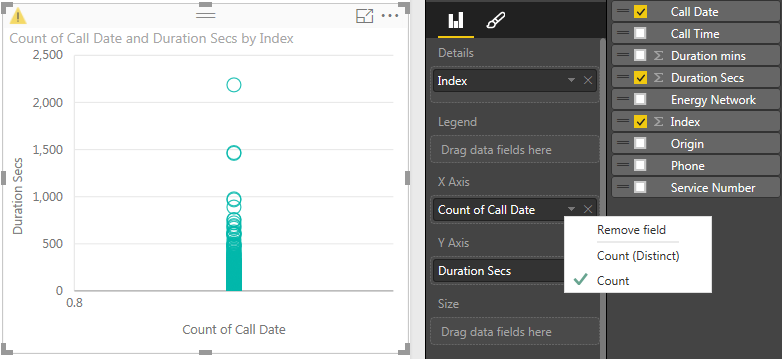
This sounds logical, but I'm running into the same problem. My date is formatted in the model and set to "Do not Summarize".
But on the X axis of the Scatter plot it shows as "Count of date". The only thing I can change is set it to distinct count. It does not show the date hierarchy either.
Any ideas?
- Mark as New
- Bookmark
- Subscribe
- Mute
- Subscribe to RSS Feed
- Permalink
- Report Inappropriate Content
For future searchers - another thread where this got covered: http://community.powerbi.com/t5/Desktop/Scatter-with-date-on-X-and-time-on-Y/m-p/19030
Helpful resources

FabCon Global Hackathon
Join the Fabric FabCon Global Hackathon—running virtually through Nov 3. Open to all skill levels. $10,000 in prizes!

Power BI Monthly Update - October 2025
Check out the October 2025 Power BI update to learn about new features.


