FabCon is coming to Atlanta
Join us at FabCon Atlanta from March 16 - 20, 2026, for the ultimate Fabric, Power BI, AI and SQL community-led event. Save $200 with code FABCOMM.
Register now!- Power BI forums
- Get Help with Power BI
- Desktop
- Service
- Report Server
- Power Query
- Mobile Apps
- Developer
- DAX Commands and Tips
- Custom Visuals Development Discussion
- Health and Life Sciences
- Power BI Spanish forums
- Translated Spanish Desktop
- Training and Consulting
- Instructor Led Training
- Dashboard in a Day for Women, by Women
- Galleries
- Data Stories Gallery
- Themes Gallery
- Contests Gallery
- QuickViz Gallery
- Quick Measures Gallery
- Visual Calculations Gallery
- Notebook Gallery
- Translytical Task Flow Gallery
- TMDL Gallery
- R Script Showcase
- Webinars and Video Gallery
- Ideas
- Custom Visuals Ideas (read-only)
- Issues
- Issues
- Events
- Upcoming Events
The Power BI Data Visualization World Championships is back! Get ahead of the game and start preparing now! Learn more
- Power BI forums
- Forums
- Get Help with Power BI
- Desktop
- Create calculated dimension field based on measure...
- Subscribe to RSS Feed
- Mark Topic as New
- Mark Topic as Read
- Float this Topic for Current User
- Bookmark
- Subscribe
- Printer Friendly Page
- Mark as New
- Bookmark
- Subscribe
- Mute
- Subscribe to RSS Feed
- Permalink
- Report Inappropriate Content
Create calculated dimension field based on measure value
Hi all
I want to show a Pie chart
Dimension=Utilization staus Measure = No of Emp Id
Ex:
when I select week= 2/8/2019
- AVG_384 is Fully Utilized (40+60= 100%)
- US_1 is Fully Utilized (70+15+5+10 =100%)
- US_2 is Partially Utilized (50%)
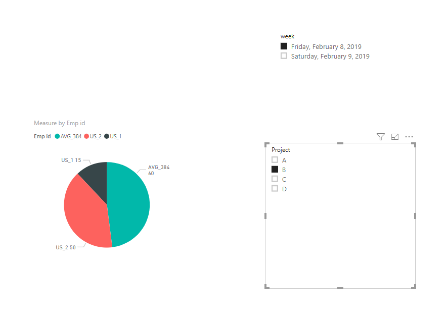
when I select week= 2/8/2019 and Project = B
- AVG_384 is Partially Utilized (60%)
- US_1 is Partially Utilized (15%)
- US_2 is Partially Utilized (50%)
How can i achive this logic?
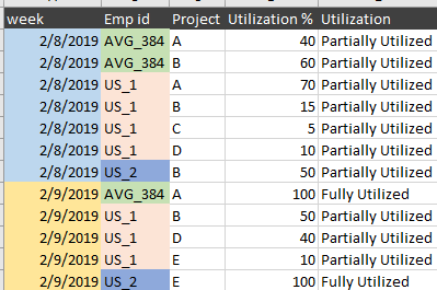
| week | Emp id | Project | Utilization % | Utilization |
| 2/8/2019 | AVG_384 | A | 40 | Partially Utilized |
| 2/8/2019 | AVG_384 | B | 60 | Partially Utilized |
| 2/8/2019 | US_1 | A | 70 | Partially Utilized |
| 2/8/2019 | US_1 | B | 15 | Partially Utilized |
| 2/8/2019 | US_1 | C | 5 | Partially Utilized |
| 2/8/2019 | US_1 | D | 10 | Partially Utilized |
| 2/8/2019 | US_2 | B | 50 | Partially Utilized |
| 2/9/2019 | AVG_384 | A | 100 | Fully Utilized |
| 2/9/2019 | US_1 | B | 50 | Partially Utilized |
| 2/9/2019 | US_1 | D | 40 | Partially Utilized |
| 2/9/2019 | US_1 | E | 10 | Partially Utilized |
| 2/9/2019 | US_2 | E | 100 | Fully Utilized |
Solved! Go to Solution.
- Mark as New
- Bookmark
- Subscribe
- Mute
- Subscribe to RSS Feed
- Permalink
- Report Inappropriate Content
Hi @Anonymous ,
Based on my test, you could refer to below steps:
Create below measure:
Measure = CALCULATE(SUM(Table1[Utilization %]),ALLSELECTED(Table1[Utilization]))
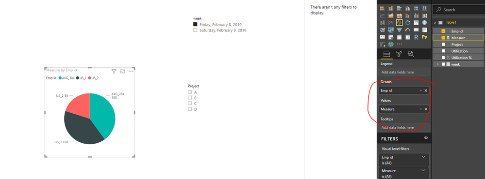
Create visual and add related fields, you could see the correct result:
You could also download the pbix file to have a view.
Regards,
Daniel He
If this post helps, then please consider Accept it as the solution to help the other members find it more quickly.
- Mark as New
- Bookmark
- Subscribe
- Mute
- Subscribe to RSS Feed
- Permalink
- Report Inappropriate Content
Thanks @v-danhe-msft
I tried, but I can't achieve my scenario
- when I select week= 2/8/2019
- Pie chart want to show Fully Utilize =2 and Partially Utilized=1
- when I select week= 2/8/2019 and Project = B
- Pie chart want to show Partially Utilized=3
- Mark as New
- Bookmark
- Subscribe
- Mute
- Subscribe to RSS Feed
- Permalink
- Report Inappropriate Content
Hi @Anonymous ,
Could you please tell me if your problem has been solved? If it is, could you please mark the helpful replies as Answered to close this topic?
Regards,
Daniel He
If this post helps, then please consider Accept it as the solution to help the other members find it more quickly.
- Mark as New
- Bookmark
- Subscribe
- Mute
- Subscribe to RSS Feed
- Permalink
- Report Inappropriate Content
Hi @Anonymous ,
I could not understand your former sentense:
when I select week= 2/8/2019
- AVG_384 is Fully Utilized (40+60= 100%)
- US_1 is Fully Utilized (70+15+5+10 =100%)
- US_2 is Partially Utilized (50%)
when I select week= 2/8/2019 and Project = B
- AVG_384 is Partially Utilized (60%)
- US_1 is Partially Utilized (15%)
- US_2 is Partially Utilized (50%)
It seemed correct with my pbix, could you have downloaded it? I am confused about your requirements:
- when I select week= 2/8/2019
- Pie chart want to show Fully Utilize =2 and Partially Utilized=1
- when I select week= 2/8/2019 and Project = B
Pie chart want to show Partially Utilized=3
Could you please post your desired result picture if possible?
Regards,
Daniel He
If this post helps, then please consider Accept it as the solution to help the other members find it more quickly.
- Mark as New
- Bookmark
- Subscribe
- Mute
- Subscribe to RSS Feed
- Permalink
- Report Inappropriate Content
Hi @Anonymous ,
Based on my test, you could refer to below steps:
Create below measure:
Measure = CALCULATE(SUM(Table1[Utilization %]),ALLSELECTED(Table1[Utilization]))
Create visual and add related fields, you could see the correct result:
You could also download the pbix file to have a view.
Regards,
Daniel He
If this post helps, then please consider Accept it as the solution to help the other members find it more quickly.
Helpful resources

Power BI Dataviz World Championships
The Power BI Data Visualization World Championships is back! Get ahead of the game and start preparing now!

| User | Count |
|---|---|
| 39 | |
| 37 | |
| 33 | |
| 32 | |
| 29 |
| User | Count |
|---|---|
| 132 | |
| 88 | |
| 82 | |
| 68 | |
| 64 |


