FabCon is coming to Atlanta
Join us at FabCon Atlanta from March 16 - 20, 2026, for the ultimate Fabric, Power BI, AI and SQL community-led event. Save $200 with code FABCOMM.
Register now!- Power BI forums
- Get Help with Power BI
- Desktop
- Service
- Report Server
- Power Query
- Mobile Apps
- Developer
- DAX Commands and Tips
- Custom Visuals Development Discussion
- Health and Life Sciences
- Power BI Spanish forums
- Translated Spanish Desktop
- Training and Consulting
- Instructor Led Training
- Dashboard in a Day for Women, by Women
- Galleries
- Data Stories Gallery
- Themes Gallery
- Contests Gallery
- QuickViz Gallery
- Quick Measures Gallery
- Visual Calculations Gallery
- Notebook Gallery
- Translytical Task Flow Gallery
- TMDL Gallery
- R Script Showcase
- Webinars and Video Gallery
- Ideas
- Custom Visuals Ideas (read-only)
- Issues
- Issues
- Events
- Upcoming Events
Get Fabric Certified for FREE during Fabric Data Days. Don't miss your chance! Request now
- Power BI forums
- Forums
- Get Help with Power BI
- Desktop
- Create an Average point on the x axis
- Subscribe to RSS Feed
- Mark Topic as New
- Mark Topic as Read
- Float this Topic for Current User
- Bookmark
- Subscribe
- Printer Friendly Page
- Mark as New
- Bookmark
- Subscribe
- Mute
- Subscribe to RSS Feed
- Permalink
- Report Inappropriate Content
Create an Average point on the x axis
HI, fairly new to PBI so forgive my ignorance.
I a clustered bar chart showing a waitinglist distribution. e.g 10 people waiting 1 week, 5 waiting 2 weeks, 6 waiting 3 weeks and so on.
I want to display the mean wait ( and median actually) on the chart - i.e. have a line coming up from the x axis to show where the average wait is.
Is this possible? if so - how??
cheers
- Mark as New
- Bookmark
- Subscribe
- Mute
- Subscribe to RSS Feed
- Permalink
- Report Inappropriate Content
Hello,
try this and create a measure = MEDIAN('Table'[Weeks])
it's what you want ?
- Mark as New
- Bookmark
- Subscribe
- Mute
- Subscribe to RSS Feed
- Permalink
- Report Inappropriate Content
ah, no I don't think so because my table is already cumulative. i.e.
WeeksWait , PeopleCount
1 10
2 5
3 6
4 3
I think what you suggest will only give me the average of either 1,2,3,4 or 10,5,6,3
- Mark as New
- Bookmark
- Subscribe
- Mute
- Subscribe to RSS Feed
- Permalink
- Report Inappropriate Content
Hi @SteveIOW ,
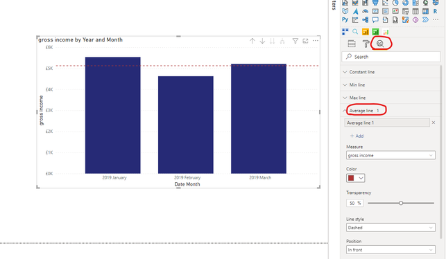
Not exactly sure on your question, but you can get an Avergae line plotted by using the following option on a clustered bar chart viusl in Power BI:
If this doesn't help add more details to your question:
https://community.powerbi.com/t5/Desktop/How-to-Get-Your-Question-Answered-Quickly/m-p/1447523
- Mark as New
- Bookmark
- Subscribe
- Mute
- Subscribe to RSS Feed
- Permalink
- Report Inappropriate Content
Thanks @Pragati11
I've used that function a few times. however in this example it will give me the average number of people waiting but what I actually need is the avergae wait time. i.e. the difference between (from the example above),
(10+5+2+6)/4 showing on the Y axis
and
(10*1 + 5*2 + 2*3 + 6*6)/23 showing on the X axis
- Mark as New
- Bookmark
- Subscribe
- Mute
- Subscribe to RSS Feed
- Permalink
- Report Inappropriate Content
HI @SteveIOW ,
In that case you can create two measures: (assuming you have number of waiting and Number of weeks as columns in your data:
Average Waiting = AVERAGE(yourTable[Number of Waiting]

Average Weeks = AVERAGE(yourTable[Number of Weeks]
Also I don't know what is the structure of your data, so see if above helps.
Then move these 2 measures to the Values section of your bar chart.
- Mark as New
- Bookmark
- Subscribe
- Mute
- Subscribe to RSS Feed
- Permalink
- Report Inappropriate Content
Cheers, but won't this just give me as below and displayed on the Y axis?
WeeksWait , PeopleCount
1 10
2 5
3 6
4 3
I think what you suggest will only give me the average of either 1,2,3,4 or 10,5,6,3
- Mark as New
- Bookmark
- Subscribe
- Mute
- Subscribe to RSS Feed
- Permalink
- Report Inappropriate Content
HI @SteveIOW ,
My suggestion is completly based on my assumptions as I don't know how your data structure is. Please share some screenshots and sample data to get your question answered.
https://community.powerbi.com/t5/Desktop/How-to-Get-Your-Question-Answered-Quickly/m-p/1447523
- Mark as New
- Bookmark
- Subscribe
- Mute
- Subscribe to RSS Feed
- Permalink
- Report Inappropriate Content
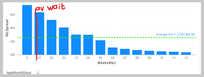
sorry - here goes...
The red av wait line is what I want. vertical Y axis shows how many people are waiting and horizontal x axis shows how long they have been waiting.
Data is structured in a table with number of waiters and length of wait. as per
WeeksWait , PeopleCount
1 10
2 5
3 6
4 3
Helpful resources

Power BI Monthly Update - November 2025
Check out the November 2025 Power BI update to learn about new features.

Fabric Data Days
Advance your Data & AI career with 50 days of live learning, contests, hands-on challenges, study groups & certifications and more!

| User | Count |
|---|---|
| 102 | |
| 79 | |
| 57 | |
| 51 | |
| 46 |


