FabCon is coming to Atlanta
Join us at FabCon Atlanta from March 16 - 20, 2026, for the ultimate Fabric, Power BI, AI and SQL community-led event. Save $200 with code FABCOMM.
Register now!- Power BI forums
- Get Help with Power BI
- Desktop
- Service
- Report Server
- Power Query
- Mobile Apps
- Developer
- DAX Commands and Tips
- Custom Visuals Development Discussion
- Health and Life Sciences
- Power BI Spanish forums
- Translated Spanish Desktop
- Training and Consulting
- Instructor Led Training
- Dashboard in a Day for Women, by Women
- Galleries
- Data Stories Gallery
- Themes Gallery
- Contests Gallery
- QuickViz Gallery
- Quick Measures Gallery
- Visual Calculations Gallery
- Notebook Gallery
- Translytical Task Flow Gallery
- TMDL Gallery
- R Script Showcase
- Webinars and Video Gallery
- Ideas
- Custom Visuals Ideas (read-only)
- Issues
- Issues
- Events
- Upcoming Events
Learn from the best! Meet the four finalists headed to the FINALS of the Power BI Dataviz World Championships! Register now
- Power BI forums
- Forums
- Get Help with Power BI
- Desktop
- Re: Create a waterfall chart
- Subscribe to RSS Feed
- Mark Topic as New
- Mark Topic as Read
- Float this Topic for Current User
- Bookmark
- Subscribe
- Printer Friendly Page
- Mark as New
- Bookmark
- Subscribe
- Mute
- Subscribe to RSS Feed
- Permalink
- Report Inappropriate Content
Create a waterfall chart
Dear All,
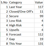
I would like to prepare the waterfall chart in power bi with the similar one prepared manually in PPT, with the simle data..
but when i try i'm coming up with the second chart results which is not the expected one.
Could someone help me to short out this one, i'm newly trying this waterfall method. Is it possible to get get the same result in power bi as we done in PPT.
Data:
Manual data presentation.
Using Power BI
Solved! Go to Solution.
- Mark as New
- Bookmark
- Subscribe
- Mute
- Subscribe to RSS Feed
- Permalink
- Report Inappropriate Content
Hi @nagoor ,
I'm afraid I can't achieve what you want with the default waterfall. Anyway, it's a good idea. You can submit a new idea. It is a place for customers provide feedback about Microsoft Office products . What's more, if feedback is high voted there by other customers, it will be promising that Microsoft Product Team will take it into consideration when designing the next version in the future.
Alternatively, you can refer to the documentation below to see if your needs can be implemented in R or Phython.
Create Power BI visuals using R - Power BI | Microsoft Learn
graph - R Waterfall chart x values - Stack Overflow
Create Power BI visuals using Python in Power BI Desktop - Power BI | Microsoft Learn
Best Regards
- Mark as New
- Bookmark
- Subscribe
- Mute
- Subscribe to RSS Feed
- Permalink
- Report Inappropriate Content
Much Appreciate for your response..
Let me try the way you suggested.
- Mark as New
- Bookmark
- Subscribe
- Mute
- Subscribe to RSS Feed
- Permalink
- Report Inappropriate Content
Helpful resources

Join our Fabric User Panel
Share feedback directly with Fabric product managers, participate in targeted research studies and influence the Fabric roadmap.

Power BI Monthly Update - February 2026
Check out the February 2026 Power BI update to learn about new features.

| User | Count |
|---|---|
| 52 | |
| 51 | |
| 35 | |
| 15 | |
| 14 |
| User | Count |
|---|---|
| 92 | |
| 75 | |
| 41 | |
| 26 | |
| 25 |


