FabCon is coming to Atlanta
Join us at FabCon Atlanta from March 16 - 20, 2026, for the ultimate Fabric, Power BI, AI and SQL community-led event. Save $200 with code FABCOMM.
Register now!- Power BI forums
- Get Help with Power BI
- Desktop
- Service
- Report Server
- Power Query
- Mobile Apps
- Developer
- DAX Commands and Tips
- Custom Visuals Development Discussion
- Health and Life Sciences
- Power BI Spanish forums
- Translated Spanish Desktop
- Training and Consulting
- Instructor Led Training
- Dashboard in a Day for Women, by Women
- Galleries
- Data Stories Gallery
- Themes Gallery
- Contests Gallery
- QuickViz Gallery
- Quick Measures Gallery
- Visual Calculations Gallery
- Notebook Gallery
- Translytical Task Flow Gallery
- TMDL Gallery
- R Script Showcase
- Webinars and Video Gallery
- Ideas
- Custom Visuals Ideas (read-only)
- Issues
- Issues
- Events
- Upcoming Events
The Power BI Data Visualization World Championships is back! Get ahead of the game and start preparing now! Learn more
- Power BI forums
- Forums
- Get Help with Power BI
- Desktop
- Re: Create a table to hold 2 Measures
- Subscribe to RSS Feed
- Mark Topic as New
- Mark Topic as Read
- Float this Topic for Current User
- Bookmark
- Subscribe
- Printer Friendly Page
- Mark as New
- Bookmark
- Subscribe
- Mute
- Subscribe to RSS Feed
- Permalink
- Report Inappropriate Content
Create a table to hold 2 Measures
Hi,
I'm trying to create a clustered bar chart where I have 10 measures. My intention is to have 2 of the measures grouped or stored in a table so that there will be spaces between each pair.
currently my bar chart looks like this:
Expected output for the bar chart
Each purple and green bar represents a measure. I'm trying to replicate this chart in PBI as it was originally created in excel.
- Mark as New
- Bookmark
- Subscribe
- Mute
- Subscribe to RSS Feed
- Permalink
- Report Inappropriate Content
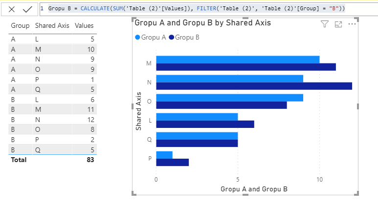
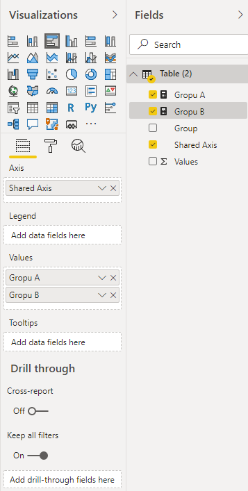
Try this useful trick... Most Charts in Power BI allow you to assign Multiple VALUES. Each of these Values will group together simular to what you were looking to make...
Create a Measure of one set of bars (let's say the Purple Lines in your example)


Please give Kudos or Mark as a Solution!
https://www.linkedin.com/in/forrest-hill-04480730/
Proud to give back to the community!
Thank You!
- Mark as New
- Bookmark
- Subscribe
- Mute
- Subscribe to RSS Feed
- Permalink
- Report Inappropriate Content
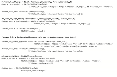
Hi @fhill , thanks for your response. Very much appreciated. What you illustrated is exactly what I intend to achieve. Like you mentioned, that I should create a measure of one set of bars (how do I accomplish that please?) Currently I have 10 measures that are dynamically calculated (all expressed in %) which I've created e.g. the measures are based on the calculation below.

- Mark as New
- Bookmark
- Subscribe
- Mute
- Subscribe to RSS Feed
- Permalink
- Report Inappropriate Content
In my example, the 2 Measures have filters of the source data that allow both sets of data to be displayed on the same chart without overlap (Legend).
It looks like your example measures are DIVIDING other measures? You'll need to post an example of your source data for us to help you with the actual Measure code.
Please give Kudos or Mark as a Solution!
https://www.linkedin.com/in/forrest-hill-04480730/
Proud to give back to the community!
Thank You!
- Mark as New
- Bookmark
- Subscribe
- Mute
- Subscribe to RSS Feed
- Permalink
- Report Inappropriate Content
- Mark as New
- Bookmark
- Subscribe
- Mute
- Subscribe to RSS Feed
- Permalink
- Report Inappropriate Content
@Emmy66 , Not very clear. Are you looking for measure slicer
measure slicer
https://radacad.com/change-the-column-or-measure-value-in-a-power-bi-visual-by-selection-of-the-slic...
https://community.powerbi.com/t5/Desktop/Slicer-MTD-QTD-YTD-to-filter-dates-using-the-slicer/td-p/50...
- Mark as New
- Bookmark
- Subscribe
- Mute
- Subscribe to RSS Feed
- Permalink
- Report Inappropriate Content
Hi @amitchandak , thanks for your reply. I'm not looking for a measure slicer. @fhill's response is what I intend to achieve. I hope it will guide you to understand my expected output.
Helpful resources

Power BI Dataviz World Championships
The Power BI Data Visualization World Championships is back! Get ahead of the game and start preparing now!

| User | Count |
|---|---|
| 38 | |
| 38 | |
| 37 | |
| 28 | |
| 28 |
| User | Count |
|---|---|
| 124 | |
| 89 | |
| 73 | |
| 66 | |
| 65 |


