Huge last-minute discounts for FabCon Vienna from September 15-18, 2025
Supplies are limited. Contact info@espc.tech right away to save your spot before the conference sells out.
Get your discount- Power BI forums
- Get Help with Power BI
- Desktop
- Service
- Report Server
- Power Query
- Mobile Apps
- Developer
- DAX Commands and Tips
- Custom Visuals Development Discussion
- Health and Life Sciences
- Power BI Spanish forums
- Translated Spanish Desktop
- Training and Consulting
- Instructor Led Training
- Dashboard in a Day for Women, by Women
- Galleries
- Data Stories Gallery
- Themes Gallery
- Contests Gallery
- Quick Measures Gallery
- Notebook Gallery
- Translytical Task Flow Gallery
- TMDL Gallery
- R Script Showcase
- Webinars and Video Gallery
- Ideas
- Custom Visuals Ideas (read-only)
- Issues
- Issues
- Events
- Upcoming Events
Score big with last-minute savings on the final tickets to FabCon Vienna. Secure your discount
- Power BI forums
- Forums
- Get Help with Power BI
- Desktop
- Create a Calculated Column from Different Tables
- Subscribe to RSS Feed
- Mark Topic as New
- Mark Topic as Read
- Float this Topic for Current User
- Bookmark
- Subscribe
- Printer Friendly Page
- Mark as New
- Bookmark
- Subscribe
- Mute
- Subscribe to RSS Feed
- Permalink
- Report Inappropriate Content
Create a Calculated Column from Different Tables
Hi Members,
I am new to power BI and need an help to build a visualization:
Below are my two tables :
| TestCases | ||
| ID | Title | Identifier |
| 1 | Title1 | x |
| 2 | Title2 | y |
| 3 | Title3 | x |
| 4 | Title4 | y |
| 5 | Title5 | x |
| CoveredTestCases | ||
| ID | Title | Identifier |
| 1 | Title1 | x |
| 2 | Title2 | x |
| 3 | Title3 | y |
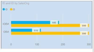
I want to build clustered bar chart based on identifier (x,y) as total (count of x,y in TestCases table) vs covered (count of x,y in CoveredTestCases table).
something like this as per below screen shot :
Looking forward your quick help here.
Thanks,
Rahul
Solved! Go to Solution.
- Mark as New
- Bookmark
- Subscribe
- Mute
- Subscribe to RSS Feed
- Permalink
- Report Inappropriate Content
Hi @Rahul66303,
Create an extra calculated table:
New Table1 =
UNION (
    SELECTCOLUMNS (
        TestCases,
        "TestCases", "TestCases",
        "Identifier", TestCases[Identifier]
    ),
    SELECTCOLUMNS (
        CoveredTestCases,
        "CoveredTestCases", "CoveredTestCases",
        "Identifier", CoveredTestCases[Identifier]
    )
)
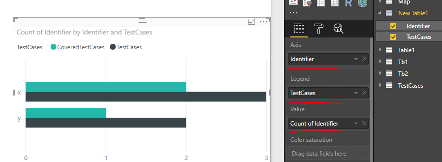
Drag corresponding fields from above table into bar chart visual.
Best regards,
Yuliana Gu
If this post helps, then please consider Accept it as the solution to help the other members find it more quickly.


