Fabric Data Days starts November 4th!
Advance your Data & AI career with 50 days of live learning, dataviz contests, hands-on challenges, study groups & certifications and more!
Get registered- Power BI forums
- Get Help with Power BI
- Desktop
- Service
- Report Server
- Power Query
- Mobile Apps
- Developer
- DAX Commands and Tips
- Custom Visuals Development Discussion
- Health and Life Sciences
- Power BI Spanish forums
- Translated Spanish Desktop
- Training and Consulting
- Instructor Led Training
- Dashboard in a Day for Women, by Women
- Galleries
- Data Stories Gallery
- Themes Gallery
- Contests Gallery
- Quick Measures Gallery
- Visual Calculations Gallery
- Notebook Gallery
- Translytical Task Flow Gallery
- TMDL Gallery
- R Script Showcase
- Webinars and Video Gallery
- Ideas
- Custom Visuals Ideas (read-only)
- Issues
- Issues
- Events
- Upcoming Events
Get Fabric Certified for FREE during Fabric Data Days. Don't miss your chance! Learn more
- Power BI forums
- Forums
- Get Help with Power BI
- Desktop
- Re: Create Your Own Custom Map for Power BI
- Subscribe to RSS Feed
- Mark Topic as New
- Mark Topic as Read
- Float this Topic for Current User
- Bookmark
- Subscribe
- Printer Friendly Page
- Mark as New
- Bookmark
- Subscribe
- Mute
- Subscribe to RSS Feed
- Permalink
- Report Inappropriate Content
Create Your Own Custom Map for Power BI
Hi, I’m sharing back with community here (I encourage you to do the same as you come across your own useful Power BI tips and recipes)
In this post, I will share how to create a custom map file to use in Power BI. To start out, add a Shape Map visual to a report in Power BI Desktop:
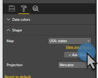
Once you add this visual you can pick from lots of included maps as well add your own custom map by clicking Add Map.
That's great, but “Where do I get custom maps or better yet how would I create my own map?” you may ask. Lots of organizations need custom maps for sales districts, service areas, and regions that don't always align nicely to states and zip codes.
How to create your own map
Let's walk through the steps to create your own custom maps using Google Maps and a couple open source tools. When we’re done, you will know how to make a professional looking map that works extremely well with Power BI.
Shape Maps in Power BI use a popular map file format called Topojson. I first encountered TopoJson when I worked as a D3.js developer. If you want to learn more about TopoJson/GeoJson you can go here.
TopoJson is a JSON file that can be quite complex and lengthy. While you could code one in notepad, that would be no fun at best.
Luckily Google Maps provides an on-line tool for creating your own custom maps.
Create a custom map in Google Maps
Go to Google Maps, open "Your Places", Maps, and click Create Map. Start drawing your own map over the area of the world you are interested in tracing. I won't go into the details on how to draw a map, but you will find it fairly intuitive and easy. Use the polygon tool to trace around your custom areas.
IMPORTANT:
To map data to your shapes in Power BI, you want to name your Polygons EXACTLY as they are in your data. For example, if in your data you have a [Region Name] field and it has a value of "Western Region", you want to name the Polygon shape you drew in Google Maps, "Western Region" if that's the field you will bind to your map's location property.
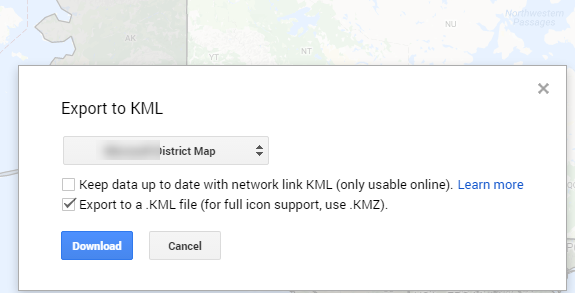
Once you have a saved map, Export to KML.
Pick your map layer instead of the "entire map" and check these options:
Click Download and Save.
Now that you have a KML file (another type of mapping file that is based on XML) we need to convert it to JSON. We must go through a couple of steps to get it into a format Power BI can use.
KML to GeoJson
You can use tools like https://mapbox.github.io/toGeoJson/ to convert KML to GeoJson. In this tool, you cut and paste the contents of your KML file into the KML window and you will get a GeoJson conversion on the right. Save the conversion to your workstation in a file with a .json extension.
GeoJson to TopoJson
We're not done yet. Now that you have a GeoJson file, you need to run this through a couple of conversions to get it to look nice and export to TopoJson. In this example, I'm focusing on getting a custom map of the United States projected as "USA Albers projection" which will, for display purposes, move Alaska and Hawaii and scale them so they can be easily viewed with the other 48 states.
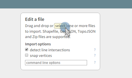
To do this we can use http://mapshaper.org.
Open your GeoJson file you just created.
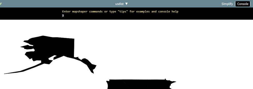
You should now see your custom map displayed.
Depending on your map, you need to do a couple of clean-ups before we're ready to save as TopoJson.
To clean up the file, you need to make sure the map is projected as WGS84. To do this, click the Console button (upper-right)
At the command prompt ($), enter the command -proj wgs84
If you want a map in Albers USA projection also enter -proj albersusa
If your shapes render as black, you may want to get a look at the boundaries before finishing. This command will do this for you.
-svg-style fill="white"
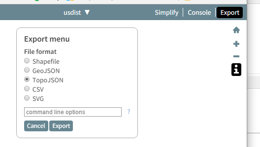
Finally, save the file as TopoJson by clicking export and selecting TopoJson.
Click Export and Save.
We're almost done. I swear!
Open your custom map in Power BI Desktop
Go back to Power BI Desktop and open your custom map in the format properties of a Shape Map visual
Select your previously created TopoJson file. You should now see your map! If you wish, you can play around with the different types of projections.
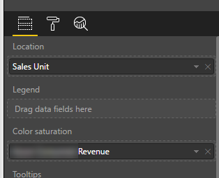
Last thing you need to do is bind data to your map. If you properly named your polygons in Google Maps, you should be able to assign your appropriate data field to the Location property of the map, and then assign a measure value to the color saturation.
At this point you should now be feeling like a B.I. rockstar and have a strong urge to show your boss the cool Power BI trick you just learned.
Enjoy and remember Power BI's Community is one of the main things that makes Power BI a great tool. Take a tip, leave a tip.
- Mark as New
- Bookmark
- Subscribe
- Mute
- Subscribe to RSS Feed
- Permalink
- Report Inappropriate Content
Does anyone know how, if possible, to make a, for example, store locator on my map, that is, for a customer to enter their zip code and show nearby customers?
- Mark as New
- Bookmark
- Subscribe
- Mute
- Subscribe to RSS Feed
- Permalink
- Report Inappropriate Content
@mjfulke THIS IS AMAZING! Thank you SO MUCH! My department uses "sibling counties" in our data sets and I could not find a way to get the counties to calculate together within a map, I searched high and low and finally found the right search words to find this thread. Followed your instructions step-by-step (even all these years later it was still spot on) and I now have a unique county configuration map that works specifically for my department!!
- Mark as New
- Bookmark
- Subscribe
- Mute
- Subscribe to RSS Feed
- Permalink
- Report Inappropriate Content
Please help point me in the right direction - anyone know how to achieve the below?
- Internal Floor Mapping –BI analytics of KPI, Financial and Operational information overlayed on internal floor plans.
- Quickly view data in a visual way – heatmaps over lists, a simplistic digital twin showing internal unit mapping.
- Likely require conversion of DWG or visual files into Shape files for linking with Power BI data sets for analysis.
Here is a sample floor plan:
Any suggestions/direction appreciated.
- Mark as New
- Bookmark
- Subscribe
- Mute
- Subscribe to RSS Feed
- Permalink
- Report Inappropriate Content
I have found this free tool will do exactly what you want here: https://okviz.com/blog/introducing-synoptic-panel-v1-4/
- Mark as New
- Bookmark
- Subscribe
- Mute
- Subscribe to RSS Feed
- Permalink
- Report Inappropriate Content
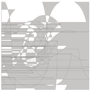
This is a very helpful post thank you! I went through the steps to make a map of Washington state as a test run but my end result was a bit off. My goal is to create a shape map of the United States including select territories but figured I should understand why the attached was my end result. It is a mercator projection but the other projections are just as confusing. Any advice as to why it looks like this would be appreciated.
- Mark as New
- Bookmark
- Subscribe
- Mute
- Subscribe to RSS Feed
- Permalink
- Report Inappropriate Content
Make sure to project the the file as -proj wgs84 in the mapshaper steps
- Mark as New
- Bookmark
- Subscribe
- Mute
- Subscribe to RSS Feed
- Permalink
- Report Inappropriate Content
Thank you.
for KML to GeoJson stage I have used this tool https://products.aspose.app/gis/conversion/kml-to-geojson - and it worked perfectly.
- Mark as New
- Bookmark
- Subscribe
- Mute
- Subscribe to RSS Feed
- Permalink
- Report Inappropriate Content
I have to achieve one functionality in a shape map in PBI, which I am not able to achieve. Request inputs if this is possible.
Problem: I have a shape map with state names for a country. Now these states are mapped into few clusters. So assuming we have 30 states in the country and these 30 states are mapped as 5 clusters. Now if i click on a particular state(s1) on the map, the expectation is that other related states(s2 & s6) in the cluster(s1 is in this cluster) should also be selected & highlighted.
Hope anyne can help me with this requirement.
- Mark as New
- Bookmark
- Subscribe
- Mute
- Subscribe to RSS Feed
- Permalink
- Report Inappropriate Content
So the Microsoft Shape Map is one level. There's a certifed visual https://appsource.microsoft.com/en-us/product/power-bi-visuals/WA104381044 that uses topojson files. I've used it successfully to map data from a US state down to the county level. This should help you out. Tip, host the topojson files on a public website like github.
- Mark as New
- Bookmark
- Subscribe
- Mute
- Subscribe to RSS Feed
- Permalink
- Report Inappropriate Content
This is a great post, thank you so much!
- Mark as New
- Bookmark
- Subscribe
- Mute
- Subscribe to RSS Feed
- Permalink
- Report Inappropriate Content
Thanks!
- Mark as New
- Bookmark
- Subscribe
- Mute
- Subscribe to RSS Feed
- Permalink
- Report Inappropriate Content
Thank you for a great how to descritiption. Only thing i cant figure out how to create labels with regions names and maybe data labels.. I tried to put a text box under the map but it disappears and there is no way to adjust transparency on the map visual. Is there a way to do it?
- Mark as New
- Bookmark
- Subscribe
- Mute
- Subscribe to RSS Feed
- Permalink
- Report Inappropriate Content
- Mark as New
- Bookmark
- Subscribe
- Mute
- Subscribe to RSS Feed
- Permalink
- Report Inappropriate Content
Almost there....
I can see the US county map in mapshaper
change to albersUSA in mapshaper
then export as TopoJSON
add to Shape map in Power BI
add matching field name to location
change to custom map and point to the new json file
then the map looks like all the shapes are STACKED on top of each other
if i try the equirectangular projection i can see the outline of the US and Alaska and Hawaii are in the correct location but all the boundaries are routing to the middle
Using the Mercator projection, all shapes are stacked
any ideas? i'm sooooo close 🙂
- Mark as New
- Bookmark
- Subscribe
- Mute
- Subscribe to RSS Feed
- Permalink
- Report Inappropriate Content
Success!
via trial and error I had to
- Mark as New
- Bookmark
- Subscribe
- Mute
- Subscribe to RSS Feed
- Permalink
- Report Inappropriate Content
- Mark as New
- Bookmark
- Subscribe
- Mute
- Subscribe to RSS Feed
- Permalink
- Report Inappropriate Content
Are you able to add another layer to these maps? My end goal is to have the UK postcode districts (which I have already created) and then to have certain points on this map (by longitude and latitude)? Any help or advice would be much appreciated.
- Mark as New
- Bookmark
- Subscribe
- Mute
- Subscribe to RSS Feed
- Permalink
- Report Inappropriate Content
Wow thank you so so much! I have been trying to find maps for the UK in PBI and I haven't had much success until now!! Thank you thank you thank you!!!!
- Mark as New
- Bookmark
- Subscribe
- Mute
- Subscribe to RSS Feed
- Permalink
- Report Inappropriate Content
Amazing post. great work. thanks for sharing.
I have been working on soemthing similar and have got to the point I want to try and build a custom map visual but don't know where to start.
In summary what I am trying to do is create a distance based circle from my data to show coverage from a centoid (chosen suburb). My data has a radius stored as Kilometers and I was hoping to use the size and buble visual, but it does not scale properly. It would be great if there was a switch to do this and take in to consideration the scale to size the circle on the map.
Here is a link to what I have done so far. My mapping Adventures in Power BI
Any suggestion on where to start building a custom map visual to show radius distance circles in Power BI, would be appreaciated
Cheers
John
- Mark as New
- Bookmark
- Subscribe
- Mute
- Subscribe to RSS Feed
- Permalink
- Report Inappropriate Content
Hi - great work! It seems to be working for me, i.e. the two test shapes I created appear and render fine........but there is no background map.........what am I missing?
Helpful resources

Fabric Data Days
Advance your Data & AI career with 50 days of live learning, contests, hands-on challenges, study groups & certifications and more!

Power BI Monthly Update - October 2025
Check out the October 2025 Power BI update to learn about new features.


