FabCon is coming to Atlanta
Join us at FabCon Atlanta from March 16 - 20, 2026, for the ultimate Fabric, Power BI, AI and SQL community-led event. Save $200 with code FABCOMM.
Register now!- Power BI forums
- Get Help with Power BI
- Desktop
- Service
- Report Server
- Power Query
- Mobile Apps
- Developer
- DAX Commands and Tips
- Custom Visuals Development Discussion
- Health and Life Sciences
- Power BI Spanish forums
- Translated Spanish Desktop
- Training and Consulting
- Instructor Led Training
- Dashboard in a Day for Women, by Women
- Galleries
- Data Stories Gallery
- Themes Gallery
- Contests Gallery
- Quick Measures Gallery
- Notebook Gallery
- Translytical Task Flow Gallery
- TMDL Gallery
- R Script Showcase
- Webinars and Video Gallery
- Ideas
- Custom Visuals Ideas (read-only)
- Issues
- Issues
- Events
- Upcoming Events
Calling all Data Engineers! Fabric Data Engineer (Exam DP-700) live sessions are back! Starting October 16th. Sign up.
- Power BI forums
- Forums
- Get Help with Power BI
- Desktop
- Create Multiple Heatmaps in Power BI
- Subscribe to RSS Feed
- Mark Topic as New
- Mark Topic as Read
- Float this Topic for Current User
- Bookmark
- Subscribe
- Printer Friendly Page
- Mark as New
- Bookmark
- Subscribe
- Mute
- Subscribe to RSS Feed
- Permalink
- Report Inappropriate Content
Create Multiple Heatmaps in Power BI
Hello,
I have a question regarding creation of heatmaps in Power BI.
Assume that I have a dataset with the following four columns:
date srcLocation dstLocation Value
The goals is to create heatmap for each date that is seen in the data. Here are the steps that I believe should be followed, and need some reference / help on either one:
1. Slice the data based on date, i.e. create a dataset for each unique date in the dataset
2. For each slice, transform the flat data into a matrix, i.e. column names should be srcLocation and row names should be destLocation and values should appear for each pair
3. Plot a heatmap that is sliced for each of the above matrices. Ideally, user can choose a date and see its heatmap.
Are there ways to achieve 1 and 2?
For 3, is the only way to create a visual in R? or does PBI have some heatmap visuals already?
Solved! Go to Solution.
- Mark as New
- Bookmark
- Subscribe
- Mute
- Subscribe to RSS Feed
- Permalink
- Report Inappropriate Content
Hi @Alkhos,
In your scenario, you can use Treemap to display values like the matrix, and place Date field within the slicer visual to filter Treemap data. See:
Best Regards,
Qiuyun Yu
If this post helps, then please consider Accept it as the solution to help the other members find it more quickly.
- Mark as New
- Bookmark
- Subscribe
- Mute
- Subscribe to RSS Feed
- Permalink
- Report Inappropriate Content
Hi @Alkhos,
1. Slice the data based on date, i.e. create a dataset for each unique date in the dataset
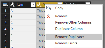
You can open Query Editor, right click the column [date] and select Remove Duplicates. Back to the report, place [date] in a slicer visual.
2. For each slice, transform the flat data into a matrix, i.e. column names should be srcLocation and row names should be destLocation and values should appear for each pair
You can just drag a matrix visual to the report page which has slicer visual, then place [srcLocation] in Columns and [destLocation] in Rows.
3. Plot a heatmap that is sliced for each of the above matrices. Ideally, user can choose a date and see its heatmap.
There is a custom visual named Table Heatmap, you can download from Visuals Gallery.
Best Regards,
Qiuyun Yu
If this post helps, then please consider Accept it as the solution to help the other members find it more quickly.
- Mark as New
- Bookmark
- Subscribe
- Mute
- Subscribe to RSS Feed
- Permalink
- Report Inappropriate Content
Thanks @v-qiuyu-msft,
Steps 1 and 2 seems trivial, but I am confused on how to pass the matrix to the heatmap.
Ideally, I want to pass a dataset with the format similar created in step 2 to the "Table Heatmap" visual that you mentioned; however, the matrix is in my visuals not in query editor. Is there a way to send back these matrices to the available data so that they can be consumed by step 3?
Thanks
Ali
- Mark as New
- Bookmark
- Subscribe
- Mute
- Subscribe to RSS Feed
- Permalink
- Report Inappropriate Content
Hi @Alkhos,
Can you share some sample data and expected data table? So that we can check whether we can achieve it in Query Editor.
Best Regards,
Qiuyun Yu
If this post helps, then please consider Accept it as the solution to help the other members find it more quickly.
- Mark as New
- Bookmark
- Subscribe
- Mute
- Subscribe to RSS Feed
- Permalink
- Report Inappropriate Content
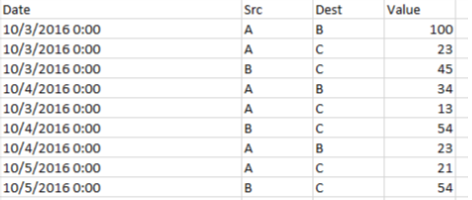
Here is some sample data:
So I deally I want to have a heatmap ( similar to the matrix visual ) that has src for the rows and dest for the columns and average of values for all dates at the intersection points ( actually if matrix visual had conditional formatting like the table, it would have done the trick ). Then I want to have a slicer that can be used to filter (avergae) data for (a) specific day(s)
Bests
Ali
- Mark as New
- Bookmark
- Subscribe
- Mute
- Subscribe to RSS Feed
- Permalink
- Report Inappropriate Content
Hi @Alkhos,
In your scenario, you can use Treemap to display values like the matrix, and place Date field within the slicer visual to filter Treemap data. See:
Best Regards,
Qiuyun Yu
If this post helps, then please consider Accept it as the solution to help the other members find it more quickly.
- Mark as New
- Bookmark
- Subscribe
- Mute
- Subscribe to RSS Feed
- Permalink
- Report Inappropriate Content
Hello,
I have a question regarding creation of heatmaps in Power BI.
Assume that I have a dataset with the following four columns:
date srcLocation dstLocation Value
The goals is to create heatmap for each date that is seen in the data. Here are the steps that I believe should be followed, and need some reference / help on either one:
1. Slice the data based on date, i.e. create a dataset for each unique date in the dataset
2. For each slice, transform the flat data into a matrix, i.e. column names should be srcLocation and row names should be destLocation and values should appear for each pair
3. Plot a heatmap that is sliced for each of the above matrices. Ideally, user can choose a date and see its heatmap.
Are there ways to achieve 1 and 2?
For 3, is the only way to create a visual in R? or does PBI have some heatmap visuals already?
Helpful resources

FabCon Global Hackathon
Join the Fabric FabCon Global Hackathon—running virtually through Nov 3. Open to all skill levels. $10,000 in prizes!

Power BI Monthly Update - September 2025
Check out the September 2025 Power BI update to learn about new features.


