FabCon is coming to Atlanta
Join us at FabCon Atlanta from March 16 - 20, 2026, for the ultimate Fabric, Power BI, AI and SQL community-led event. Save $200 with code FABCOMM.
Register now!- Power BI forums
- Get Help with Power BI
- Desktop
- Service
- Report Server
- Power Query
- Mobile Apps
- Developer
- DAX Commands and Tips
- Custom Visuals Development Discussion
- Health and Life Sciences
- Power BI Spanish forums
- Translated Spanish Desktop
- Training and Consulting
- Instructor Led Training
- Dashboard in a Day for Women, by Women
- Galleries
- Data Stories Gallery
- Themes Gallery
- Contests Gallery
- QuickViz Gallery
- Quick Measures Gallery
- Visual Calculations Gallery
- Notebook Gallery
- Translytical Task Flow Gallery
- TMDL Gallery
- R Script Showcase
- Webinars and Video Gallery
- Ideas
- Custom Visuals Ideas (read-only)
- Issues
- Issues
- Events
- Upcoming Events
The Power BI Data Visualization World Championships is back! Get ahead of the game and start preparing now! Learn more
- Power BI forums
- Forums
- Get Help with Power BI
- Desktop
- Create Custom Average Line In Line Chart ( to avoi...
- Subscribe to RSS Feed
- Mark Topic as New
- Mark Topic as Read
- Float this Topic for Current User
- Bookmark
- Subscribe
- Printer Friendly Page
- Mark as New
- Bookmark
- Subscribe
- Mute
- Subscribe to RSS Feed
- Permalink
- Report Inappropriate Content
Create Custom Average Line In Line Chart ( to avoid skewed value)
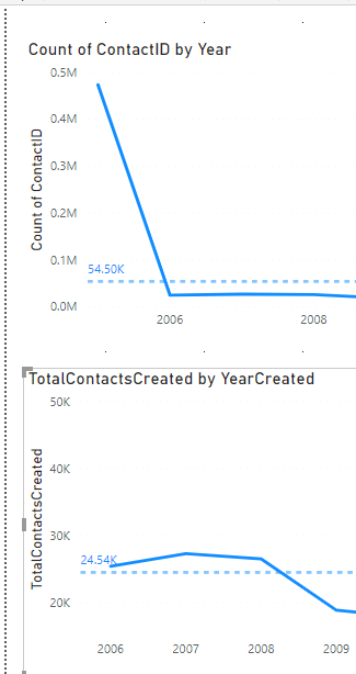
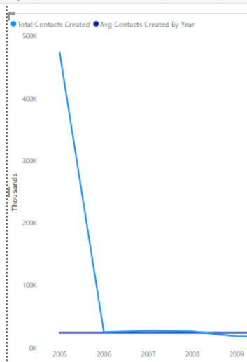
How can I create a custom Average Line? I am counting records created by year, but I don't want the average based on inclusion of the first year (2005). The average on the bottom is what i am aiming for , but it doesn't display the skewed value in the solid line, which i need to include.
Solved! Go to Solution.
- Mark as New
- Bookmark
- Subscribe
- Mute
- Subscribe to RSS Feed
- Permalink
- Report Inappropriate Content
Hello @Anonymous ,
You can create a new average measure using DAX as follows,
AverageMeasure = CALCULATE(AVERAGE(column_name),FILTER(table_name,tablename[year]<>2005))
- Mark as New
- Bookmark
- Subscribe
- Mute
- Subscribe to RSS Feed
- Permalink
- Report Inappropriate Content
Hello @Anonymous ,
You can create a new average measure using DAX as follows,
AverageMeasure = CALCULATE(AVERAGE(column_name),FILTER(table_name,tablename[year]<>2005))
- Mark as New
- Bookmark
- Subscribe
- Mute
- Subscribe to RSS Feed
- Permalink
- Report Inappropriate Content
Thanks @SriKandimalla , This helped me to see what I was doing wrong in how I implemented my dax expression. I also needed to implement as a calculated column instead of a measure to get the constant line on the chart. The only tradeoff of this custom way is that I can't format the line to show the average like I can using the analytics pane average line. Turning on the data label will show the average datapoint on all years.
Helpful resources

Power BI Dataviz World Championships
The Power BI Data Visualization World Championships is back! Get ahead of the game and start preparing now!

| User | Count |
|---|---|
| 155 | |
| 131 | |
| 115 | |
| 79 | |
| 54 |


