FabCon is coming to Atlanta
Join us at FabCon Atlanta from March 16 - 20, 2026, for the ultimate Fabric, Power BI, AI and SQL community-led event. Save $200 with code FABCOMM.
Register now!- Power BI forums
- Get Help with Power BI
- Desktop
- Service
- Report Server
- Power Query
- Mobile Apps
- Developer
- DAX Commands and Tips
- Custom Visuals Development Discussion
- Health and Life Sciences
- Power BI Spanish forums
- Translated Spanish Desktop
- Training and Consulting
- Instructor Led Training
- Dashboard in a Day for Women, by Women
- Galleries
- Data Stories Gallery
- Themes Gallery
- Contests Gallery
- QuickViz Gallery
- Quick Measures Gallery
- Visual Calculations Gallery
- Notebook Gallery
- Translytical Task Flow Gallery
- TMDL Gallery
- R Script Showcase
- Webinars and Video Gallery
- Ideas
- Custom Visuals Ideas (read-only)
- Issues
- Issues
- Events
- Upcoming Events
The Power BI Data Visualization World Championships is back! Get ahead of the game and start preparing now! Learn more
- Power BI forums
- Forums
- Get Help with Power BI
- Desktop
- Count unique strings in column containing list of ...
- Subscribe to RSS Feed
- Mark Topic as New
- Mark Topic as Read
- Float this Topic for Current User
- Bookmark
- Subscribe
- Printer Friendly Page
- Mark as New
- Bookmark
- Subscribe
- Mute
- Subscribe to RSS Feed
- Permalink
- Report Inappropriate Content
Count unique strings in column containing list of strings
I have data like the following:
| Timestamp | Subscriptions |
| 2020-06-11 | sub1, sub2 |
| 2020-06-11 | sub2, sub3 |
| 2020-06-12 | sub5, sub6 |
| 2020-06-12 | sub5 |
I'd like to be able to plot a chart which shows the number of unique subscriptions at each time stamp. So for timestamp 2020-06-11, the value would be 3, and for timestamp 2020-06-12, the value would be 2. Is this possible?
Solved! Go to Solution.
- Mark as New
- Bookmark
- Subscribe
- Mute
- Subscribe to RSS Feed
- Permalink
- Report Inappropriate Content
Hi @gopalv ,
Based on the requirements you have posted, i think you will need to get your table in the correct format.
For calculating it only once, you can create a CC

- Mark as New
- Bookmark
- Subscribe
- Mute
- Subscribe to RSS Feed
- Permalink
- Report Inappropriate Content
Hi @gopalv ,
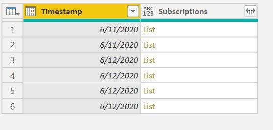
You can use Power Query
let
Source = Table.FromRows(Json.Document(Binary.Decompress(Binary.FromText("i45WMjIwMtA1MNM1NFTSUSouTTLUUQCSRkqxOphyRmA5Y1Q5I4icKVjODLscCaImSrGxAA==", BinaryEncoding.Base64), Compression.Deflate)), let _t = ((type nullable text) meta [Serialized.Text = true]) in type table [Timestamp = _t, #"(blank)" = _t]),
#"Changed Type" = Table.TransformColumnTypes(Source,{{"Timestamp", type date}, {"(blank)", type text}}),
#"Renamed Columns" = Table.RenameColumns(#"Changed Type",{{"(blank)", "Subscriptions"}}),
SplittedCol = Table.TransformColumns(#"Renamed Columns",{{"Subscriptions", each Text.Split(_,",")}}),
#"Expanded Subscriptions" = Table.ExpandListColumn(SplittedCol, "Subscriptions"),
#"Trimmed Text" = Table.TransformColumns(#"Expanded Subscriptions",{{"Subscriptions", Text.Trim, type text}})
in
#"Trimmed Text"
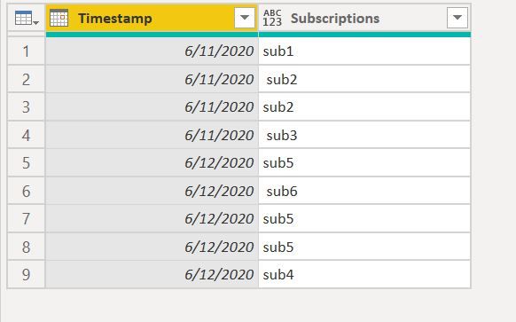
Original Table : Have Added some Values
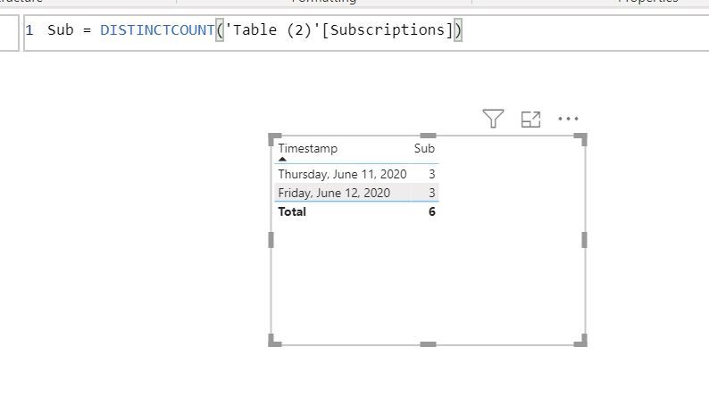
Create a simple measure
Regards,
Harsh Nathani
Did I answer your question? Mark my post as a solution! Appreciate with a Kudos!! (Click the Thumbs Up Button)
- Mark as New
- Bookmark
- Subscribe
- Mute
- Subscribe to RSS Feed
- Permalink
- Report Inappropriate Content
Hi @gopalv ,
You can also use this code in Power Query
let
Source = Table.FromRows(Json.Document(Binary.Decompress(Binary.FromText("i45WMjIwMtA1MNM1NFTSUSouTTLUUQCSRkqxOphyRmA5Y1Q5I4icKVjODLscCaImSrGxAA==", BinaryEncoding.Base64), Compression.Deflate)), let _t = ((type nullable text) meta [Serialized.Text = true]) in type table [Timestamp = _t, #"(blank)" = _t]),
#"Changed Type" = Table.TransformColumnTypes(Source,{{"Timestamp", type date}, {"(blank)", type text}}),
#"Renamed Columns" = Table.RenameColumns(#"Changed Type",{{"(blank)", "Subscriptions"}}),
#"Grouped Rows" = Table.Group(#"Renamed Columns", {"Timestamp"}, {{"a", each Text.Combine([Subscriptions], ", "), type text}}),
#"Renamed Columns1" = Table.RenameColumns(#"Grouped Rows",{{"a", "Combined"}}),
#"RemovedDuplicates" = Table.TransformColumns (#"Renamed Columns1",{{"Combined", each Text.Combine(List.Distinct(List.Transform(Text.Split(_,","), Text.Trim)),", ")}})
in
#"RemovedDuplicates"
Create a measure
- Mark as New
- Bookmark
- Subscribe
- Mute
- Subscribe to RSS Feed
- Permalink
- Report Inappropriate Content
- Mark as New
- Bookmark
- Subscribe
- Mute
- Subscribe to RSS Feed
- Permalink
- Report Inappropriate Content
In my example, I have multiple rows per timestamp. Would this code still work in that case?
- Mark as New
- Bookmark
- Subscribe
- Mute
- Subscribe to RSS Feed
- Permalink
- Report Inappropriate Content
Hi @gopalv ,
Yes, it will.
The first post.. Removes the delimiter and creates a new row for each time stamp and then does a DISTINCT COUNT.
The second post .. Combines the rows for a particular time stamp, then removes the duplicates and Counts the no. of words.
Regards,
Harsh Nathani
- Mark as New
- Bookmark
- Subscribe
- Mute
- Subscribe to RSS Feed
- Permalink
- Report Inappropriate Content
I'd prefer a DAX solution, if possible. The given DAX solution doesn't appear to be correct and the problem with splitting subscriptions in PowerQuery is that the resulting table ends up double- or triple-counting values in another column (not shown) that represent usage across all subscriptions at each timestamp.
For example, I start with:
| Timestamp | Subscriptions | Computetype | Usage (across all subscriptions) |
| 2020-06-11 | sub1, sub2 | Compute1 | 35 |
| 2020-06-11 | sub3, sub4 | Compute2 | 89 |
| 2020-06-12 | sub5, sub6 | Compute1 | 32 |
| 2020-06-12 | sub7, sub8 | Compute2 | 82 |
Your solution will give me a table that looks like:
| Timestamp | Subscription | Compute | Usage |
| 2020-06-11 | sub1 | Compute1 | 35 |
| 2020-06-11 | sub2 | Compute1 | 35 |
| 2020-06-11 | sub3 | Compute2 | 89 |
| 2020-06-11 | sub4 | Compute2 | 89 |
| ... | |||
| 2020-06-12 | sub8 | Compute2 | 82 |
Now, if I try to plot usage over time without any filters, I will suddenly have double as much usage at every time point.
- Mark as New
- Bookmark
- Subscribe
- Mute
- Subscribe to RSS Feed
- Permalink
- Report Inappropriate Content
Hi,
To plot usage over time, drag Year/Month from the Calendar Table and write this mwasure
=min(Data[Usage])
Hope this helps.
Regards,
Ashish Mathur
http://www.ashishmathur.com
https://www.linkedin.com/in/excelenthusiasts/
- Mark as New
- Bookmark
- Subscribe
- Mute
- Subscribe to RSS Feed
- Permalink
- Report Inappropriate Content
Hi @gopalv ,
Based on the requirements you have posted, i think you will need to get your table in the correct format.
For calculating it only once, you can create a CC

Helpful resources

Power BI Dataviz World Championships
The Power BI Data Visualization World Championships is back! Get ahead of the game and start preparing now!

Power BI Monthly Update - November 2025
Check out the November 2025 Power BI update to learn about new features.

| User | Count |
|---|---|
| 66 | |
| 44 | |
| 40 | |
| 29 | |
| 19 |
| User | Count |
|---|---|
| 200 | |
| 130 | |
| 102 | |
| 72 | |
| 55 |


