Join the #PBI10 DataViz contest
Power BI is turning 10, and we’re marking the occasion with a special community challenge. Use your creativity to tell a story, uncover trends, or highlight something unexpected.
Get started- Power BI forums
- Get Help with Power BI
- Desktop
- Service
- Report Server
- Power Query
- Mobile Apps
- Developer
- DAX Commands and Tips
- Custom Visuals Development Discussion
- Health and Life Sciences
- Power BI Spanish forums
- Translated Spanish Desktop
- Training and Consulting
- Instructor Led Training
- Dashboard in a Day for Women, by Women
- Galleries
- Webinars and Video Gallery
- Data Stories Gallery
- Themes Gallery
- Contests Gallery
- Quick Measures Gallery
- Notebook Gallery
- Translytical Task Flow Gallery
- R Script Showcase
- Ideas
- Custom Visuals Ideas (read-only)
- Issues
- Issues
- Events
- Upcoming Events
Join us for an expert-led overview of the tools and concepts you'll need to become a Certified Power BI Data Analyst and pass exam PL-300. Register now.
- Power BI forums
- Forums
- Get Help with Power BI
- Desktop
- Re: Count unique strings in column containing list...
- Subscribe to RSS Feed
- Mark Topic as New
- Mark Topic as Read
- Float this Topic for Current User
- Bookmark
- Subscribe
- Printer Friendly Page
- Mark as New
- Bookmark
- Subscribe
- Mute
- Subscribe to RSS Feed
- Permalink
- Report Inappropriate Content
Count unique strings in column containing list of strings
I have data like the following:
| Timestamp | Subscriptions |
| 2020-06-11 | sub1, sub2 |
| 2020-06-11 | sub2, sub3 |
| 2020-06-12 | sub5, sub6 |
| 2020-06-12 | sub5 |
I'd like to be able to plot a chart which shows the number of unique subscriptions at each time stamp. So for timestamp 2020-06-11, the value would be 3, and for timestamp 2020-06-12, the value would be 2. Is this possible?
Solved! Go to Solution.
- Mark as New
- Bookmark
- Subscribe
- Mute
- Subscribe to RSS Feed
- Permalink
- Report Inappropriate Content
Hi @gopalv ,
Based on the requirements you have posted, i think you will need to get your table in the correct format.
For calculating it only once, you can create a CC

- Mark as New
- Bookmark
- Subscribe
- Mute
- Subscribe to RSS Feed
- Permalink
- Report Inappropriate Content
Hi @gopalv ,
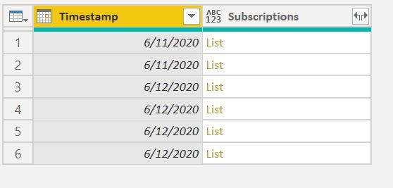
You can use Power Query
let
Source = Table.FromRows(Json.Document(Binary.Decompress(Binary.FromText("i45WMjIwMtA1MNM1NFTSUSouTTLUUQCSRkqxOphyRmA5Y1Q5I4icKVjODLscCaImSrGxAA==", BinaryEncoding.Base64), Compression.Deflate)), let _t = ((type nullable text) meta [Serialized.Text = true]) in type table [Timestamp = _t, #"(blank)" = _t]),
#"Changed Type" = Table.TransformColumnTypes(Source,{{"Timestamp", type date}, {"(blank)", type text}}),
#"Renamed Columns" = Table.RenameColumns(#"Changed Type",{{"(blank)", "Subscriptions"}}),
SplittedCol = Table.TransformColumns(#"Renamed Columns",{{"Subscriptions", each Text.Split(_,",")}}),
#"Expanded Subscriptions" = Table.ExpandListColumn(SplittedCol, "Subscriptions"),
#"Trimmed Text" = Table.TransformColumns(#"Expanded Subscriptions",{{"Subscriptions", Text.Trim, type text}})
in
#"Trimmed Text"
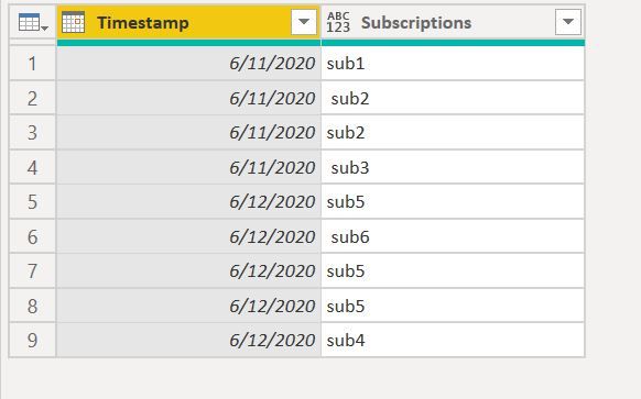
Original Table : Have Added some Values
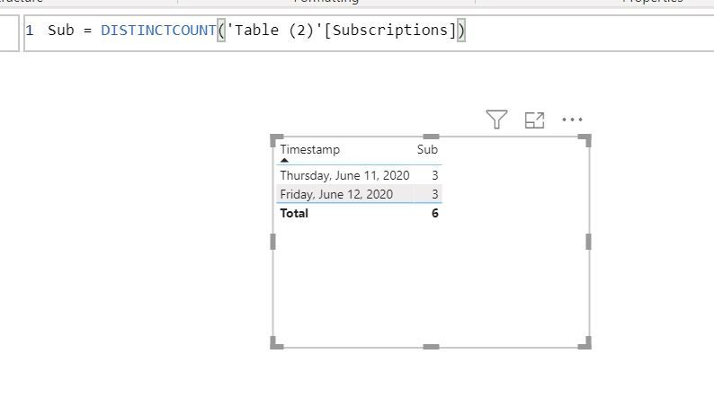
Create a simple measure
Regards,
Harsh Nathani
Did I answer your question? Mark my post as a solution! Appreciate with a Kudos!! (Click the Thumbs Up Button)
- Mark as New
- Bookmark
- Subscribe
- Mute
- Subscribe to RSS Feed
- Permalink
- Report Inappropriate Content
Hi @gopalv ,
You can also use this code in Power Query
let
Source = Table.FromRows(Json.Document(Binary.Decompress(Binary.FromText("i45WMjIwMtA1MNM1NFTSUSouTTLUUQCSRkqxOphyRmA5Y1Q5I4icKVjODLscCaImSrGxAA==", BinaryEncoding.Base64), Compression.Deflate)), let _t = ((type nullable text) meta [Serialized.Text = true]) in type table [Timestamp = _t, #"(blank)" = _t]),
#"Changed Type" = Table.TransformColumnTypes(Source,{{"Timestamp", type date}, {"(blank)", type text}}),
#"Renamed Columns" = Table.RenameColumns(#"Changed Type",{{"(blank)", "Subscriptions"}}),
#"Grouped Rows" = Table.Group(#"Renamed Columns", {"Timestamp"}, {{"a", each Text.Combine([Subscriptions], ", "), type text}}),
#"Renamed Columns1" = Table.RenameColumns(#"Grouped Rows",{{"a", "Combined"}}),
#"RemovedDuplicates" = Table.TransformColumns (#"Renamed Columns1",{{"Combined", each Text.Combine(List.Distinct(List.Transform(Text.Split(_,","), Text.Trim)),", ")}})
in
#"RemovedDuplicates"
Create a measure
- Mark as New
- Bookmark
- Subscribe
- Mute
- Subscribe to RSS Feed
- Permalink
- Report Inappropriate Content
- Mark as New
- Bookmark
- Subscribe
- Mute
- Subscribe to RSS Feed
- Permalink
- Report Inappropriate Content
In my example, I have multiple rows per timestamp. Would this code still work in that case?
- Mark as New
- Bookmark
- Subscribe
- Mute
- Subscribe to RSS Feed
- Permalink
- Report Inappropriate Content
Hi @gopalv ,
Yes, it will.
The first post.. Removes the delimiter and creates a new row for each time stamp and then does a DISTINCT COUNT.
The second post .. Combines the rows for a particular time stamp, then removes the duplicates and Counts the no. of words.
Regards,
Harsh Nathani
- Mark as New
- Bookmark
- Subscribe
- Mute
- Subscribe to RSS Feed
- Permalink
- Report Inappropriate Content
I'd prefer a DAX solution, if possible. The given DAX solution doesn't appear to be correct and the problem with splitting subscriptions in PowerQuery is that the resulting table ends up double- or triple-counting values in another column (not shown) that represent usage across all subscriptions at each timestamp.
For example, I start with:
| Timestamp | Subscriptions | Computetype | Usage (across all subscriptions) |
| 2020-06-11 | sub1, sub2 | Compute1 | 35 |
| 2020-06-11 | sub3, sub4 | Compute2 | 89 |
| 2020-06-12 | sub5, sub6 | Compute1 | 32 |
| 2020-06-12 | sub7, sub8 | Compute2 | 82 |
Your solution will give me a table that looks like:
| Timestamp | Subscription | Compute | Usage |
| 2020-06-11 | sub1 | Compute1 | 35 |
| 2020-06-11 | sub2 | Compute1 | 35 |
| 2020-06-11 | sub3 | Compute2 | 89 |
| 2020-06-11 | sub4 | Compute2 | 89 |
| ... | |||
| 2020-06-12 | sub8 | Compute2 | 82 |
Now, if I try to plot usage over time without any filters, I will suddenly have double as much usage at every time point.
- Mark as New
- Bookmark
- Subscribe
- Mute
- Subscribe to RSS Feed
- Permalink
- Report Inappropriate Content
Hi,
To plot usage over time, drag Year/Month from the Calendar Table and write this mwasure
=min(Data[Usage])
Hope this helps.
Regards,
Ashish Mathur
http://www.ashishmathur.com
https://www.linkedin.com/in/excelenthusiasts/
- Mark as New
- Bookmark
- Subscribe
- Mute
- Subscribe to RSS Feed
- Permalink
- Report Inappropriate Content
Hi @gopalv ,
Based on the requirements you have posted, i think you will need to get your table in the correct format.
For calculating it only once, you can create a CC

Helpful resources

Join our Fabric User Panel
This is your chance to engage directly with the engineering team behind Fabric and Power BI. Share your experiences and shape the future.

Power BI Monthly Update - June 2025
Check out the June 2025 Power BI update to learn about new features.

| User | Count |
|---|---|
| 72 | |
| 71 | |
| 57 | |
| 38 | |
| 36 |
| User | Count |
|---|---|
| 81 | |
| 67 | |
| 62 | |
| 46 | |
| 45 |


