FabCon is coming to Atlanta
Join us at FabCon Atlanta from March 16 - 20, 2026, for the ultimate Fabric, Power BI, AI and SQL community-led event. Save $200 with code FABCOMM.
Register now!- Power BI forums
- Get Help with Power BI
- Desktop
- Service
- Report Server
- Power Query
- Mobile Apps
- Developer
- DAX Commands and Tips
- Custom Visuals Development Discussion
- Health and Life Sciences
- Power BI Spanish forums
- Translated Spanish Desktop
- Training and Consulting
- Instructor Led Training
- Dashboard in a Day for Women, by Women
- Galleries
- Data Stories Gallery
- Themes Gallery
- Contests Gallery
- QuickViz Gallery
- Quick Measures Gallery
- Visual Calculations Gallery
- Notebook Gallery
- Translytical Task Flow Gallery
- TMDL Gallery
- R Script Showcase
- Webinars and Video Gallery
- Ideas
- Custom Visuals Ideas (read-only)
- Issues
- Issues
- Events
- Upcoming Events
View all the Fabric Data Days sessions on demand. View schedule
- Power BI forums
- Forums
- Get Help with Power BI
- Desktop
- Count based on Percentage Category
- Subscribe to RSS Feed
- Mark Topic as New
- Mark Topic as Read
- Float this Topic for Current User
- Bookmark
- Subscribe
- Printer Friendly Page
- Mark as New
- Bookmark
- Subscribe
- Mute
- Subscribe to RSS Feed
- Permalink
- Report Inappropriate Content
Count based on Percentage Category
Hi,
How should be go about to get the count of employees(distinct) in the below scenario.
| Activity | Emp | Budget hrs | hours |
| a | 1 | 2.5 | 2 |
| b | 1 | 2.5 | 2 |
| c | 1 | 2.5 | 2 |
| x | 2 | 3 | 1 |
| y | 2 | 3 | 1 |
Then I want to plot the count on a clustered bar chart...like below
For 2 employees:
Category (y-axis) 50% - 80% ----------> 1
30% - 49%-----------> 1
Thanks in advance for your time and efforts.
Regards,
David
Solved! Go to Solution.
- Mark as New
- Bookmark
- Subscribe
- Mute
- Subscribe to RSS Feed
- Permalink
- Report Inappropriate Content
Hi @vinaydavid ,
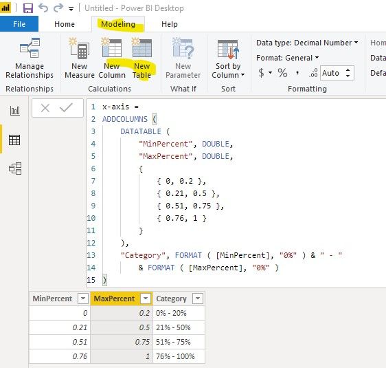
First of all, we need to create a calculated table as x-axis, you can change the value in this table to generate different category:
x-axis =
ADDCOLUMNS (
    DATATABLE (
        "MinPercent", DOUBLE,
        "MaxPercent", DOUBLE,
        {
            { 0, 0.2 },
            { 0.21, 0.5 },
            { 0.51, 0.75 },
            { 0.76, 1 }
        }
    ),
    "Category", FORMAT ( [MinPercent], "0%" ) & " - "
        & FORMAT ( [MaxPercent], "0%" )
)
Then we can create a measure as the value of this chart:
EmplyCount =
COUNTX (
    FILTER (
        SUMMARIZE (
            'Table',
            'Table'[Emp],
            "Percent", DIVIDE ( SUM ( 'Table'[hours] ), SUM ( 'Table'[Budget hrs] ), 0 )
        ),
        [Percent] > MAX ( 'x-axis'[MinPercent] )
            && [Percent] < MIN ( 'x-axis'[MaxPercent] )
    ),
    [Emp]
)
Best regards,
If this post helps, then please consider Accept it as the solution to help the other members find it more quickly.
- Mark as New
- Bookmark
- Subscribe
- Mute
- Subscribe to RSS Feed
- Permalink
- Report Inappropriate Content
The first part is easy. If you want a count distinct and lets say your table is called Employees, we can create a measure as bellow.
DistinctEmp = DISTINCTCOUNT(Employees[Emp])
I did not understand the second part of the question
- Mark as New
- Bookmark
- Subscribe
- Mute
- Subscribe to RSS Feed
- Permalink
- Report Inappropriate Content
Thanks for your reply,
2nd part,
Is to find the Productivity % of each employee (Hours/Budgeted hours - which I can do) and based on the % values, I need to categorize and show the count of employees falling in say, 0% - 20%, 21% - 50%, 51% - 75% & 76% - 100% in a bar chart.
Thanks!
- Mark as New
- Bookmark
- Subscribe
- Mute
- Subscribe to RSS Feed
- Permalink
- Report Inappropriate Content
Hi @vinaydavid ,
How about the result after you follow the suggestions mentioned in my original post?Could you please provide more details about it If it doesn't meet your requirement?
Best regards,
If this post helps, then please consider Accept it as the solution to help the other members find it more quickly.
Helpful resources

Power BI Monthly Update - November 2025
Check out the November 2025 Power BI update to learn about new features.

Fabric Data Days
Advance your Data & AI career with 50 days of live learning, contests, hands-on challenges, study groups & certifications and more!


