This is best Fabric, Power BI, SQL and AI community event. How do we know? The last event sold out! Save €200 with code FABCMTY200.
Register nowJuly 28 - August 9 | Final Round of the Power BI Dataviz World Championships. This is your chance. Learn more
Only recently started getting familiar with power bi i may have made a mistake in wading out into R scripting to soon. I'm hitting a wall with best (or even working) practice when i want to create a correlation matrix.
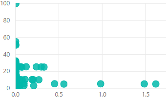
The picture on the left is basically the scatter chart i want to evaluate
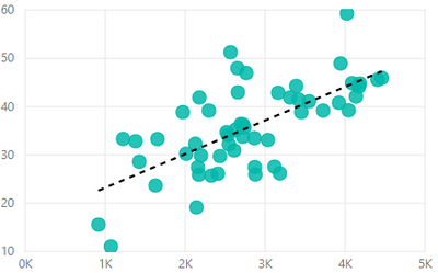
It's however made through 3 fields and a bunch of filters. Filters because i have several divisions and products i want to be able to specify on. And the fields are Weight (x-axis), efficency (measure and y-axis) and date. Date is used as the detail so it sums weight by day.
As my weight is not a sum by date column but rather many small registrations it looks like the picture on the right without date as detail. Passing the results of the right picture through corrplot in R scripting doesn't look valid.
Data involved in this with exception of filters is just Date, Weight and a measure that calculates efficency by hours spent. Weight and efficiency filtered to matching divisions by other columns. Weight and Hours are two separate tables.
Anyone with a bit more experience with me have any good ideas on how this is solvable, preferably without overcomplicating things. The best idea i've got right now is creating a new table with 1 value for both weight and timespent of each day for each division. But something in the back of my head tells me, no that's not it ![]()
Solved! Go to Solution.
So i went ahead and solved it as a new table. It's a bit cumbersome of a solution and i'd much prefer it if there was a better way of passing it directly into R formated as you have in power bi. I couldn't find one though. If you're like me and new with this and use a lot of filters like me there's either M or "in" and "Contains". It works at least.
I noticed something odd with trend lines as i was testing it. It wouldn't let me use trend lines with x and y's alone. Had to use detail field even if it did not change the scatterplot in any way.
So i went ahead and solved it as a new table. It's a bit cumbersome of a solution and i'd much prefer it if there was a better way of passing it directly into R formated as you have in power bi. I couldn't find one though. If you're like me and new with this and use a lot of filters like me there's either M or "in" and "Contains". It works at least.
I noticed something odd with trend lines as i was testing it. It wouldn't let me use trend lines with x and y's alone. Had to use detail field even if it did not change the scatterplot in any way.
Join us in Barcelona for FabCon and SQLCon, the Fabric, Power BI, SQL, and AI community event. Save €200 with code FABCMTY200.
If you love stickers, then you will definitely want to check out our community sticker challenge, Barcelona edition!
Check out the July 2026 Power BI update to learn about new features.
| User | Count |
|---|---|
| 25 | |
| 23 | |
| 19 | |
| 17 | |
| 14 |
| User | Count |
|---|---|
| 24 | |
| 20 | |
| 20 | |
| 19 | |
| 19 |