cancel
Showing results for 
Search instead for 
Did you mean: 

July 28 - August 9 | Final Round of the Power BI Dataviz World Championships. This is your chance. Learn more

Reply
Anonymous
Not applicable

Copy conditional format from table to chart

Dear Friends,

Appreciate advice on the below

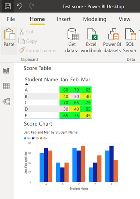
I have created a score cluster column chart by copying the visual from the score table.

There are conditional formatting in the score table that change the background Color to Green for pass, yellow for 40-50 and pink for less than 40 values.


Seeking advice on how to duplicate the table chart Color format to the Clusterd Chart Bar (will show Green, Yellow or Pink)

Thank you very much.


yhlworkacc_0-1635493006678.png


Best Regards,


1 ACCEPTED SOLUTION
v-easonf-msft
Community Support
Community Support

Hi, @Anonymous 

As mentioned by @amitchandak , conditional formatting is not applicable to cluster bar chart with a legend field or multiple value fields. So you may need to unpivot you table columns first.
Please check the sample file I attached for more details.


146.png

For now, there is no content of description in the thread. If you still need help, please share more details to us.

Best Regards,
Community Support Team _ Eason

View solution in original post

4 REPLIES 4
v-easonf-msft
Community Support
Community Support

Hi, @Anonymous 

As mentioned by @amitchandak , conditional formatting is not applicable to cluster bar chart with a legend field or multiple value fields. So you may need to unpivot you table columns first.
Please check the sample file I attached for more details.


146.png

For now, there is no content of description in the thread. If you still need help, please share more details to us.

Best Regards,
Community Support Team _ Eason

Anonymous
Not applicable

Thanks for provinding the file. Much appreciated.

Anonymous
Not applicable

Thank you Sir, I will try out what you have proposed. 

Much appreciated for your time and help.


Best Regards,

amitchandak
Super User
Super User

@Anonymous , when you use more than one measure or legend, conditional formatting is not supported.


If this a legend you can try two axis -> concatenate label off and -> sort on axis and then you can do conditional formatting

I have shown that in power bi part here

Bar/Clustered Bar: https://youtu.be/2P5BBRN853c


Measure based conditional formattng

How to do conditional formatting by measure and apply it on pie?: https://youtu.be/RqBb5eBf_I4

Share with Power BI Enthusiasts: Full Power BI Video (20 Hours) YouTube
Microsoft Fabric Series 60+ Videos YouTube
Microsoft Fabric Hindi End to End YouTube

Helpful resources

Announcements
FabCon and SQLCon Barcelona 2026

FabCon & SQLCon – Barcelona 2026

Join us in Barcelona for FabCon and SQLCon, the Fabric, Power BI, SQL, and AI community event. Save €200 with code FABCMTY200.

Fabric Community Sticker Design Challenge Barcelona Carousel

Fabric Community Sticker Challenge - Barcelona 2026

If you love stickers, then you will definitely want to check out our community sticker challenge, Barcelona edition!

July Power BI Update Carousel

Power BI Monthly Update - July 2026

Check out the July 2026 Power BI update to learn about new features.

Power BI DataViz World Championships carousel

Power BI DataViz World Championships - June 2026

A new Power BI DataViz World Championship is coming this June! Don't miss out on submitting your entry.

Top Solution Authors